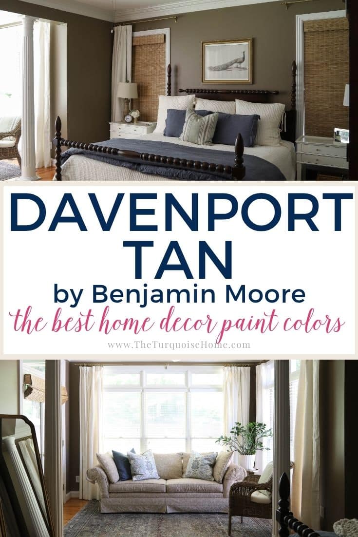
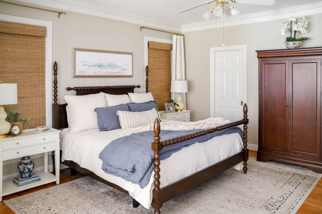
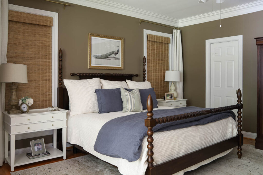
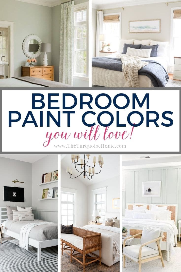
Benjamin Moore Davenport Tan (HC-76) in Our Primary Bedroom
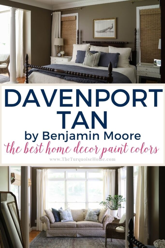
Discover Benjamin Moore Davenport Tan (HC-76), a rich dark taupe with warm brown undertones. See how it transformed our bright primary bedroom into a cozy retreat, plus coordinating colors, undertones, and decorating tips.
When we moved into this house five years ago, I was determined to cover up the very dated paint colors. Think every shade of green and yellow you can imagine (and not the pretty ones!). In my rush, I grabbed two of my tried-and-true favorites, Revere Pewter for the bedroom and Sea Salt for the bathroom. I knew I could happily live with them while I figured out our long-term plan.
Originally, my thought was simple: paint the walls, make a few small updates, and then wait until we could do a full renovation: new floors in the bedroom and a complete bathroom remodel. But here we are, five years later, and those big renovations aren’t happening anytime soon. So instead of waiting, I decided it was time to truly decorate the space we have now.
And that led me to this paint spotlight: Benjamin Moore Davenport Tan (HC-76).
Want to Save This?
Enter your email below and I’ll send it directly to your inbox!
This post contains affiliate links for your convenience. See my full disclosure policy.
Why I Chose a Darker Paint Color
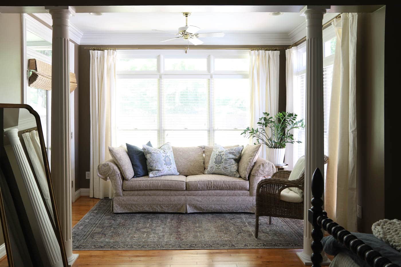
After years of staring at neutral walls, I knew I wanted something moodier and more dramatic in our bedroom. With nine (!!) windows plus transoms, the space gets a ton of natural light. Just like in my living room, I felt like the brightness could handle a darker paint color.
I narrowed my choices down to a deep taupe or brown. When I mentioned it to my husband, he said, “Sure. I’m not surprised. You’ve always loved brown!” He reminded me that my bridesmaids’ dresses were brown almost 20 years ago. (Ha! Proof that colors really do come full circle!)
The New Look in Progress
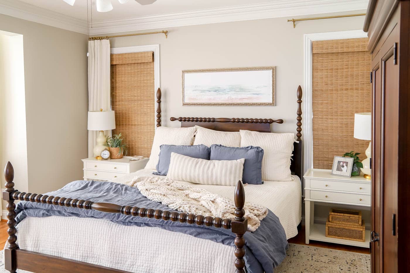
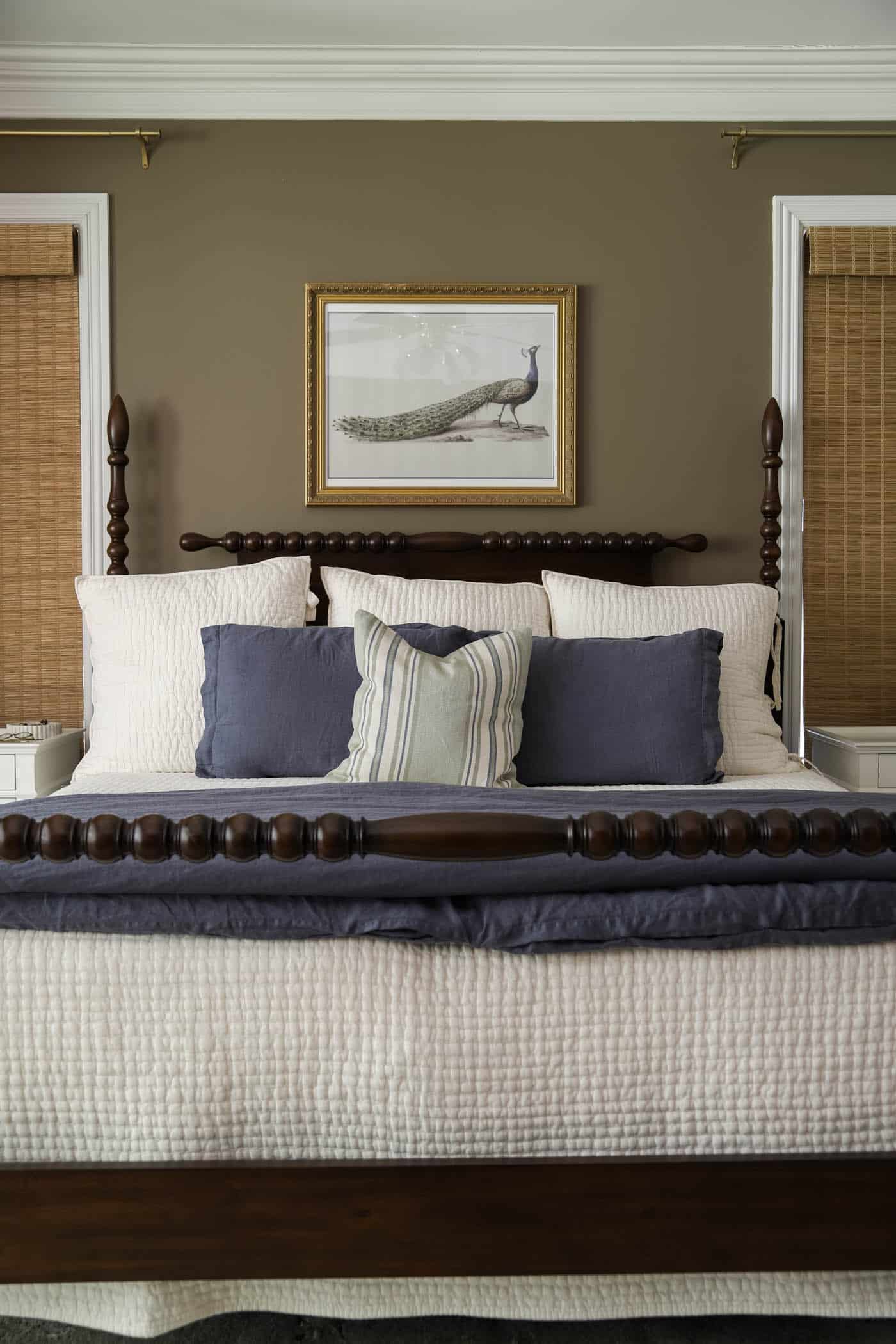
I’ve started pulling in decor with the peacock art and pretty blue-green pillows, which feel so rich against the warm taupe walls. I still need to find the right lamps (the ones I had picked out sold out before I grabbed them! boo!), and I have plans for wall trim and a few bigger decor pieces. But even mid-process, I’m loving the new direction.
Painting the room Davenport Tan has already transformed it. The darker walls make the space feel cozy and grounded, which is perfect for our light-filled bedroom. It’s funny, because I never noticed the blank walls when they were light, but now the darker paint makes me want to layer in artwork, trim, and textures right away.
What’s Next
One day, we’ll still tackle that bathroom renovation and replace the bedroom flooring. But for now, I’m embracing this new, cozier chapter in our primary bedroom with its brown, blue, and green palette. It finally feels like “us” … layered, warm, and restful.
Stay tuned as I keep adding the finishing touches, but for now, I just couldn’t wait to share this rich, earthy paint color with you.

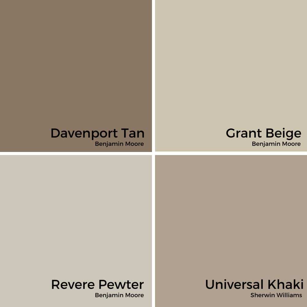
Benjamin Moore Davenport Tan HC-76: Paint Color Review
If you’re looking for a warm, timeless neutral that adds depth without feeling too dark, Benjamin Moore Davenport Tan might just be the perfect color for your home. It’s part of Benjamin Moore’s Historic Collection, which means it’s designed with classic, versatile style in mind; and it works beautifully in both traditional and modern spaces.
Whether you’re painting walls, cabinetry, or trim, Davenport Tan has that cozy, earthy richness that instantly makes a room feel grounded and welcoming. Let’s break it down so you can see if this color is right for your next project!

What Color is Benjamin Moore Davenport Tan?
Davenport Tan is a mid-to-dark neutral tan with strong gray and green undertones. Unlike some tans that can lean orange or pink, this one keeps a muted, natural feel that’s incredibly versatile. It’s warm and rich, but it doesn’t overwhelm a room.
It sits in that sweet spot between a khaki and a darker taupe, which makes it a great backdrop for both crisp whites and deeper accent colors.
PRO Tip
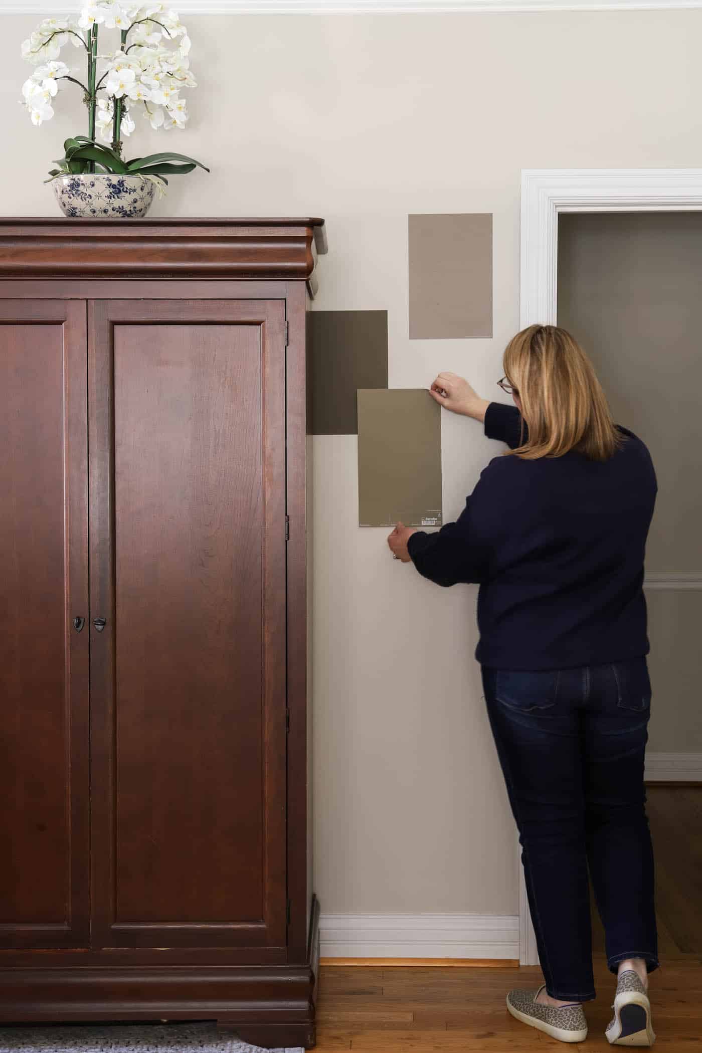
Any time you are choosing a new paint color, you need to try out the real paint color in your home first!
The easiest and quickest way to do that is with Samplize! I solely use them for paint samples now. There’s no mess, no leftover sample pots of paint. Plus, these no-mess, peel-and-stick rectangles made from real paint, are easy to move around the room and easy to save for future reference!
Davenport Tan Undertones
The key undertone in Davenport Tan is gray and green. That’s what keeps it from feeling too golden or muddy. Depending on your lighting, you might notice it look more like an earthy olive-beige in bright natural light, or a deeper warm neutral in low light.
If you’re sensitive to undertones, definitely test this color with large swatches before committing, especially if your room leans warm with lots of southern light.
Is Davenport Tan Warm or Cool?
This color is definitely warm. It brings a cozy, inviting feeling to any room. In north-facing light, it may read a little more muted and gray-green, while in south-facing rooms, the warmth will be more noticeable.
Light Reflectance Value (LRV) of Davenport Tan
Davenport Tan has an LRV of 20.35, which makes it a medium-dark color. It’s not super dark, but it’s definitely not a light neutral either. This means it can add contrast to trim or cabinetry, but still work as a whole-room color without feeling cave-like.
Reminder: LRV runs from 0–100. Zero is pure black, and 100 is pure white.
Where to Use Davenport Tan
- Bedrooms: Warm and grounding, perfect for a restful retreat.
- Living Rooms: Adds depth, especially in spaces with good natural light.
- Dining Rooms: Creates a warm, inviting backdrop for gatherings.
- Offices or Libraries: Pairs beautifully with wood tones and traditional decor.
- Cabinets or built-ins: A sophisticated choice for kitchens, offices, or mudrooms.
- Exteriors: Timeless curb appeal when paired with crisp white trim and a darker accent.
Coordinating Colors for Davenport Tan
One of my favorite things about this color is how easily it pairs with others. Here are a few combinations to try:
- Crisp White Trim: Benjamin Moore White Dove or Chantilly Lace for a classic look.
- Soft Neutrals: Revere Pewter or Edgecomb Gray for a layered, tonal palette.
- Blues & Greens: Sea Salt, Wythe Blue, or Blue Heather (BM) for a fresh contrast.
- Rich Accents: Hale Navy, Essex Green, or even a deep teal for drama.
Davenport Tan vs. Similar Colors
BM Grant Beige: Lighter and softer, with less depth.
BM Revere Pewter: Lighter and greige, more neutral.
SW Universal Khaki: A touch lighter with slightly less green, but comparable.
Final Thoughts
If you’re craving a warm, earthy paint color that feels timeless and rich without being too bold, Benjamin Moore Davenport Tan might be the perfect choice. It’s versatile enough for walls, cabinetry, or even exteriors — and it works beautifully with crisp whites and deep accent colors.
Always remember to test large samples in your space to see how the lighting affects it. But if you love those earthy, historic, cozy vibes, Davenport Tan will not disappoint!
More Posts You Will Love:

I really like the original color much better. this is too dark for me. However, it is never about others opinions but what brings joy to your heart. Glad ypu followed your desires and are happy.
I think the color you chose really shows how beautiful your room is laid out! Actually, it looks bigger and better. Good choice!
I am not a fan of brown, beige, tan, off white, or any of these horrible colorless shades everyone has embraced recently. That said, I do like taupe and this looks really great in your room. After living in an apartment following a divorce and having to sell my gorgeous home, I couldn’t wait to have color around me again. When I bought this house 17 years ago I repainted all of the hideous wall colors with a medium deep grey (Downpour) in the living room (with true white trim), Russian Blue in the kitchen and powder room (a nice soft grey/blue), Scotland Road a medium shade of green which is also a muted shade in the master bedroom and bath, and a lovely medium purple shade in my office which I believe is called Winter Amythest. After 17 years I still love all of these choices with the exception of a lighter celery green in a spare bedroom. I chose that to go with the furniture I had and a pretty sage green carpet. I was never really happy with that choice. Glad to see you are finally able to at least do some painting , if not total renovations. Looks lovely!
Thanks Gail!! I love it! I do think it’s funny how the colors from 15-20 years ago are coming back around. I really had a lot of clothes and decor in this color around the time I got married 16 years ago. 🙂 So, it has a special place in my heart. But I think my bedroom color will look even better when I get it all completely decorated! Stay tuned! xo, Laura
Looks so rich & sophisticated. Well done!
Thank you so much, Helen! xo, Laura