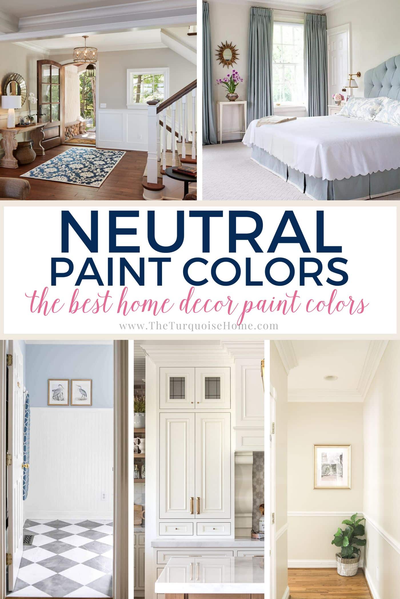
The Best 15 Neutral Paint Colors for 2024
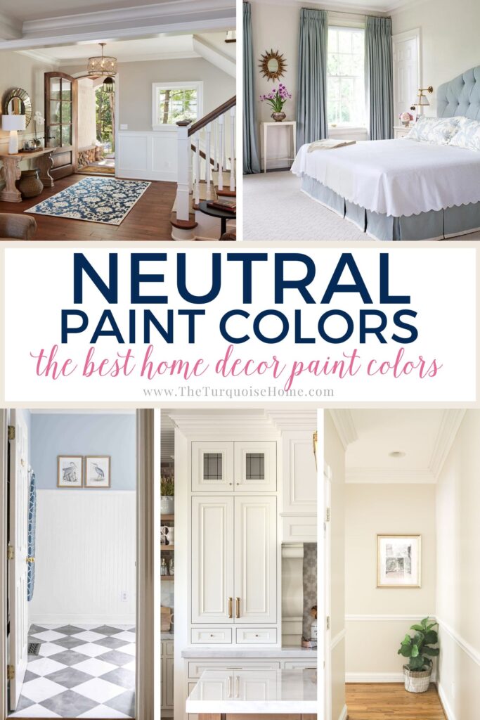
Neutral colors reign in the interior design world because they offer unparalleled versatility. Here are the top 15 best neutral paint colors that work nearly anywhere and everywhere!
When did you last walk into a house with brightly colored neon paint on the walls? It’s been years for me.
Unless the wall color is a pale blue or green or a deep neutral-acting shade like navy (ex: Benjamin Moore’s Hale Navy), many people give a hard pass on bright wall colors in favor of neutral ones.
Designers have been using neutrals for years because people love them, and they are timeless and beautiful in ways that other colors can’t compete.
Neutral paint colors are king in the design world because no other color family can match the versatility, flexibility, and enduring sophistication that neutrals offer, all while allowing decor pieces to shine and take center stage.
And choosing a neutral paint color, especially for the main areas of your home, is the foundation for choosing a whole house color palette.
So, I’m dedicating this post to the best neutral color palettes that have proven their versatility and beauty time and time again. If you’re searching for neutral colors, you will likely find just what you need on this list of 15 colors!
Want to Save This?
Enter your email below and I’ll send it directly to your inbox!
This post contains affiliate links for your convenience. See my full disclosure policy.
What is a neutral color?
Neutral shades don’t belong to traditional color families such as blue, green, red, etc.
Some people hear of neutrals and think they are boring, but they have come a long way in the past 15 years or so. We’ve ditched the yellow-tinted, one-dimensional “builder’s beiges” of the 90s and moved on from the frosty grays of the early 2000s.
Now, we have a variety of popular neutral families (whites, off-whites, grays, beiges, and greiges) with a large selection of shades in each family. These colors may sound simple, but they possess incomparable (and sometimes unexpected) depth and beauty.
PRO Tip
Any time you are choosing a new paint color, you need to try out the real paint color in your home first!
The easiest and quickest way to do that is with Samplize! I solely use them for paint samples now. There’s no mess, no leftover sample pots of paint. Plus, these no-mess, peel-and-stick rectangles made from real paint, are easy to move around the room and easy to save for future reference!
Undertones in Neutral Paint Colors
Choosing a shade of greige, taupe, off-white or white paint sounds easy, right?
Well, if you’ve done it before, you know exactly how challenging it is. And if you’ve never done it before, take my word for it: choosing a specific shade is much more complex than you may initially think.
Each shade has subtle differences (called undertones) that allow it to stand out from the crowd in its unique way. The plus side is that we have tons of options to choose from. The downside is that all these options make choosing only one color difficult.
Each color family has the possibility of certain undertones, and it’s important to be aware of the ones you’re likely to see in neutral paint colors:
- Whites can have yellow, gray, beige (brown), or blue undertones.
- Warm-leaning colors (beiges, warm greiges) can have pink, red, or yellow undertones.
- Cool-leaning shades (grays and cool greiges) show off their blue, purple, or green undertones.
Everything from your furniture to your decor to even your light bulbs can strongly impact the paint’s appearance by drawing out undertones. You may think you purchased a can of gorgeous greige only to discover that after you cover your home in it, you see a hint of unexpected pink when you look at the walls.
Avoid this frustrating scenario and choose paint colors that work well with your home and light exposure. Whether you’re painting your living room, kitchen, or bedroom, use large paint swatches to vet any colors you like before you buy them!
Picking Paint Color Tip
Don’t choose neutral paint colors in a vacuum. When choosing a neutral paint color, make sure the undertones work with your fixed finishes already in your home! That will be countertops, cabinets and even flooring. Hold up swatches to your existing elements!
15 Most Popular Neutral Paint Colors
With all that in mind, it can help to have a starting point to help you narrow down what to even swatch on your walls!
If you’re searching for a must-have neutral paint color for your home, you’ve come to the right place. I’m sharing a variety of shades (15 in total), and each one is a popular choice that both designers and homeowners love.
Note: I have published paint color reviews on many of these options to offer more information and depth, along with some examples so you can get a better idea of how they behave. Click through the provided links to learn more!
1. Benjamin Moore White Dove
I think this is one of the most well-rounded white paint colors on the market. It’s clean and crisp yet also warm and inviting. White Dove (OC-17) has yellow undertones that give it the creamy, soft off-white nature it’s known for. It’s a favorite for cabinets, trim, and molding.
2. Sherwin Williams Agreeable Gray
I’m convinced that Agreeable Gray (SW 7029) gets its name because it’s just SO agreeable! That’s probably why it’s one of the most popular greiges available (and Sherwin Williams’s most popular color).
This soft, warm-leaning greige provides flexibility as it can shift between beige and gray and has mild green-gray undertones. With an LRV of 60, this go-to neutral paint offers rich color and good saturation without looking too dark in low-lit rooms.
Use it in bedrooms, living rooms, kitchens, and much more.
3. Sherwin Williams Light French Gray
Light French Gray (SW 0055) is a beautiful true gray from Sherwin Williams. It won’t overpower any room, but with an LRV of 53, it’s a little darker and has more depth than many of the shades on this list.
This gray offers a good balance of warm and cool with a subtle purple undertone to create an endlessly versatile and timeless shade. It looks gorgeous on walls (family room, bedroom, bathroom, etc.), cabinets, and furniture.
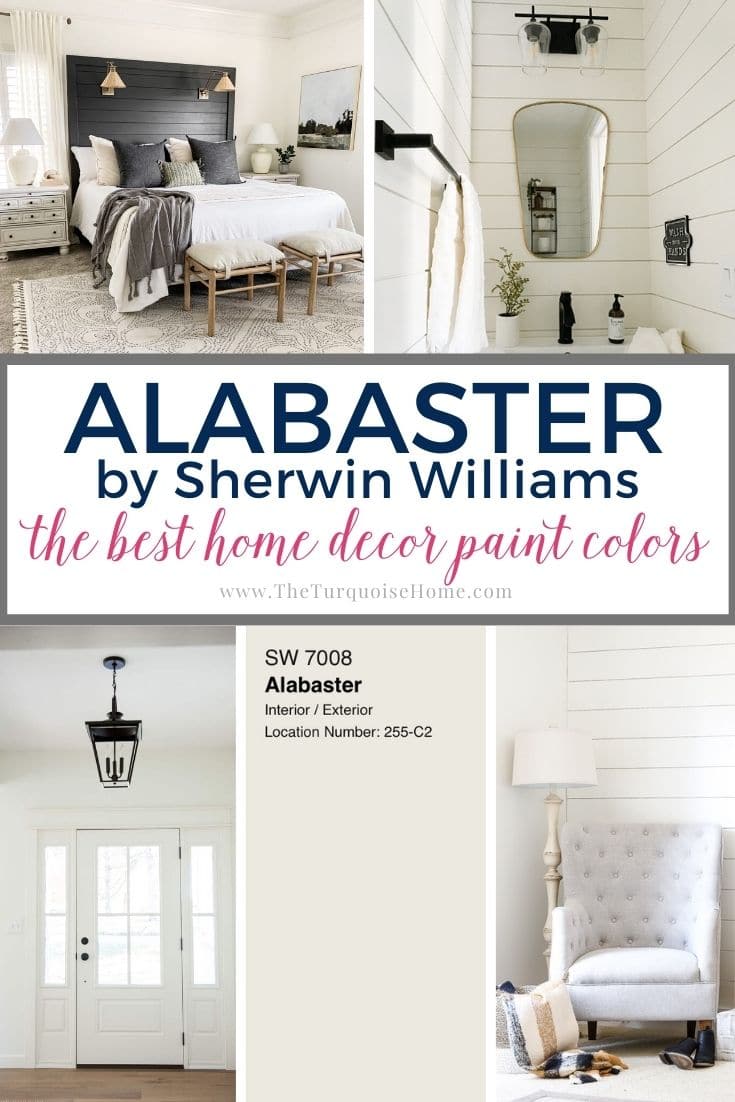
4. Sherwin Williams Alabaster
If you want a warm white that will never look cold or stark and provides an ideal neutral background for art and decor to shine, Alabaster should be at the top of your list! Alabaster (SW 7008) is a soft white with a hint of creaminess that brightens a room while creating a warm and inviting ambiance.
It’s a popular color for walls, trim, cabinets, and more.
5. Benjamin Moore Edgecomb Gray
This popular neutral paint color is a warm, versatile beige-leaning greige. Like its gray-leaning counterpart, Agreeable Gray, it can shift between beige and gray in different lighting situations.
Edgecomb Gray (HC-173) has gray-green undertones that give it a soft quality, while its LRV of 63.88 keeps it looking interesting and airy.
6. Benjamin Moore Simply White
This shade is one of my personal favorites! Simply White (OC-117) is a bright warm off-white with mild yellow undertones and an LRV of 89.52. It’s a versatile hue that doesn’t read as cream (unless it’s next to a clean, cool white), making it a popular choice for trim, ceilings, and kitchen cabinets.
7. Benjamin Moore Revere Pewter
Revere Pewter (HC-172) is a popular (some polls say the most popular) gray in the design world for a good reason. This shade is one of my personal favorites because it provides a gorgeous and timeless backdrop that contrasts well with white and allows accent colors to shine.
With an LRV of 55.51 and warm undertones, it’s versatile enough to use in any home decor style.
8. Benjamin Moore Sea Pearl
Sea Pearl (OC-19) is a favorite warm off-white for many designers. It has yellow and gray undertones, but it doesn’t lean strongly into either one of them and, instead, appears soft and inviting.
With an LRV of 76.43, Sea Pearl makes a room feel light and fresh without looking too bright, even in a flood of natural light.
9. Sherwin Williams Accessible Beige
Accessible Beige (SW 7036) is nearly as popular as Agreeable Gray. This greige has both gray and beige undertones, although it tends to lean toward beige more strongly than gray. However, the blend of undertones makes it a complex go-to shade because people love its chameleon nature.
With an LRV of 58, it has enough saturation that it can start to feel too dark for some people in rooms with low light levels, but it stuns in rooms with natural light.
10. Sherwin Williams Iron Ore
Neutral paint colors aren’t limited to light or medium-depth colors. Some gorgeous dark neutrals offer a neutral backdrop and a pop of color, and Iron Ore (SW 1069) is one of my favorites.
With an LRV of 6, it’s a deep shade of charcoal gray that many people describe as a soft-looking black. Its mild blue-gray undertones only appear in certain lighting situations, giving this color interesting depth and beauty.
11. Benjamin Moore Gray Owl
Gray Owl (OC-52) is an attractive gray that many homeowners love because it can shift quite a bit as lighting changes throughout the day. Its blue and green undertones make it read warmer than many grays.
With an LRV of 65.77, it’s a dependable and lovely favorite for people who want a light gray with some depth.
12. Benjamin Moore Pale Oak
Pale Oak (OC-20) may not be the most popular greige listed here, but this rich, beautiful shade is seriously underappreciated. This lovely soft greige has an LRV of 70 and pink and yellow undertones, giving it a complex nature that works in nearly any home decor style and can shift significantly in various lighting situations.
I highly recommend using paint swatches to vet it first and ensure you don’t get surprising or undesirable undertones in your home.
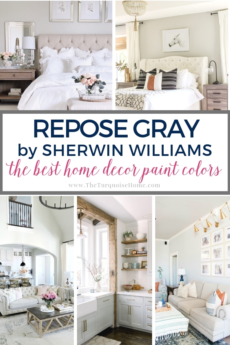
13. Sherwin Williams Repose Gray
Repose Gray (SW 7015) is one of the best neutral paint colors because it’s a balanced gray with brown and mild purple undertones to give this shade a soft, inviting appearance and just the right amount of warmth. With its undertones and medium saturation (LRV of 58), it can shift slightly between leaning warm or cool depending on the colors you pair it with.
Confidently use it with any decor style!
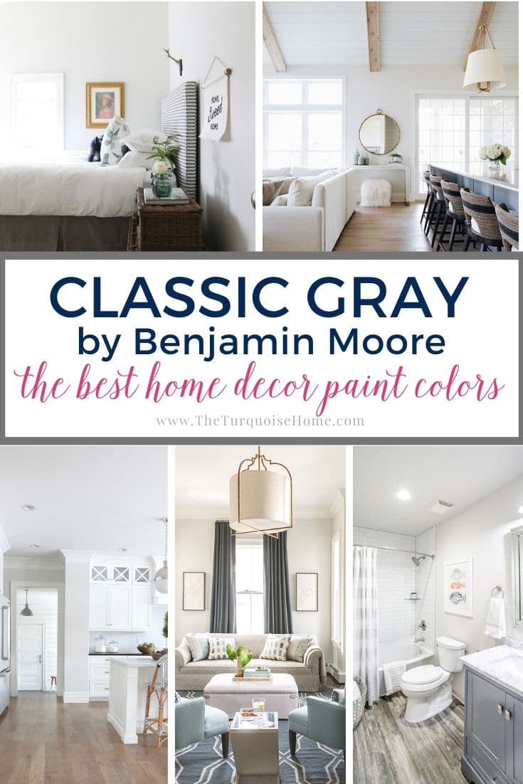
14. Benjamin Moore Classic Gray
Classic Gray (OC-23) is one of my go-to neutral paint colors because it’s a versatile and timeless warm shade with subtle green undertones that give it eye-catching depth.
Since it has an LRV of 74.78, it’s one of the lightest non-white neutral colors on this list and can wash out in bright lighting. But it has enough saturation that it will always contrast with white.
15. Sherwin Williams White Duck
White Duck (SW 7010) is a creamy, warm, off-white that leans towards beige but doesn’t carry strong yellow undertones. Plus, it has mild gray undertones that soften this shade.
Overall, it will appear as a soft off-white with hints of greige, making it an excellent choice for anyone who wants the light airiness of white with subtle color on their walls.
NOTE: If you’re doing the painting yourself, these tools will help tremendously. And check out my best tips for painting a room in 5 easy steps to get the best results.
Final Thoughts
I hope this list of the best neutral paint colors helps you pick the perfect neutral paint color for your home easily and confidently! Always remember to use color swatches to see how a color behaves in YOUR home before committing to it because the mix of undertones and light can cause colors to appear much different in your home than on a computer screen!
More Posts You Will Love: