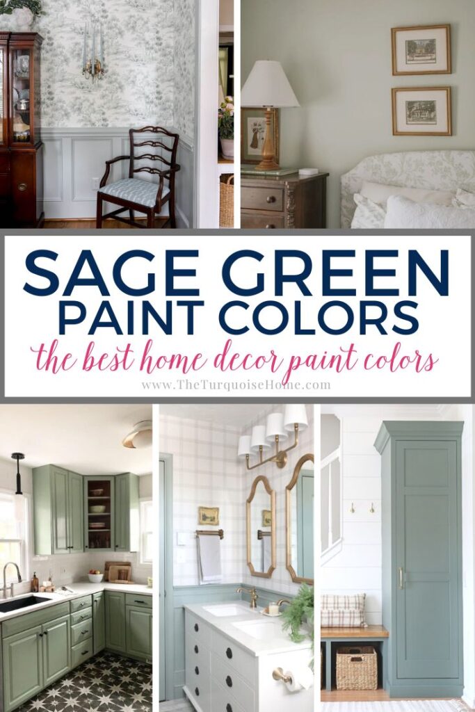
The Best 17 Sage Green Paint Colors For Your Home
If you’ve been on the fence or still looking for the best sage green paint colors, I’ve put together a guide to the best sage colors for your home. While we’ve been hearing about greens – specifically shades of sage – for a couple of years now, they’re not going away for a while, if ever.
Sage green paint colors took the spotlight in 2022, with different hues taking color-of-the-year picks from both Sherwin Williams and Benjamin Moore. We saw the green trend with other companies too, just in other variations.

Greens are timeless, and it’s been shown their popularity increases around economic and cultural shifts. Green symbolizes rebirth, growth, and prosperity – all positive and hopeful vibes.
Why wouldn’t you want that kind of inspiration all the time? As someone who’s welcomed the sage green shades into my own home, I can attest that they are the perfect intersection of trend and tranquility.
That’s one big reason this interior paint trend will endure. Another is because it’s just such a versatile color. Sage green pairs with so many other hues and natural materials that it’s become a new neutral – almost. We’ll take a look at how sage compares to neutrals, what colors pair best with it, and what to consider about lighting in choosing your perfect shade of sage green paint.
Want to Save This?
Enter your email below and I’ll send it directly to your inbox!
Is Sage A Neutral?
While sage green often behaves as a neutral, it’s not considered a “true” neutral because it carries distinct undertones of green and gray. True neutrals – whites, off-whites, grays, beiges, and greiges –are the most universal because they do not have these undertones. Sage’s subtle variations keep it firmly in the realm of greens.
In other words, if you know what to do with those undertones, sage green works really well as a neutral despite not being one by definition. While it does have more nuances than true neutrals (see my favorite neutrals for 2024), the design process is similar and almost as easy. You only need to pick the shade to match your desired vibe, and then build the rest of your color palette around it.
PRO Tip
Any time you are choosing a new paint color, you need to try out the real paint color in your home first!
The easiest and quickest way to do that is with Samplize! I solely use them for paint samples now. There’s no mess, no leftover sample pots of paint. Plus, these no-mess, peel-and-stick rectangles made from real paint, are easy to move around the room and easy to save for future reference!
What Colors Go Well With Sage Green Paint?
Sage is an equal blend of citron and slate. On a color wheel, you’ll find the sage hue between blue and yellow. Without getting too far into color theory, you get citron by blending orange and green and slate by mixing violet and green.
Common Sage Green Paint Undertones
- Gray undertones create a muted, soft, sophisticated, and neutral feel.
- Blue undertones infuse a cooler, calming effect similar to blues found in nature.
- Warm undertones bring hints of yellow or brown for extra earthiness and warmth.
- Muted undertones soften the color’s vibrancy for a more subtle, classic touch.
- Olive undertones deliver depth and richness for a lush green.
While sage green paint can go with just about anything, it almost always works best with ivory, cream, light gray, taupe, and brown.
Many modern designs pair it with darker woods. It also works very well with black. You can try a pop of color here and there with one or two accent pieces in bold hues.
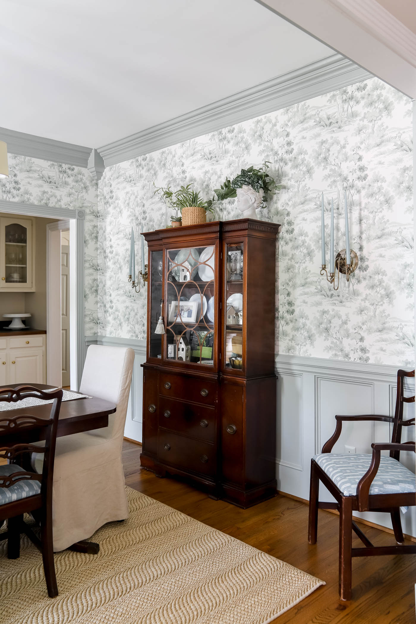
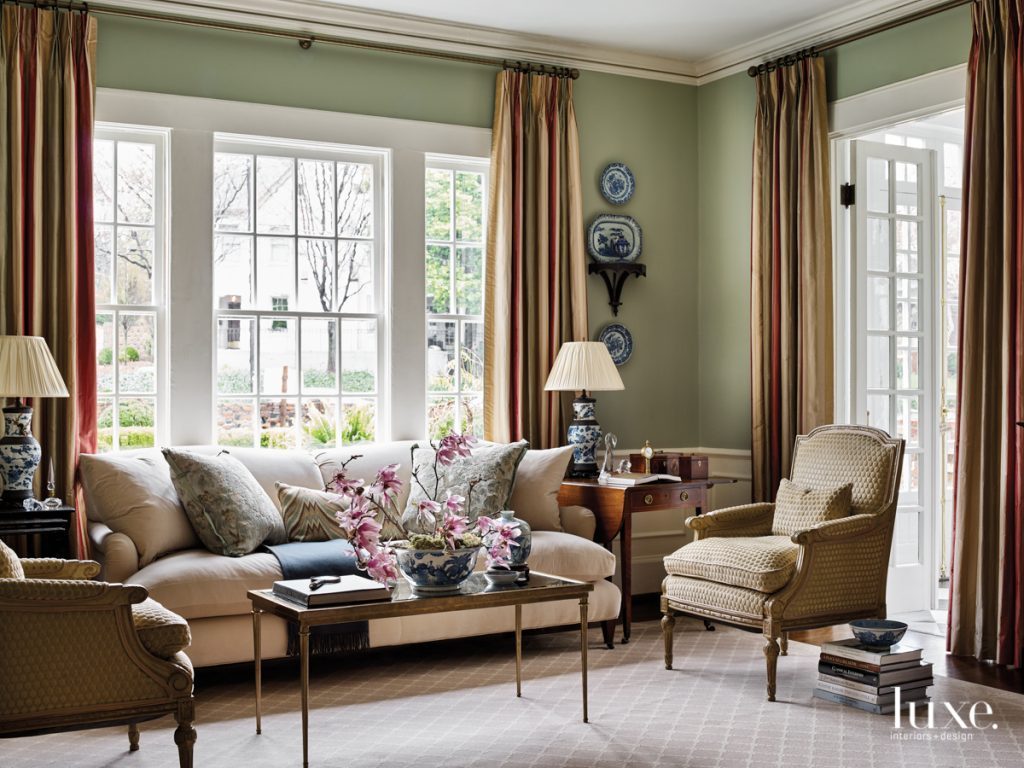
Because green is on the opposite side of the color wheel from red, I love to use greens when I’m working with red undertones in flooring or furniture. Like in the case of my dining room, I paired a sage green wall color with my great-grandmother’s dark wood furniture. And it really calmed the red down.
How Does Lighting Impact Sage Green Paint?
Ever notice outdoors how different greens can look depending on the time of day? Sage green paint is similar. In natural light, it appears fresh and vibrant, often bringing out its yellow tones. On the other hand, at darker times of day, your interior lighting will dramatically impact the color. Check out my post on choosing the right light bulbs for more help with that.
Also, note the light reflectance value (LRV) for each of the sage green shades below. The higher the number, the more light it reflects on its own – and the less natural or artificial light you need for it to feel bright. The lower the number, the more light it absorbs. In that case, pay very close attention to your light sources if you want a brighter, airy feel.
These picks will help you narrow your choices, yet nothing works better than seeing for yourself! Pop up large enough paint swatches to observe the color at different times of day and, if possible, at various placements around the room.
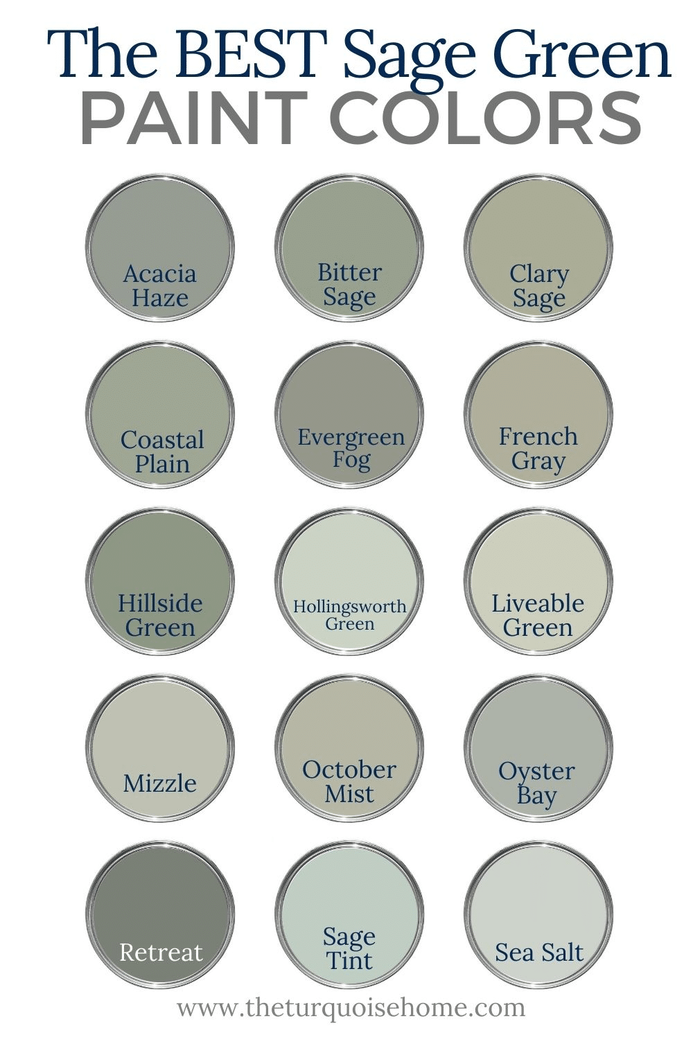
17 Most Popular Sage Green Paint Colors
Let’s get to the best of the best sage paint colors, as promised. These picks range from muted to warm, and you’re sure to find one that suits your design plan.
1. Benjamin Moore October Mist
A timeless hue in the company’s Classics Collection®, Benjamin Moore October Mist 1495 contains a delicate balance of gray and yellow undertones for tranquil green. With an LRV of 46, it’s especially earthy in warm, natural light, bringing coziness to bedrooms and living rooms and calm to home offices. Because of its gray undertones, it also appears much more silver in artificial light.
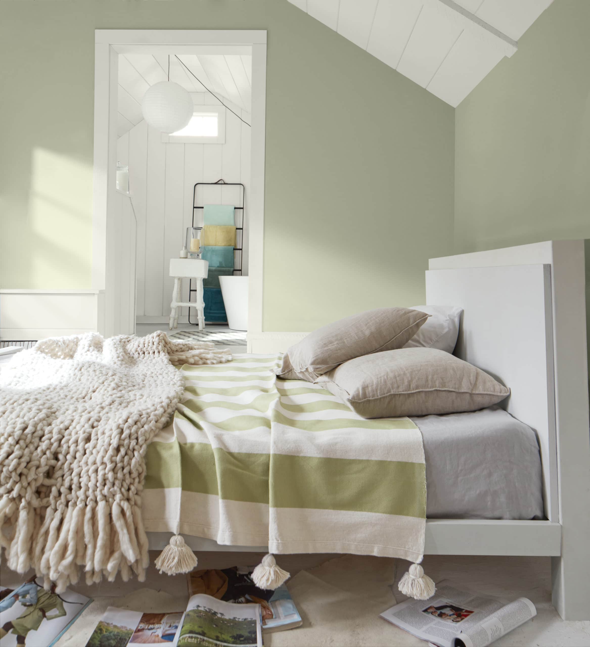
This adaptable shade also complements kitchens, especially when paired with crisp whites or contrasting cabinetry.
2. Benjamin Moore Saybrook Sage
Benjamin Moore Saybrook Sage HC-114 is a very cool shade of sage with heavy gray undertones for a silvery look. It has an LRV of 46 and pairs seamlessly with most neutrals, whites, and soft blues.

Its soothing, sophisticated, and timeless charm works well in traditional living rooms, bedrooms, and kitchens. Pairing seamlessly with neutrals, whites, and soft blues, it’s elevated and inviting.
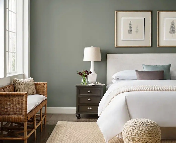
3. Benjamin Moore Hollingsworth Green
Benjamin Moore Hollingsworth Green HC-141 has a high LRV of 63.25, so it radiates a fresh and airy atmosphere even without a lot of light. It’s a combination of green, blue, and gray that goes well with crisp whites, creams, and soft grays.
This light, botanical hue brings a serene, uplifting natural ambiance that can transform living rooms and bedrooms into elegant retreats.
4. Benjamin Moore Sage Tint
Benjamin Moore Sage Tint 458, is another shade on the lighter side with an LRV of 57.85 and floating between blue, green, and gray – almost minty. Paired with soft neutrals and blues, or warm grays, brings a calming, muted feel.
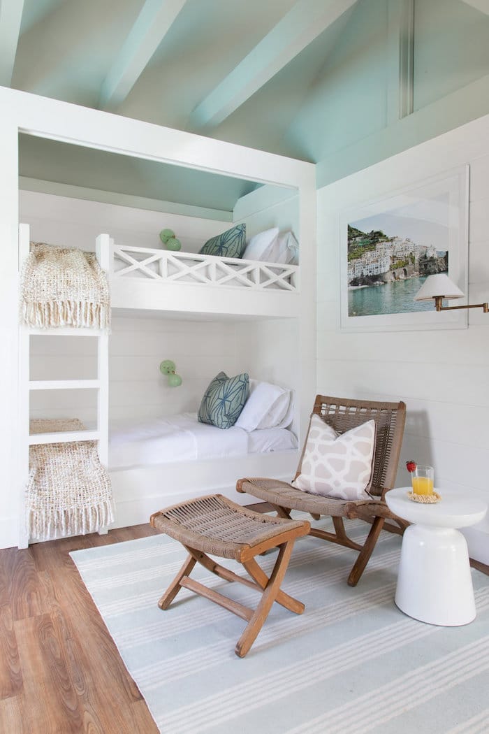
When matched with crisp, cool whites and natural woods, you’ll get a more lively feel with Sage Tint, as shown here used within a clean, beachy cabana design.
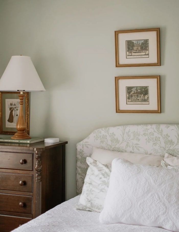
5. Benjamin Moore Silver Sage
Benjamin Moore Silver Sage 506, is one of the two lightest colors on my list, with an LRV of 63.26. It bathes rooms in a soft, silvery glow, pairing nicely with almost all whites, grays, and muted blues. It’s refined and sophisticated without lacking personality.
This example shows how well Silver Sage complements bold choices in tile patterns and undertones. In this space, the color complements the gray-green subway tiles, giving the contrasting black-and-white tile choices maximum impact.
6. Sherwin Williams Clary Sage
Sherwin Williams Clary Sage 6168 is lush, herbal green. Yellow undertones and an LRV of 41 deliver a welcoming botanical vibe.
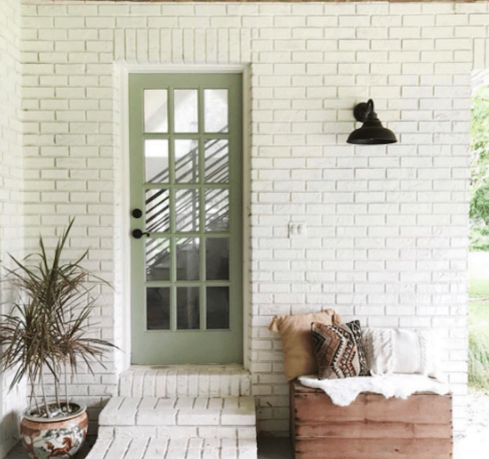
I have said before I might find the saturation too much in my interior spaces, but I could see Clary Sage for an accent wall, trim, or a focal piece of furniture. One of my favorite examples is Clary Sage on this exterior door and how well it works with the white brick, natural wood, textured neutrals, and beautifully potted plant.
7. Sherwin Williams Evergreen Fog
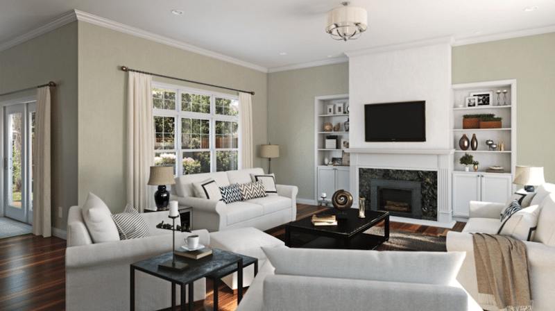
Sherwin Williams Evergreen Fog 9130 is the second Color of the Year entry on this list, as it was the company’s top pick in 2022. With an LRV 30, this one truly stands out for its richness and versatility. Ideal for living rooms and bedrooms, it pairs seamlessly with neutrals, whites, dark gray-brown, cool blues, and metallic accents, offering a sophisticated and grounding presence.
I chose two photos for Evergreen Fog to show how well it works with varied styles, from more traditional to mid-century modern.
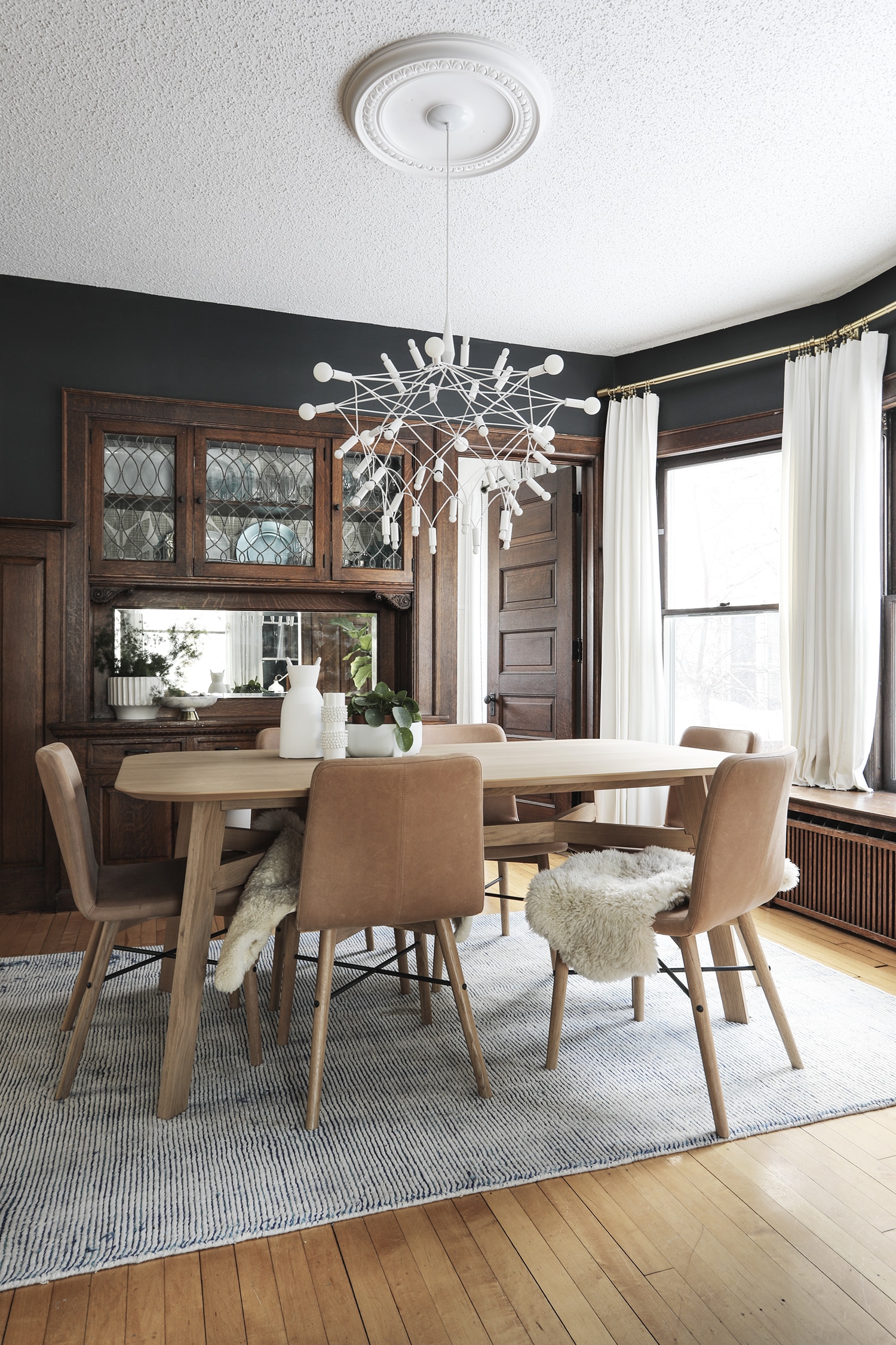
8. Sherwin Williams Oyster Bay
Sherwin Williams Oyster Bay 6206 is the first of two sage green paint colors I have been thrilled with using in my own home. Oyster Bay’s strong slate blue undertones lend a crisp, cool neutrality. Like most sage hues, it’s great for bedrooms and bathrooms, and yet I found it to be absolutely perfect for my traditional dining room design.

It’s a soothing, gray-blue green that’s fairly saturated with an LRV of 44. I chose it because I wanted to use my grandmother’s beautiful dining room set while tempering the red tones in the wood. I also wanted to bring in some of my favorite shades of blue. While the room is traditional, it pushed me outside of my comfort zone. I couldn’t be happier with the result.
9. Sherwin Williams Sea Salt
Sherwin Williams Sea Salt 6204, is the second of our lightest colors on this list (LRV of 63) and also is the second example of sage colors I’ve personally used in my home decor. I used it in my last kitchen, and we have it in the primary bathroom of our current home.
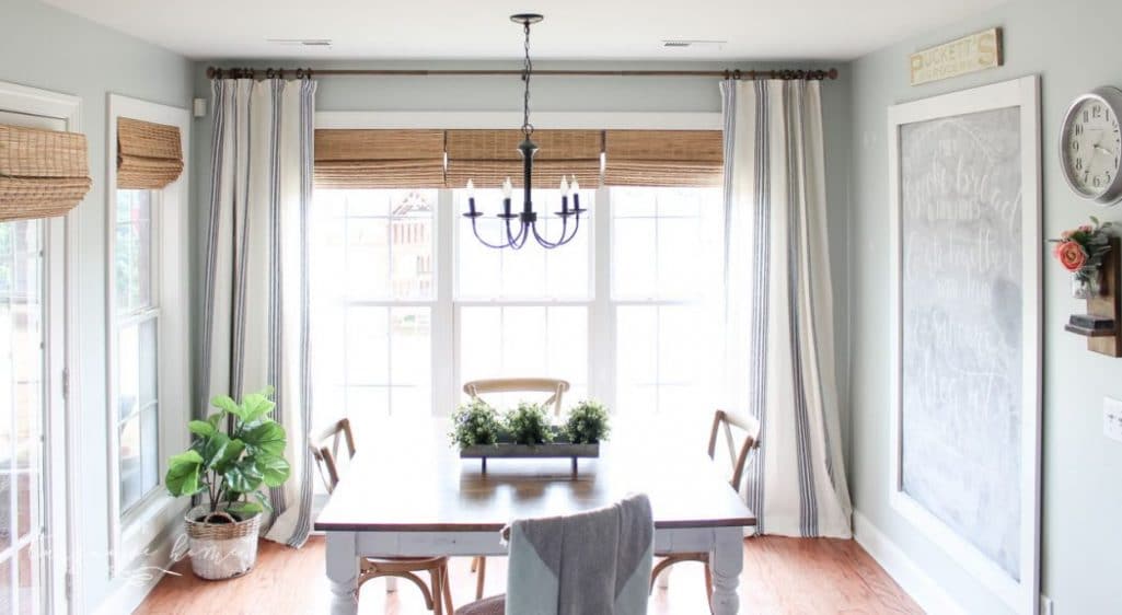
It crafts a serene and light atmosphere, perfect for those desiring a sage look without a dark hue.
True to its name and depending on the light, this one can read more blue than green. Consider pairing Sea Salt with crisp, pure whites for a clean and classic contrast. Alternatively, warm whites with subtle undertones of cream or beige add warmth.
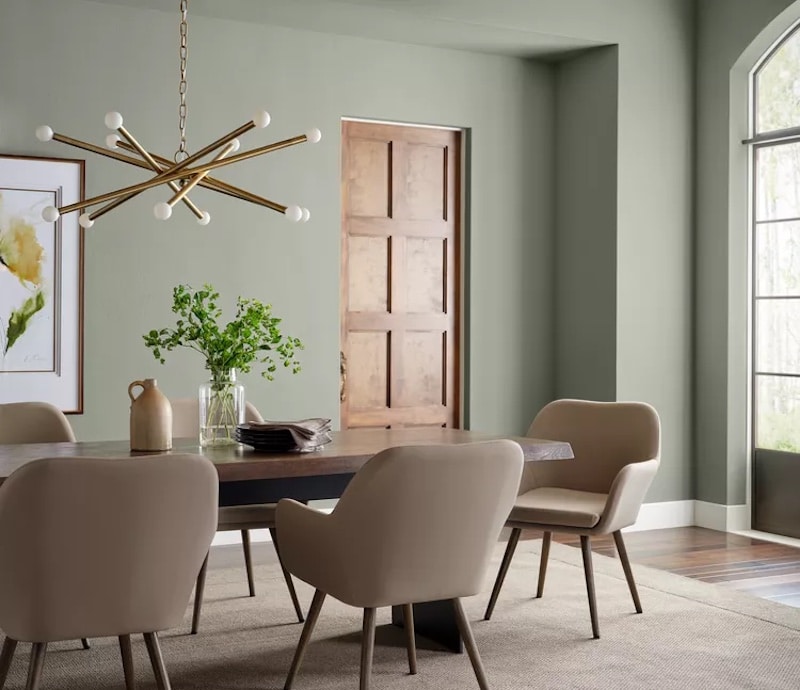
10. Sherwin Williams Coastal Plain
Sherwin Williams Coastal Plain 6192, with an LRV of 37, infuses spaces with a warm and grounded atmosphere, harmonizing best with earthy tones, warm whites, and soft neutrals. Undertones of beige and subtle warmth in neutrals complement Coastal Plain, as do other blue-green neutrals.
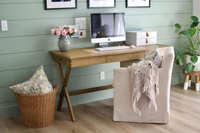
I love how Coastal Plain brings such a fresh, cozy, and inviting feel to this shiplap in an office space.
11. Sherwin Williams Acacia Haze
Sherwin Williams Acacia Haze 9132 is a muted and warm gray paint with an LRV of 32. It works well with warm neutrals, soft grays, and earthy tones for a cozy atmosphere in various rooms.
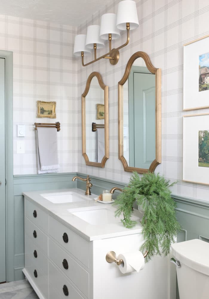
For example, check out Acacia Haze on the wainscoting, door, and trim in this beautiful English Cottage Bathroom. I am on the lookout for a place to use this color in my home. I absolutely love it when mixed with warm wood tones and brass fixtures.
12. Sherwin Williams Liveable Green
You’ll get a fresh, inviting atmosphere with plenty of warmth by using Sherwin Williams Liveable Green 6176. Yellow-gray undertones place it on the warmer side, however, the bright LRV of 61 lends to easy pairings with most whites, soft neutrals, and natural textures. The lightness lends a nice contrast to selective black accents, as well.
Liveable Green is another with a very well-chosen name. It’s airy, light, organic, and cozy. Perfect for a living room and a solid choice for other spaces, too.
13. Sherwin Williams Retreat
Sherwin William’s Retreat 6207 takes the blue-gray green of Oyster Bay to the next level with its low LRV of 21. It’s rich, comforting, and perfect for cozy bedrooms, a serene study, or other intimate spaces.
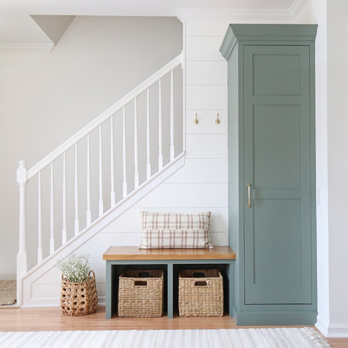
And how about this use of Retreat in an entryway? While those words seem to be the opposite, this space makes it clear it’s where your retreat within the sanctuary of the home begins. Slip off your shoes and jacket, and get comfy! I love how it pops off the white shiplap walls!
14. Farrow & Ball French Gray
Farrow and Ball’s French Gray No. 18, gracefully blends green and gray into a hue that was inspired by traditional colors of 19th-century French decor. It has a medium LRV of approximately 44 and is ideal for exterior woodwork and front doors. In most instances you see this paint, it appears more green than gray. This one shifts a lot depending on your lighting and time of day.
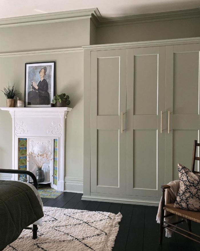
While recommended for exterior woodwork, especially in scenes surrounded by greenery, I love how this looks in a tidy bedroom with mostly neutrals besides the lively colors of the hearth tile.
15. Farrow & Ball Mizzle
Farrow and Ball’s Mizzle No. 266 is misty, soothing, and glows moderately with an LRV of 52. The company says its unique grey-green tone is inspired by the mist and drizzle of England’s West Country evening weather, hence the name mizzle.
Distinct from other greens, its absence of cool blue tones creates a lighter, more serene shade that pairs best with mid-tone neutrals.
16. Behr Bitter Sage
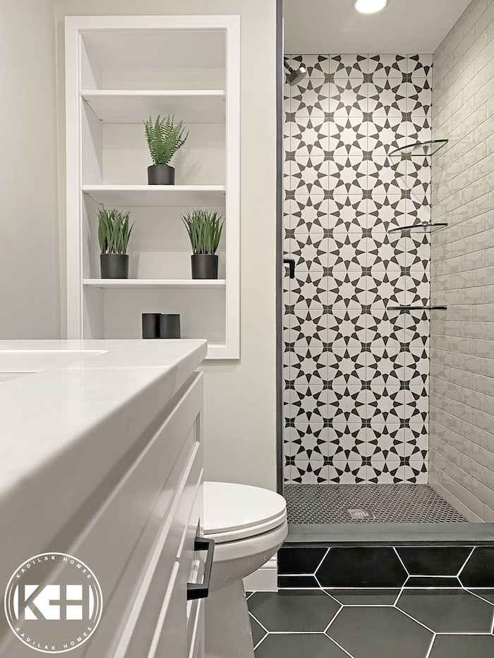
Behr Bitter Sage N390-4 has a nuanced, light- to mid-tone green intensity, that radiates warmth. Its depth of color and relatively low LRV of 34 elevate spaces. This one reminds me a bit of Clary Sage for its saturation and yet is much more blue-green.
Bitter Sage works so well here with the light, white counters, contrasting tile, minimal wood accents, and touches of metallics. It all brings such an elevated, designer look to a compact kitchen.
17. Behr Hillside Green
Behr Hillside Green PPU11-17 has a blend of blue and gray undertones that make it dramatically different from the much warmer Benjamin Moore shade of the same name. It can infuse spaces with cool, calming vibes wherever you choose. With a lower LRV of 30, it is best suited for spaces with a lot of light to get the full benefit of the color.
I chose this example to show you Behr’s Hillside Green and also how big an impact paint can make, especially if you’re on a budget. Paint and lighting are probably the best and top-priority cosmetic investments and choices you can make. Just look at this fresh update of a traditional 1950s kitchen.
If you’re doing the painting yourself, these tools will help tremendously. And check out my best tips for painting a room in 5 easy steps to get the best results.
My Favorite
Painting Tools
Final Thoughts
I hope you’ve enjoyed our exploration of the best sage green paints – from the calming vibes of Benjamin Moore’s October Mist to the chic elegance of Farrow and Ball’s French Gray. More than that, I hope you’ve come away with some inspiration. Get in touch and let me know about your favorite sage colors.
More Posts You Will Love:
These are so pretty! Sherwin williams Forever green is a pretty one to add, as well.