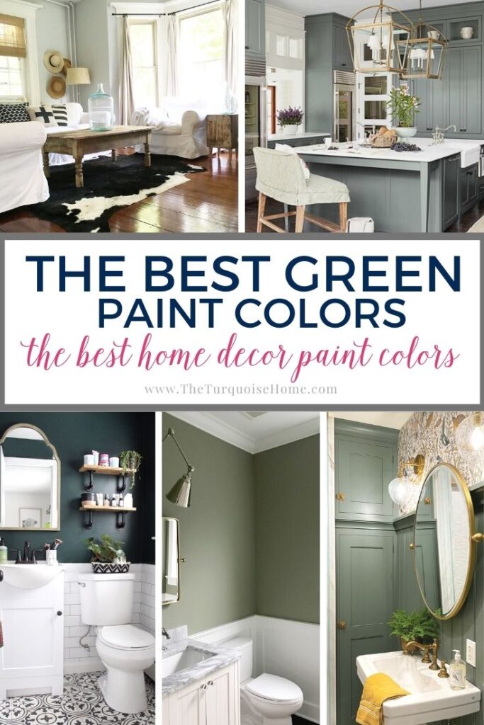
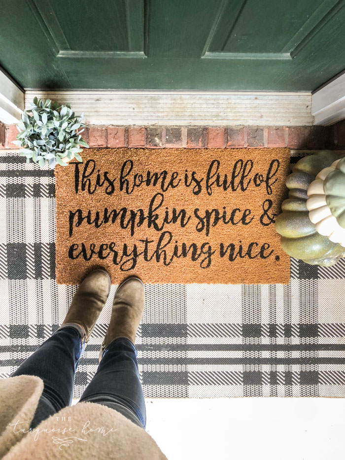
The Best Green Paint Colors For Your Home
Green paint colors can take your home to the next level. Whether your home decor style is sophisticated, rustic, or light and airy, there’s a green paint shade out there that’s perfect for your space. Here are some of the best green colors on the market!
Do you go green with envy when browsing green paint colors on Pinterest? I do, too! (It’s taken me a few years to see past my love of blue paint colors and really love true green wall paint. But I have!)
I will often have dreams of soft, glowing green bedrooms, deep, bold green kitchen cabinets, and just-right sage green exterior doors. Why not humor your fantasies by considering one of the many beautiful shades of green paint on the market?
Want to Save This?
Enter your email below and I’ll send it directly to your inbox!
This post contains affiliate links for your convenience. See my full disclosure policy.
The Light Reflectance Value (LRV) Of Paint
First, a word about Light Reflectance Value, or LRV of paint.
As you peruse the list of green paint colors below, you’ll see a couple of numbers. The first number is simply the number corresponding to the paint shade, which you can use to ask for a shade at your local store. The second number is the Light Reflectance Value of that paint shade, and I’ll tell you why it’s important.
The Light Reflectance Value (LRV) of a color refers to how bright or dark it is. Pure white has an LRV of 100, whereas pure black has an LRV of 0. So, LRV numbers closer to 100 will be brighter and lighter, and the lower the number gets, the darker the shade gets.
Make sense?
LRV can be a useful tool, but what’s considered a light or dark color can be totally subjective. I did my best to dole out green paint colors among three categories: light, medium-toned and dark, but what I consider medium-toned, you might consider dark. It’s all a matter of preference!
Without any further ado, here are some of the best green paint colors to try in your home!
Tip: Use Real Paint Samples
Any time you are choosing a new paint color, you need to try out the real paint color in your home first!
The easiest and quickest way to do that is with Samplize! I solely use them for paint samples now. There’s no mess, no leftover sample pots of paint. Plus, they are easy to move around the room and easy to save for future reference!
The Best Light Green Paint Colors
There is so much you can do with light green paint colors! Set a dreamy scene in your bedroom with a soft seafoam shade, or give your bathroom some relaxing spa vibes with an earthy, light neutral green.
No matter how you envision light shades of green paint, here are some favorites from interior designers and homeowners alike.
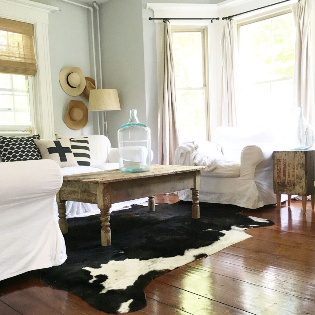
Sea Salt by Sherwin Williams
SW 6204 / LRV 63
This serene, pale blueish-green has a cult following for a good reason: its gray undertones keep it neutral enough to work well in any space. With a Light Reflectance Value (LRV) of 63, it’s light enough to be used with confidence in any room.
Plus, it’s one of my favorite paint shades, having used Sherwin Williams Sea Salt in my kitchen in my previous home and now my bathroom.
Moonshine by Benjamin Moore
2140-60 / LRV 68.28
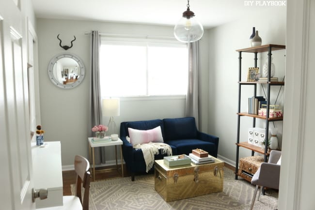
As its name suggests, Benjamin Moore Moonshine is an ethereal pale green that’s more often described as a soft gray with green undertones that can sometimes have blue undertones.
When you get it up on a wall, it certainly looks gray and can morph depending on the directions the windows are facing, and even as the sun changes throughout the day.
It looks pretty light and neutral in this fun office from The DIY Playbook.
Oyster Shell by Benjamin Moore
864 / LRV 68.94
This is another shade that’s classified as a light gray green paint, but certainly looks green on the swatch. It’s cool and fresh, and casts a very subtle green glow (especially when trees outside reflect through the windows), but doesn’t run into the problem of leaning too blue.
I love the look of Oyster Shell as a light wall color in this rustic-inspired room with a black, white, and neutral palette.
Healing Aloe by Benjamin Moore
1562 / LRV 69.66
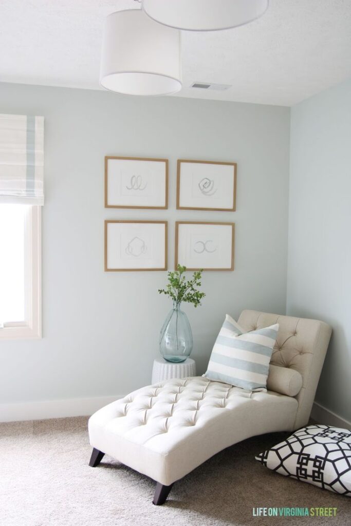
Healing Aloe is a wildly popular light green paint shade, beloved by designers and DIYers alike. This soft, pale green seems to glow in any space, making it ideal for nurseries, bedrooms, and bathrooms, but unobtrusive enough to work in any room of the house.
It’s a perfect wall shade for this sweet green room from Life on Virginia Street.
Gray Mirage by Benjamin Moore
2142-50 / LRV: 54.9
Benjamin Moore says it best: “An understated green with grey tones, gray mirage invites relaxation and calm. Perfect for turning a bedroom or bath into a tranquil sanctuary”.
Gray Mirage is a great choice if you love sage shades but are looking for a very soft wash of color in your bathroom, bedrooms, or on bathroom or kitchen cabinets.
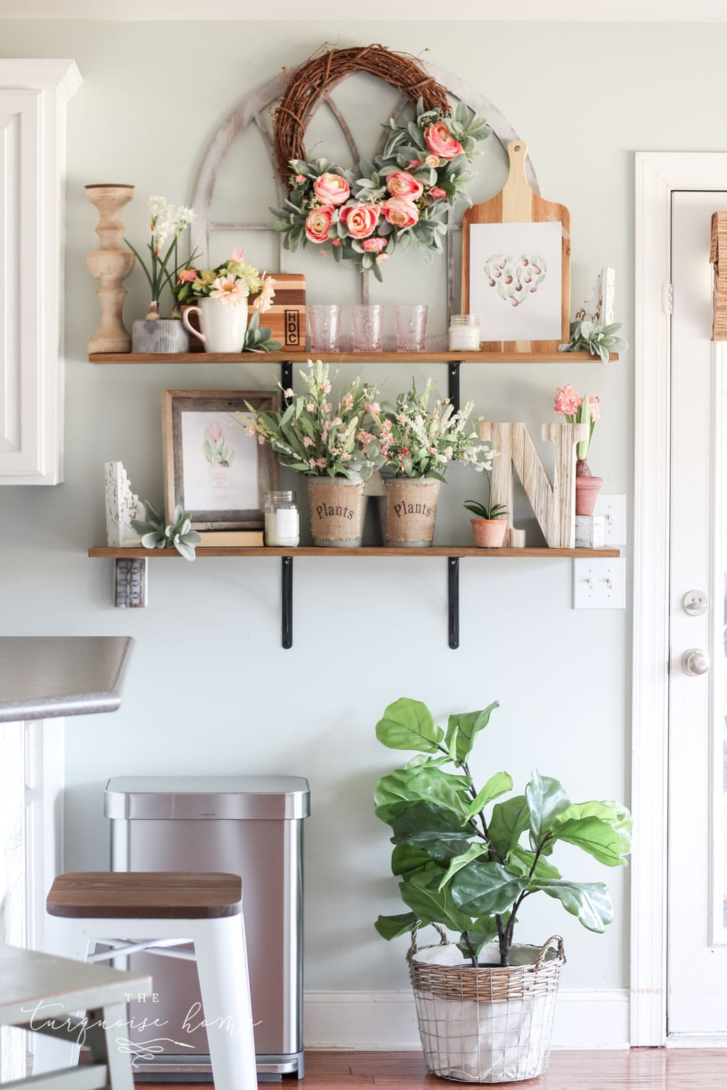
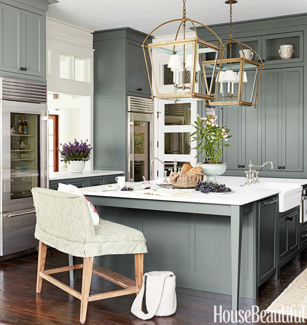
Comfort Gray by Sherwin Williams
SW 6205 / LRV 54
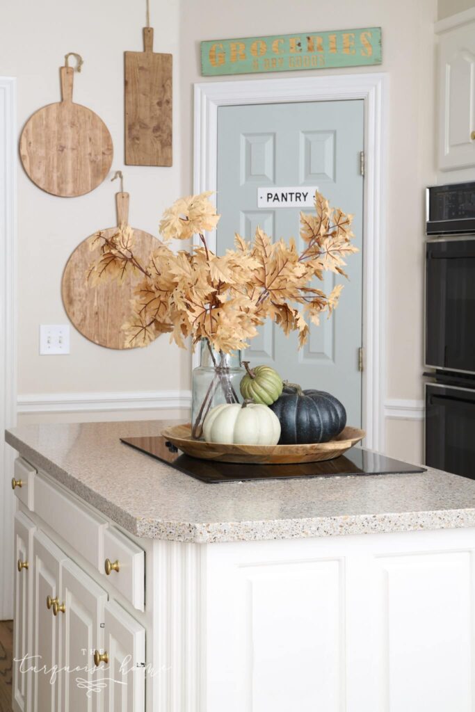
This stunning, stormy gray is the next step up from those beautiful pale blue/gray greens that homeowners tend to love. It’s still light enough to be subtle on the walls in any room of the house, but just slightly darker, giving it some depth and body.
I love how pretty Sherwin William Comfort Gray looks on my kitchen pantry door.
The Best Medium-Toned Green Paint Colors
These medium-toned green shades are the earthy middle ground between soft and ethereal light green paint colors and bold and head-turning deep greens.
Earthy and botanical, one of these beautiful colors might just be the right shade for your powder room walls or built-in cabinets.
Clary Sage by Sherwin Williams
SW 6178 / LRV 41
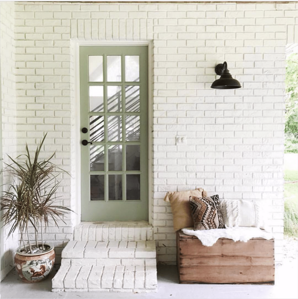
This beautiful, medium-toned sage green is super interesting…and maybe for that reason, a little tricky to get right. While it may be too saturated to look good on most interior walls, how sweet is this exterior door?
Clary Sage adds just a pop of color next to the painted white brick. I’m officially in love.
Sage by Sherwin Williams
SW 2860 / LRV 42
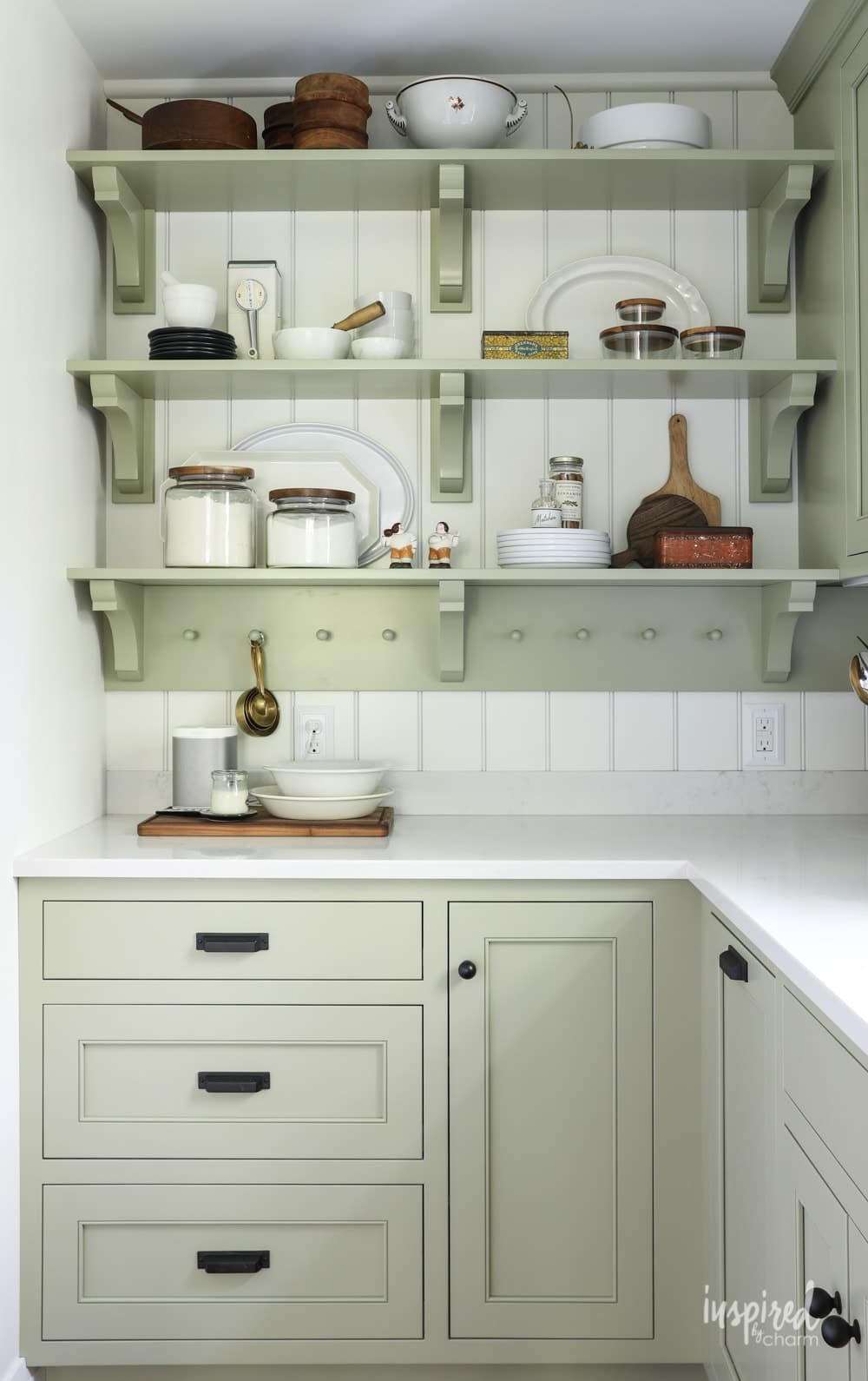
A highly pigmented sage green with some brown mixed in, Sherwin Williams Sage has just a slight hint of yellow in its undertones.
In this breathtaking kitchen remodel on Inspired by Charm, it looks spectacular as a cabinet color. There’s enough depth in the shade to let it be an interesting pop of color, yet muted enough to look somewhat neutral, making it a wonderful green for exterior paint.
Lichen by Farrow & Ball
No. 19 / LRV: Approx. 34
I have to include this description from Farrow and Ball: “This calm and muted green is named after the ever-changing, subtle colour of creeping algae which ages stone so beautifully”.
Consider me sold!
A beautiful sage green that is starting to lean toward the dark side, this is a wonderful color if you covet an earthy feel for your home. How perfect is Lichen in this lovely powder room from Elizabeth Street Post?
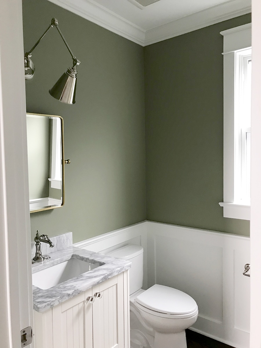
Storm Cloud Gray by Benjamin Moore
2140-40 / LRV 27.85
Turns out, folks just can’t get enough of ambiguously almost-gray, almost-green shades. Why? They play the role of a neutral while adding just a hint of interesting color.
Take a moment to drool over this moody, earthy kitchen from Remodelista. Storm Cloud Gray is muted enough to be used all over – on the many kitchen cabinets and trim. Gorgeous!
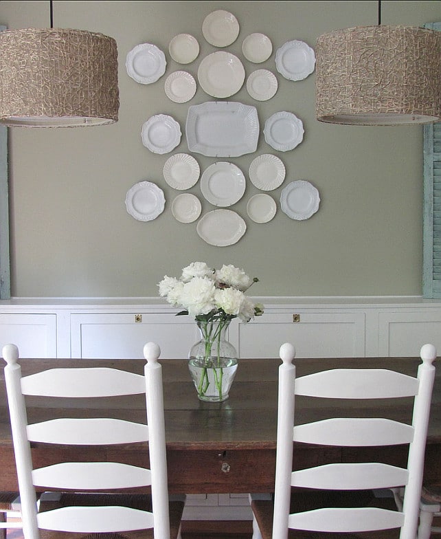
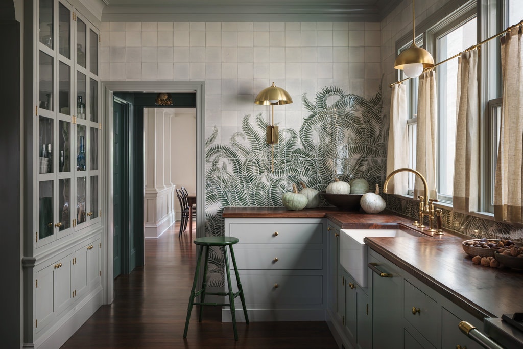
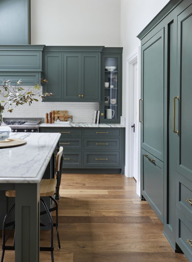
Oyster Bay by Sherwin Williams
SW 6206 / LRV 44

This lovely, moody green has some subtle sage characteristics but is confidently a green blue with some gray undertones. It’s perfect for powder rooms, and pairs nicely with white beadboard or wainscoting or as painted wainscoting, like my fresh-feeling dining room.
The Best Dark Green Paint Colors
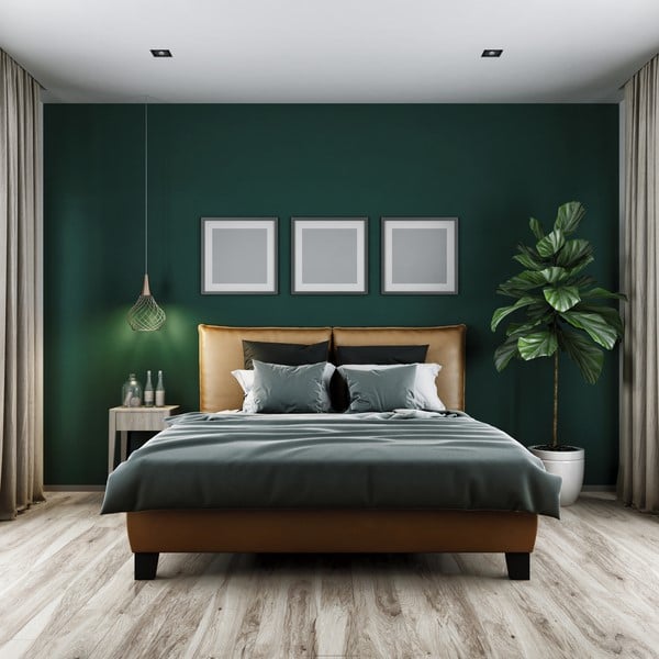
Bold, subdued or mysterious, deep greens are absolutely gorgeous on cabinets and green accent walls, pairing decadently with brushed gold hardware.
Take a chance with one of these stunning dark green paint colors!
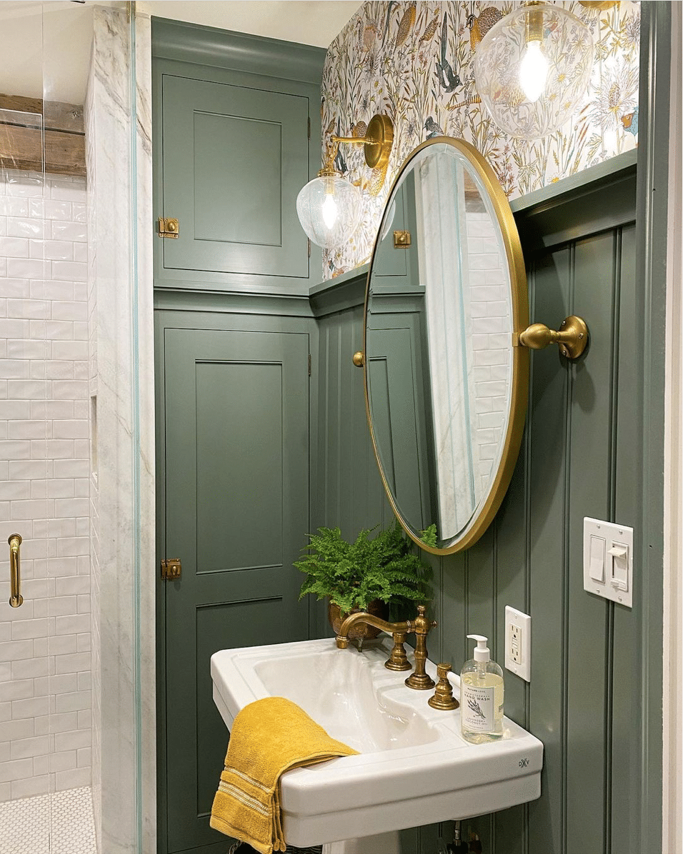
Calke Green by Farrow & Ball
FB No. 34 / LRV ~17
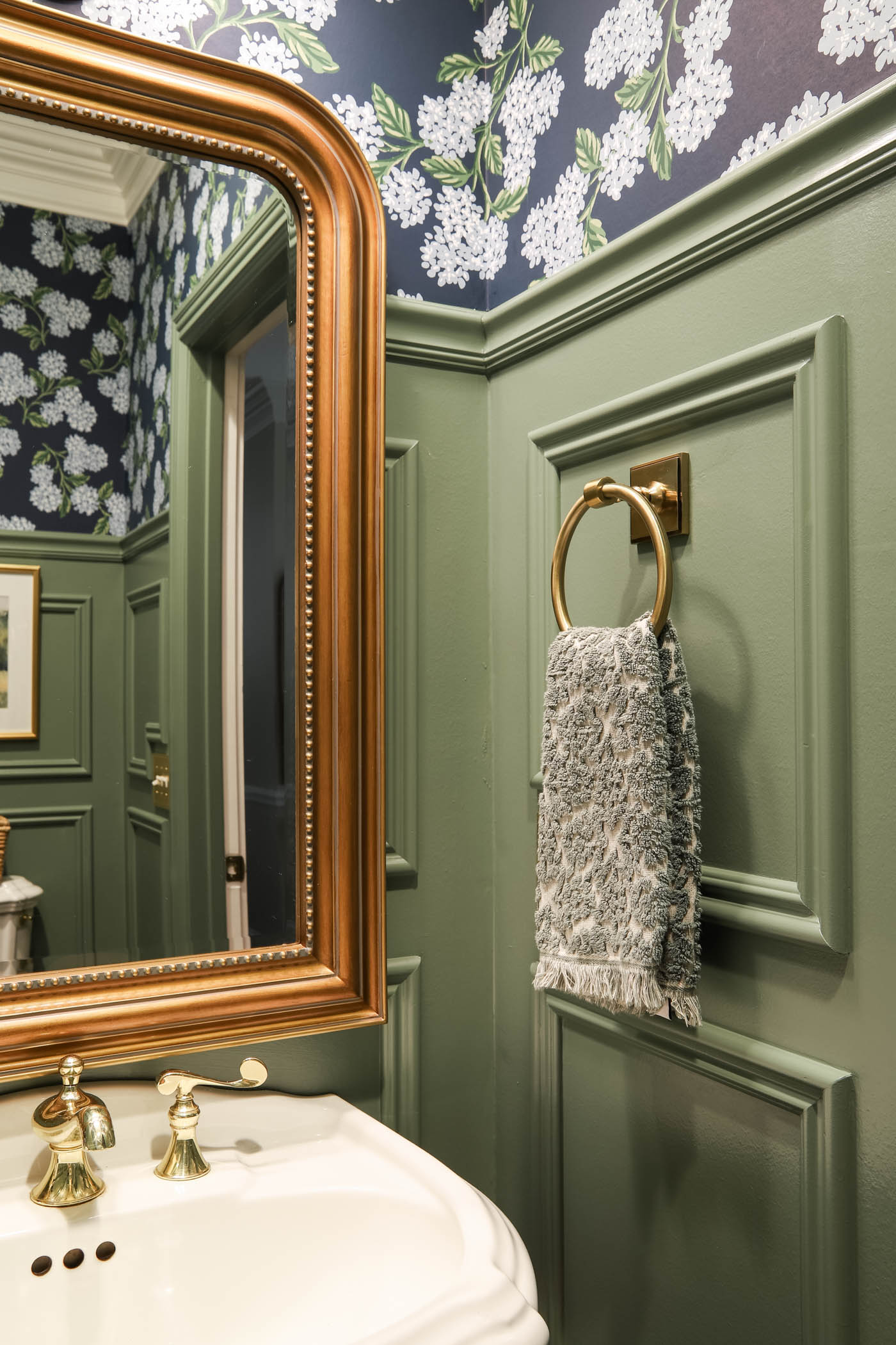
I recently used this gorgeous medium-dark green paint color in my powder room makeover. Farrow&Ball describes this color as, “This rich and traditional green … is best used either on its own on both walls and woodwork, or with a darker neutral like Old White to enhance its deep sage notes. It is particularly suitable for smaller rooms and studies due to its dark and masculine feel.”
And that masculine vibe pairs perfectly with my hydrangea wallpaper above. I love how it makes the tiny powder room feel stately and traditional!
Retreat by Sherwin Williams
SW 6207 / LRV 21
Fans of blue/gray greens like Oyster Bay who want to push the envelope a little bit further should look to Sherwin William’s Retreat.
This heavily grayish-green has rich botanical vibes, and if you couldn’t already guess from the name, lends a level of sanctuary to homes that make you never want to leave.
Pewter Green by Sherwin Williams
SW 6208 / LRV 12
Don’t be afraid of this dark and mysterious green – this may be the sophisticated dark shade you’re looking for.
Allow your fireplace, home office/study or kitchen cabinets to be enveloped in this rich, grayish-green shade that recalls the depths of an unexplored forest. Is it weird to lust over a cabinet paint color?
I’m so taken with how lustrous SW Pewter Green looks paired with gold hardware.
Farrow & Ball Green Smoke
No. 47 / LRV: Approx. 19
If you’re looking to wow your guests with an incredibly chic bathroom, Green Smoke by Farrow & Ball may be your shade. It pairs splendidly with wallpaper containing dark leafy designs, and brushed gold accents will pop.
Use it to embolden the wainscoting in your powder room.
Green Bay by Benjamin Moore
2045-10 / LRV 6.51
Searching for that perfect, bold emerald? Look no more!
Sometimes you just need that bright, saturated green of Green Bay by Benjamin Moore for your kitchen cabinets that would put the capital city of Oz to shame.
Salamander by Benjamin Moore
2050-10 / LRV 3.66
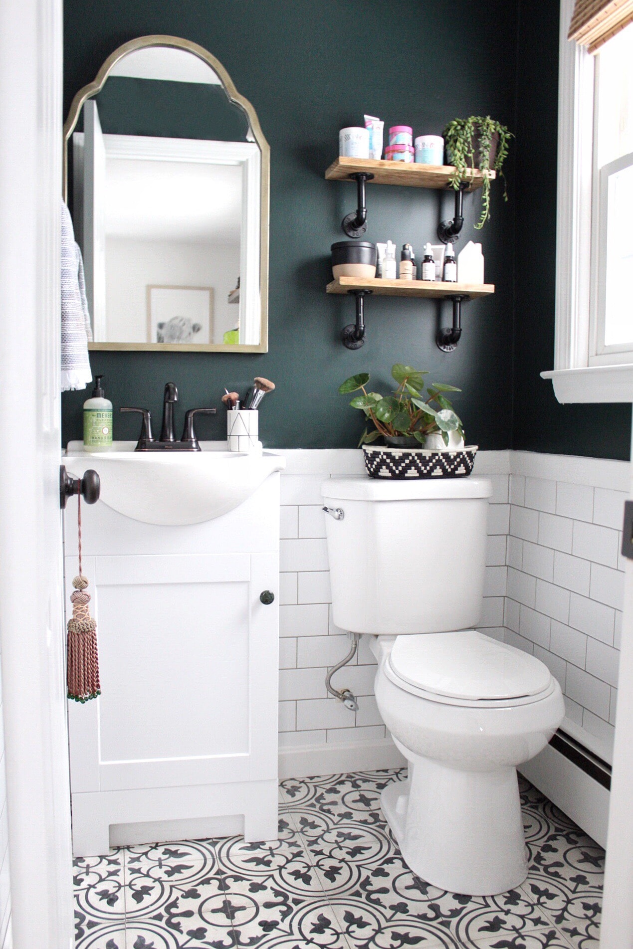
For that dramatic accent wall that’s almost black but not quite, Salamander, by Benjamin Moore is a sophisticated and incredibly dark teal. It plays the role of a navy, but in my humble opinion, is so much more interesting.
How stunning is Salamander as an upper wall color in this bathroom by Emily Everyday?
Hunter Green by Benjamin Moore
2041-10 / LRV 4.31
Last but certainly not least, the stunning Hunter Green from Benjamin Moore is pretty dark, but undeniably green and beautifully saturated.
It’s pretty much a deep forest green with some subtle, jewel-toned characteristics to keep it from appearing too muddy or moody. It works great as an accent color when paired with a neutral color palette.
Final Thoughts
There you have it – some of the best and most gorgeous green paint colors out there. Whether you’re looking for a light, medium or dark green shade for your home, testing out one of the stunning shades on this list is a great way to start your search.

Hi. My whole house is BM Classic Gray. Made it easy when moving in and chose this color. Now I need to add some accent walls and drama in bathrooms and above chair rail in dining room. Green in my favorite color. Do you recommend and medium to dark recommendations that blend with Classic Gray?
Your home is soooo beautiful !!! I am gonna paint my house in Edgecomb gray. I want to paint my kitchen island in a green , have orange oak cabinets. What green would go best with Edgecomb gray ? Thank you for your time.
After too many years of Agreeable Beige, Agreeable Gray and bedrooms of soft dusky blue, I have finally convinced my husband that living with lovely shades of green is good for the soul. In many instances, green performs as the perfect neutral. We/I took a plunge last fall and had the knotty wood pine walls in our den sanded and painted Sherwin-Williams Dover White. The long wall of built-in floor-to-ceiling bookshelves and cabinets was painted Sherwin-Williams, Contented, a soothing, calming, toned-down green. The den is now a tranquil oasis where my husband has spent hours relaxing and reading instead of watching TV or looking at his laptop screen. The compliments we’ve received from friends and family over the past holiday season further assured my husband I/we made an excellent choice.
My fav is Benjamin Moore Jade Romanesque.
BM Louisburg Green (HC) is a great match to F & B Lichen. BM Nantucket Gray (HC) is another mossy green great for a front door.
Thank you!! I’m about to paint some new green colors and can’t wait to share!
Hi Laura. The clary sage door on the exterior of the house – what color is the white paint on the brick? I’m looking for a neutral interior paint to go with my clary sage accent wall in The family room.
Hi Pat,
It’s Sherwin Williams Alabaster. Hope this helps!
Thanks for sharing! Green is my all time favorite color! We used several shades of green in our new house, it’s a modern craftsman style, and the siding is SW Artichoke with Dover White trim. We also saw a model home painted SW Oak Moss which is a shade darker. They are the next two shades darker than Clary Sage on the paint strip, and a nice mix of forest and olive. Our kitchen island is SW Cucuzza Verde. We used SW Acanthus in our bonus room, which is a nice light green. Our two full bathrooms are SW Windowpane. I believe it was in the whites/pastels section of the paint deck, but when I checked the number in the back, it was one number off (lighter) than Sea Salt. It is very much a mix of pale blue and green with a lovely spa feeling, I love it! Have a great day!