Sherwin Williams Accessible Beige
Accessible Beige is a beige-gray neutral paint color that will never go out of style. The versatility easily adds classic beauty to any home!
Sherwin Williams Accessible Beige (SW 7036) might give off those retired vibes of the 1990’s and 2000s beige era, but this is NOT your mom’s beige!
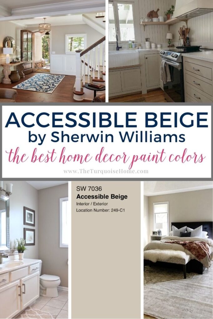
This beautiful, earthy beige is a modern twist on the beige of old. The flexibility of Accessible Beige has made it a top contender that still holds strong throughout the years and is still popular today.
Considered a warm neutral, Accessible Beige feels mature and sophisticated. Compared to other beiges, it doesn’t emit those Tucson golden sun colors. Instead, it just lights the room with a perfect touch of warmth with gray undertones.
Keep on reading to see if you need Accessible Beige in your home color palette.
This post contains affiliate links for your convenience. See my full disclosure policy.

Want to Save This?
Enter your email below and I’ll send it directly to your inbox!
Accessible Beige Undertones
When looking at Sherwin Williams’ Accessible Beige, you can tell it’s different from a lot of other beige colors out there. Most beiges tend to have lots of golden colors in them. At times, they can feel really yellow and those are the beiges you would have seen in homes during the 2000s.
Accessible Beige is a warm color, however, is not a true beige, as it has taupe undertones. This makes it appear grayer than those of its predecessors. The taupe makes it feel warm without getting that overly yellow feeling. It leans towards more of a greige, being between beige and gray, though not true to either.
In certain lighting, you may also notice a hint of green which gives the paint a more earthy feel. I find you notice it best when paired with other greens and pinks. You can bring out any of the desired undertones of paint simply based on what you pair it with.
Light Reflectance Value of Accessible Beige Paint
When shopping for paint, Light Reflectance Value (LVR) can disclose a lot about how your paint will perform in your room. Depending on the lighting in the room, all colors will feel and look very different.
Accessible Beige has an LVR of 58 (with 1 being pure black and 100 being pure white). This means it will reflect a decent amount of light.
Don’t expect it to lighten up a dark room. However, you don’t have to worry about it making a room appear darker than it is either. Overall, it acts as a medium-tone.
Many people notice it as a transitional color, changing throughout the day as the natural lighting in the rooms shifts. In dimly lit spaces (natural or artificial light), it will feel slightly darker in the sense that the color gets more saturated. It won’t feel gloomy or moody in any sense, however.
North and south-facing rooms will look entirely different in Accessible Beige paint. Southern-facing rooms will pick up that hint of green undertones. The room won’t feel too warm as it won’t pick up any of the yellow tones that may be hiding. Northern-facing rooms will feel much more gray.
Sherwin Williams Accessible Beige Complimentary Colors
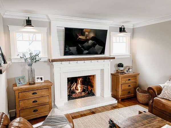
SW Accessible Beige and earthy colors are truly a match made in heaven. Since it is already an earthy color, it will gravitate and look best with other earthy shades. Any natural colors will work, such as browns, greens, blues, and creams. It works as the overall neutral, and the other shades can add more pops of color and accents.
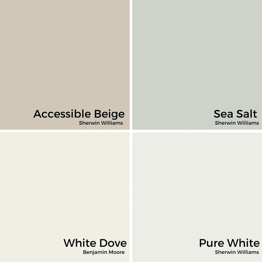
By default, it won’t look best with bright colors. To make it feel more balanced, go for muted versions of complementary colors. For example, Sherwin Williams Sea Salt has a delightful blue-green feel to it that works very well.
When choosing complimentary cream colors, choose ones that don’t lean too heavily on yellows. Sherwin Williams Pure White is a good example of this, and it doesn’t feel overly stark either.
Other gray colors compliment Accessible Beige well. Just be sure to avoid any gray (or greige) colors that are lighter than them. You want a warm gray with an LVR value below 58.
PRO Tip
Any time you are choosing a new paint color, you need to try out the real paint color in your home first!
The easiest and quickest way to do that is with Samplize! I solely use them for paint samples now. There’s no mess, no leftover sample pots of paint. Plus, these no-mess, peel-and-stick rectangles made from real paint, are easy to move around the room and easy to save for future reference!
Agreeable Gray vs. Accessible Beige
Two of the most popular Greige paint colors are Accessible Beige and Agreeable Gray. They can be easily confused, but you can trust their names! As you can see in the comparison photo below, Accessible Beige leans more beige while Agreeable Gray leans more gray!
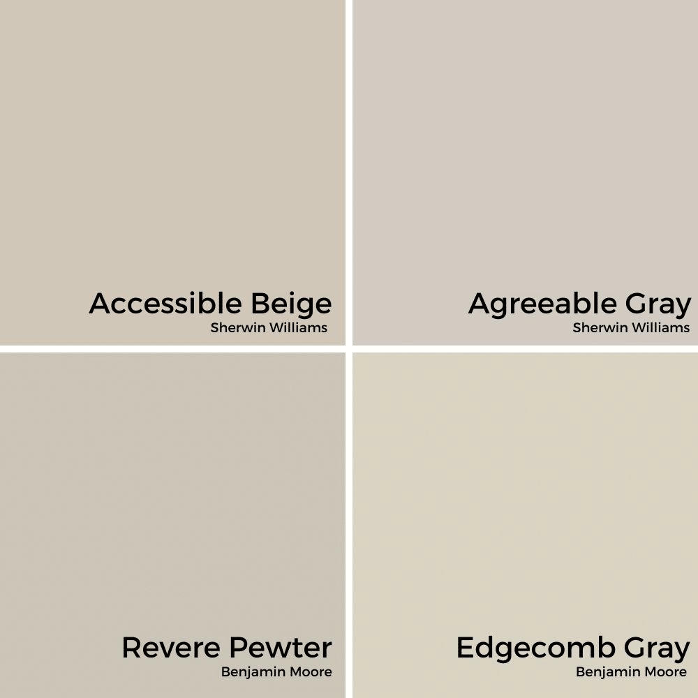
I also compared the ever popular Revere Pewter vs. Accessible Beige and even compared Edgecomb Gray for good measure. You can see that Review Pewter and Edgecomb Gray have even more of a green undertone than the top two colors.
These are all very popular all-over home paint colors. And you can’t go wrong with any of them. Just look at the other items in your home and decide if you want more beige or gray undertones.
Accessible Beige in the Home
Nobody can deny the versatility of Accessible Beige paint. A soft neutral, it works with many colors and features you already have present in the home. It holds a good amount of saturation so it won’t make your walls feel boring either.
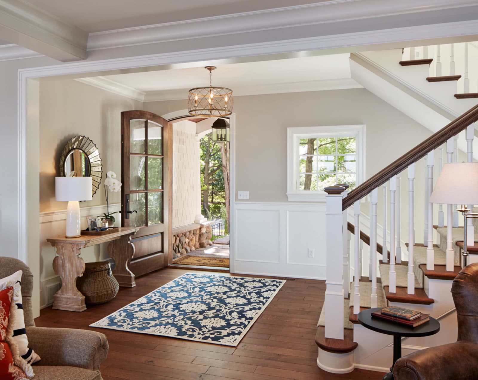
It has my permission to pretty much go in any room it pleases. That being said, here are some samples of it in different rooms.
Kitchen
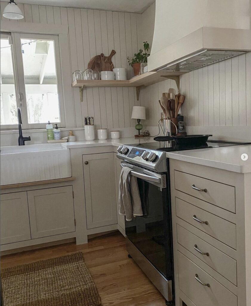
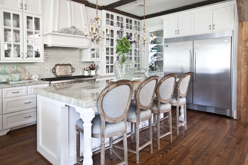
A farmhouse-style kitchen pairs beautifully with Accessible Beige. And since both are showing to be timeless design decisions, it’s a low-risk paint choice. Since it’s lighter and warmer, it does work well with lightly stained wood floors and white cabinets or walls and trim.
Bedroom
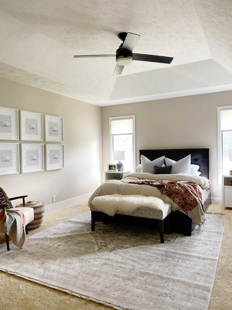
I like bedrooms that encourage relaxation and won’t stimulate the senses when it comes to bedtime. Accessible Beige provides soft and cozy feelings. It looks wonderful with white bedding and allows the art and furniture to take over and play with color more. If you’re stuck on how to paint your guest bedroom, you can’t go wrong with SW Accessible Beige.
Bathroom
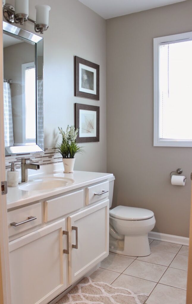
Bathrooms painted with Accessible Beige give me spa-like vibes. And that’s certainly not a bad thing! For a simple guest bathroom or powder room, use this paint and then pair it with a white vanity and trim. Play around with fun artwork, shower curtains, bathmats, and other decor.
Exterior
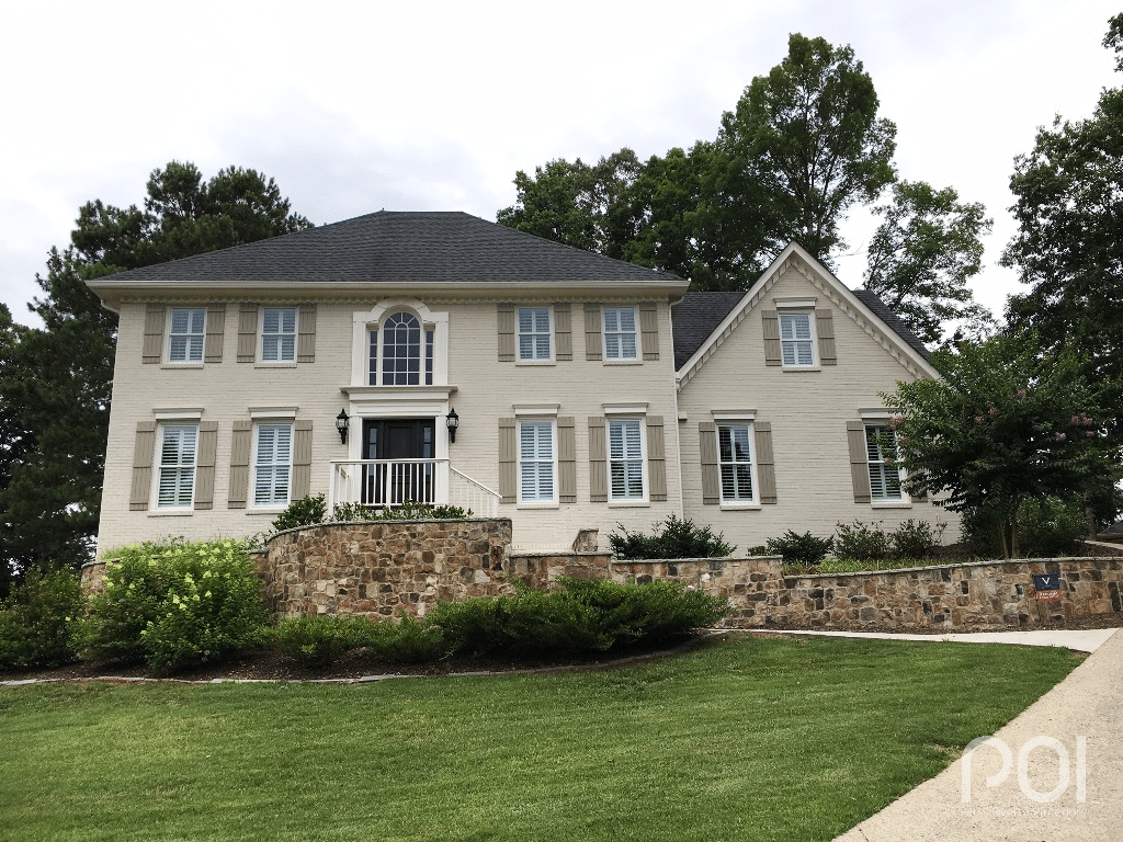
Many people think of Accessible Beige as solely an interior color, but it looks amazing outside too. When all brightened up, it looks more greige and almost an off-white color in the lighting. If you used other soft colors and earthy tones (such as a dark brown trim), your house will be the envy of the neighborhood. Stained wood decks and stonework also look exceptional next to siding painted Accessible Beige.
And that should be enough inspiration to get you started! Remember, always try out a paint sample directly on the walls before you commit to the whole thing. It’s the best way to truly know how it will look in your home and lighting. Happy painting!
More Posts You Will Love:


What white would you use with accessible beige for the ceiling?
Love the exterior, what colors did you use for trim and shutters? looks amazing.
Hi Carol, that’s not my photo, but the link below the photo takes you to the original post and author of the photo. I took a look for you and saw that she did share all of the colors. Body: Accessible Beige, Trim: Aesthetic White and Shutters: Tony Taupe. I hope that helps! – Laura
I have accessible beige in my entire home expect for the bathrooms. I love the feeling
it generates in the rooms. They all look different because of the furniture. My painter
suggested this color and I am completely satisfied. Friends and neighbors have asked what the color is.
I am considering accessible beige but concerned it may look dark. I might lighten it by 25%. Does it look dark to you?