Create a Whole House Color Palette
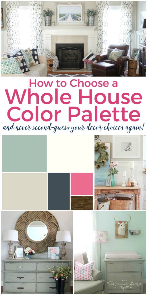
A whole house color scheme sets the backdrop for your home, which takes the guesswork out of decorating. Learn how to create your own whole home color palette with this step-by-step guide based on color theory and real-life examples. You will save money, time and sanity when you use this process to make decorating choices!
Choosing a whole house color palette for your home, from the painted walls to the throw pillows, can seem daunting. I know I get countless e-mails and comments from sweet readers asking how to choose the right colors.
This post contains affiliate links for your convenience. See my full disclosure policy here.
Where to start when they feel overwhelmed and how they don’t have the first clue about pulling a home together. And don’t even get me started on the paint section of the hardware store. Can you say overwhelming?!
How do you even begin to choose a paint selection for your whole home while standing there staring at eleventy bajillion colors that don’t even really look like that once they are painted on your walls!?!
Want to Save This?
Enter your email below and I’ll send it directly to your inbox!
Just the other day I had one reader ask if you could use one paint color for the whole house? I’ll give you a hint – you can! These are all questions that I had when I started the process of decorating the three homes that we’ve owned so far.
Both of them came to me as a blank slate, and let’s just say that I learned quite a few lessons from the first house. 😉 As I sat and stared at the current home we live in, I decided that I was going to create a color palette that kept things simple and straightforward. I wanted to create a plan for my home that allowed me to:
- Make easy design choices about the paint colors on my walls and the decor I bought at the store.
- Never second-guess the decisions that I make the first time. It turns out that deciding on a select few colors now prevents confusion down the road.
- Quickly walk through a store and confidently know what items will and will not work in my home. Less impulse purchases and wasted trips to the store is always a win in my book!
- And … create a home that flows well together, yet doesn’t look matchy-matchy.
The good news is that you don’t have to be an interior designer to select the paint colors in your home!
What to Know Before You Pick Paint Colors
This doesn’t just include your walls, but your floors, furnishings, accents and more!
1. Get Inspired
We’re going to find inspiration for possible color combinations by looking at what we’ve already chosen surrounding us.
What are your favorite colors? Look around your home and see if there is a color pattern that you love already. Look over your Pinterest account and see if you have pinned a lot of one color.
And lastly, take a peek in your closet. Do you tend to wear all neutrals or lots of color? Narrow your inspiration down to 2-3 favorite colors from those sources.
Do you need help figuring out your decorating style? Start here!
2. Choose the Mood
I like to think of my home as it relates to the season and when I feel the most comfortable in my home. These are some attributes you can relate to as it comes to seasons, mood and color.
- Spring – open, creative, clean, on-trend, contemporary, friendly and simple
- Colors: light, bright and clear. Pastels like yellows and lime green.
- Summer – elegant, graceful, balanced, efficient, romantic, luxurious, abstract, casual
- Colors: cool, delicate and muted. Lavender, mint, navy and greens.
- Autumn – passionate, warm, earthy, organic, comfortable, family-centered, historical
- Colors: warm, intense and muted. Burnt umber, pale straw, reds and browns.
- Winter – strong, dynamic, focused, luxurious, glamorous, decisive, uncompromising
- Cool, strong, intense and clear. Ice blues, metallics, neons and blacks.
I don’t want to get too far into the psychology of color, but these moods will help guide you as you think of how you want colors to play nicely together in your home. And you can definitely overlap between seasons, but you’ll find yourself being pulled to one or the other.
3. Use the Color Wheel to your Advantage
Understanding basic color theory is helpful when deciding what colors to bring into your home. The color wheel is a tool that helps us see how colors work together. Let’s dive in!
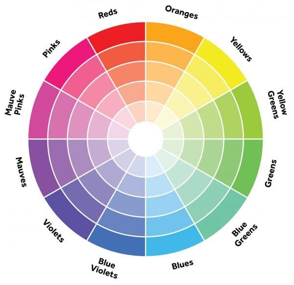
- Colors that are next to one another on the wheel are called analogous and create a harmonious, casual and relaxing atmosphere (perfect for a bedroom). I use a lot of blues and greens in my home and mix them frequently. This creates the casual feel I’m going for!
- Colors that are opposite of each other on the color wheel are called complementary colors. They will create a dramatic, colorful atmosphere in your home. I love to use pops of pink with my blue/green colors. It’s a complementary color and looks fabulous in small doses, at least for me who loves color!
- If you want to do a monochromatic color scheme in your home, that is perfectly fine, too! Grab your favorite color and use various tones of it around the house. This answers the question of my sweet reader above who wanted to know if she could use the same paint color in the whole house. Absolutely! Just use different shades of it and it will look so good!
Warm vs. Cool Colors
It’s also good to know your warm and cool colors. And know that most neutrals will pull a warm or cool undertone, so it’s important to remember this distinction.
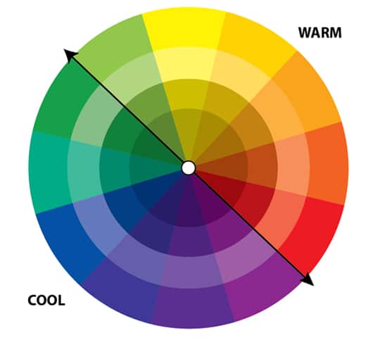
- Warm colors will lend to a happy, fun and energetic vibe. They tend to exert themselves into the space, sometimes making rooms appear smaller than they are.
- Cool colors lend themselves to a calming, soothing and relaxing vibe. And they tend to give the feeling of more expanse, so the rooms will feel larger.
You can choose one or the other, or mix the two colors to give both calming and happy feelings in a space. I personally favor cool colors like blues and greens, but I like to add pops of pink and yellow for fun and energy!
4. Consider Hard Finishes
Take a look at the permanent colors you already have in your home, like flooring, cabinet and countertop colors. Are you dealing with wood floors with warm or cool undertones?
Are your cabinets a warm wood or a cool color? Do your countertops work well with browns or grays or do they have hints of both? Are you super lucky and they are very neutral cabinets and countertops that will go with whatever? (Yay!)
One of the best decisions you can ever make, if you have wood floors installed, is to choose a medium brown stain. Then your floors will act like blue jean denim, which goes with anything!
The existing countertops in my kitchen have browns, taupes and greige colors in them. So, I chose a main color that worked together with the countertops and not against them!
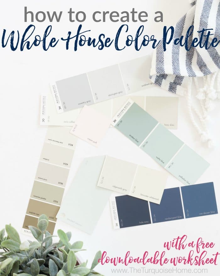
How to Choose a Whole House Color Palette
Let’s walk through the step-by-step process of choosing paint colors that work together seamlessly!
1. Choose Trim and Ceiling Paint Color
Start with your trim color, since this is the paint color that will be used throughout the entire home. Typically this is a clean white or off-white color that you can use in every room. I personally use Simply White, which is a creamy white, on every trim, ceiling or cabinet in my home.
Oftentimes when moving into a new home, the trim color is already chosen for you and can be costly to change. So, you’ll need to take into consideration if your trim is a pure white or is it an off-white color.
If it’s not pure white, then you’ll want to choose colors with warmth for your walls so that your trim doesn’t look dirty. Or just be prepared as to how it may look and that you may need to paint it your new default white color.
When choosing a white color, think about the colors you already have in your home. If your floors are warm and you’re going for a complementary color scheme, then you’ll want to choose a cool, crisp white.
If your home has blue cabinets and you want to choose a monochromatic palette, then you’ll also want a cool white. If red is your favorite color and you want a monochromatic palette, then you’ll choose a warm white.
Tip: You can paint a room white and it can be the same color as your trim. Simply use semi-gloss or gloss sheen for the trim and a flat or eggshell sheen for the walls and the paint will read differently.
2. Choose Your Primary Neutral Color for Your Main Space
Choose a neutral paint color for your common areas next. Depending on your floor plan, this may include living rooms, kitchens, hallways, and entryways.
In most modern homes with open floor plans, these rooms will all flow together and should be considered as one large room. In homes with a more closed layout, you may be able to choose different paint colors for individual rooms.
When choosing a neutral color, most people will choose a gray, beige or white color. But you don’t have to stick to those colors. It just needs to be a lighter color that plays well with others.
Keep in mind the undertones (cool vs. warm) and how it will work with your trim color.
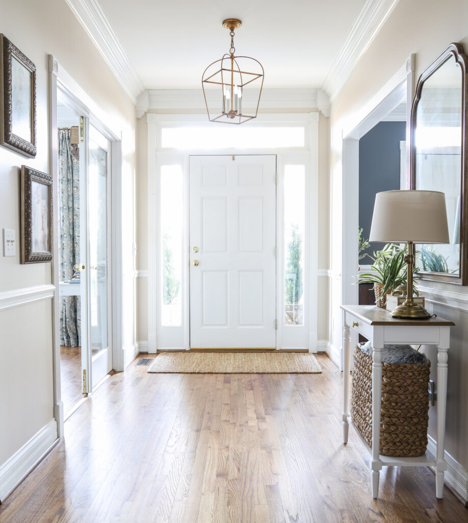
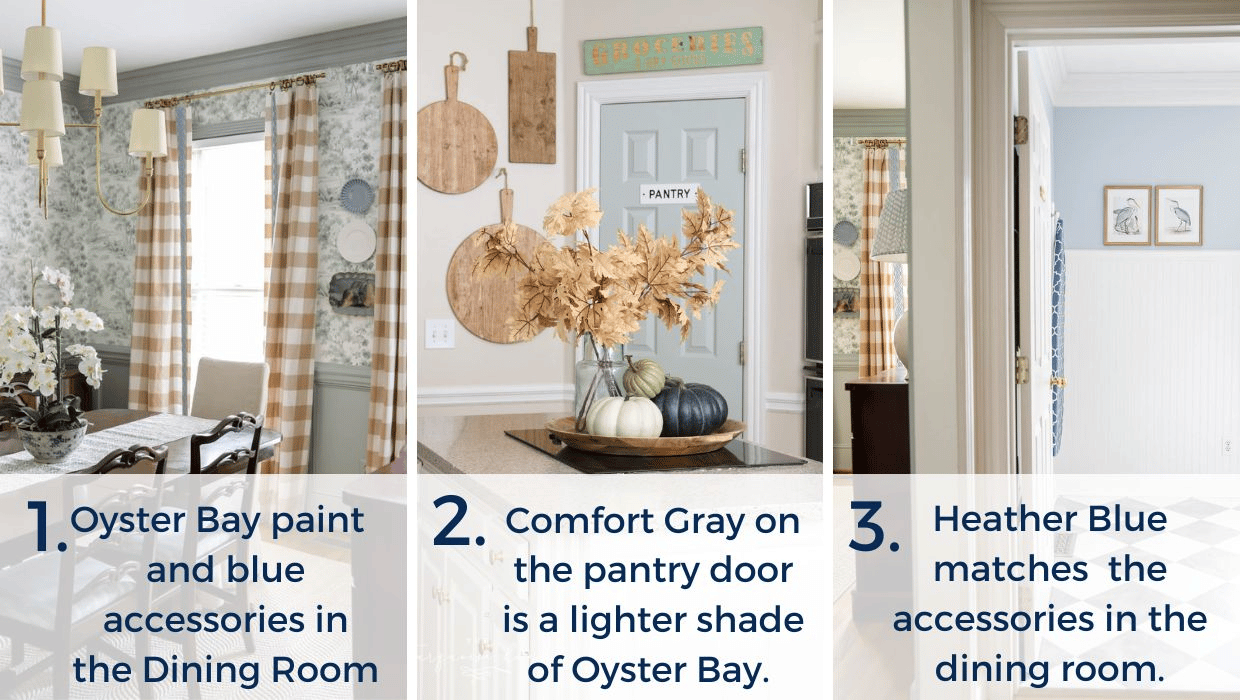
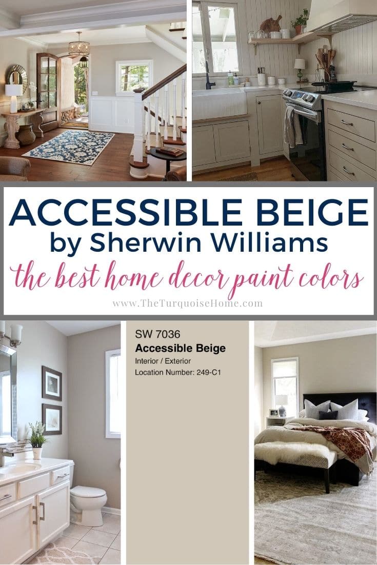
I chose a green beige neutral color for both my current home and previous home. In my current home, I have Edgecomb Gray in my kitchen, hallways, entryway, stairwell and loft area.
And in my former home, I picked Revere Pewter for the main color in my living room and hallways.
Popular Neutral Paint Colors
As always, you’ll want to try any and all colors on your walls before committing to them. Colors look different in every room depending on other colors, lighting, the direction of the room and more!
PRO Tip
Any time you are choosing a new paint color, you need to try out the real paint color in your home first!
The easiest and quickest way to do that is with Samplize! I solely use them for paint samples now. There’s no mess, no leftover sample pots of paint. Plus, these no-mess, peel-and-stick rectangles made from real paint, are easy to move around the room and easy to save for future reference!
3. Choose Another Color for Secondary Rooms
As we move along into the secondary living spaces, bathrooms and laundry rooms, it’s time to select some fun colors that work well together!
Refer back to the color wheel and the mood you’d like to see in your home, to choose another color. This color will play out on walls and accessories throughout your home.
It could also be another neutral, like black, gray, taupe or beige. Just choose a general color, because you can do varying shades of the same color and everything will still look cohesive.
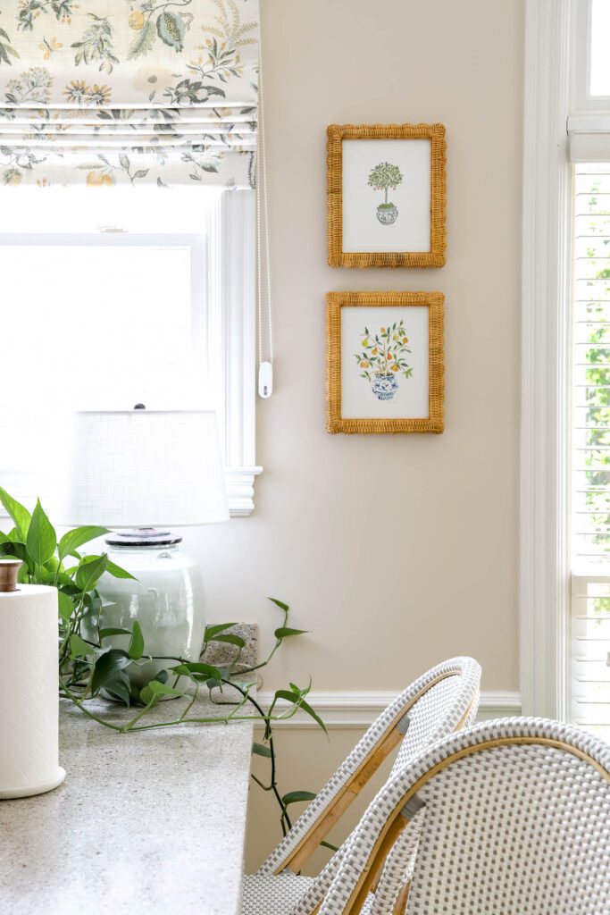
For me, I chose shades of blue and green. Nobody’s surprise, right!? Ha!
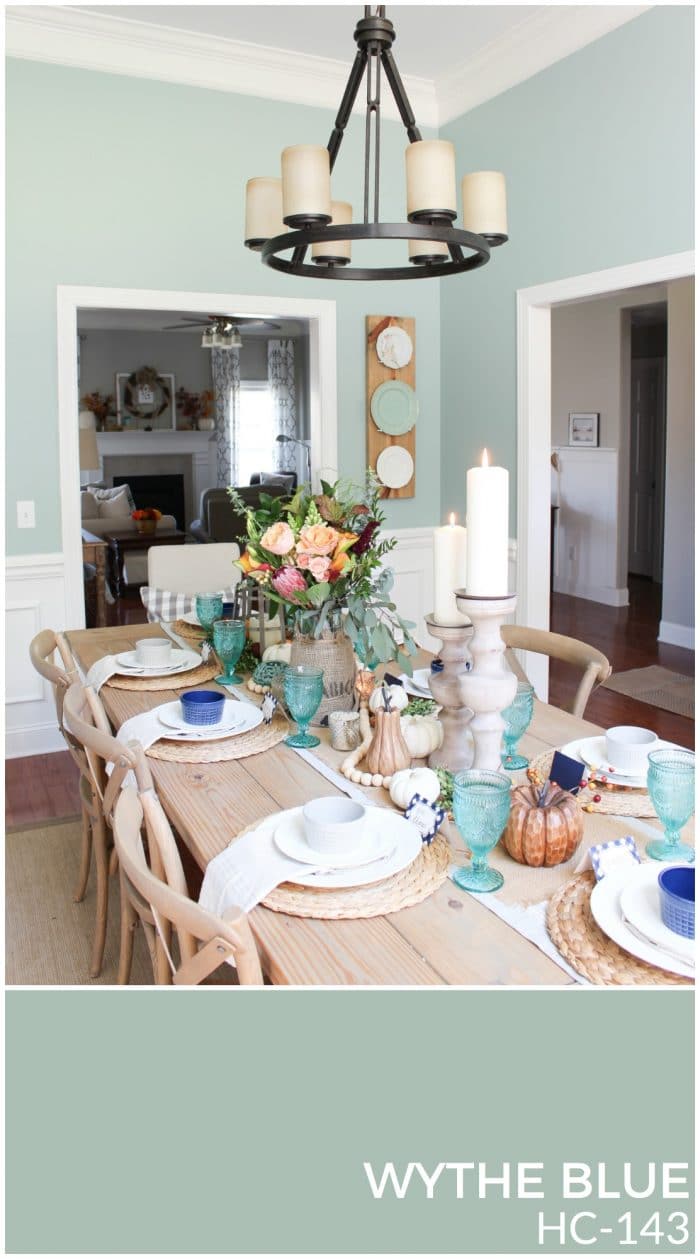
In my former home, I chose Wythe Blue (by Benjamin Moore) as my blue/green paint color. It was the wall color in my dining room, and many of the accessories throughout my home. I toned it down quite a bit and painted my kitchen walls a very light blue/green color (Sea Salt by Sherwin Williams).
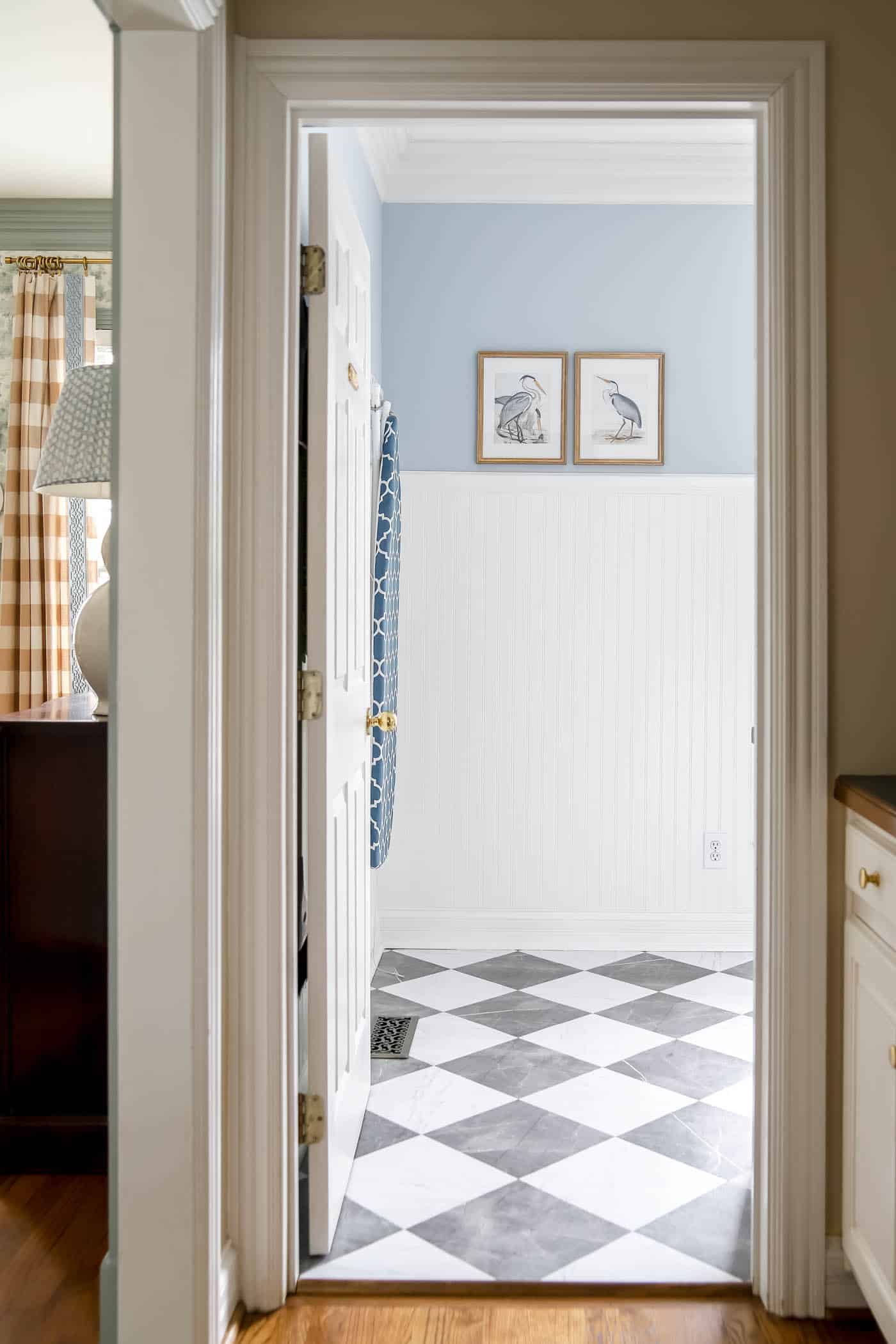
4. Choose an Accent Color for Bedrooms, Small Rooms and Accessories
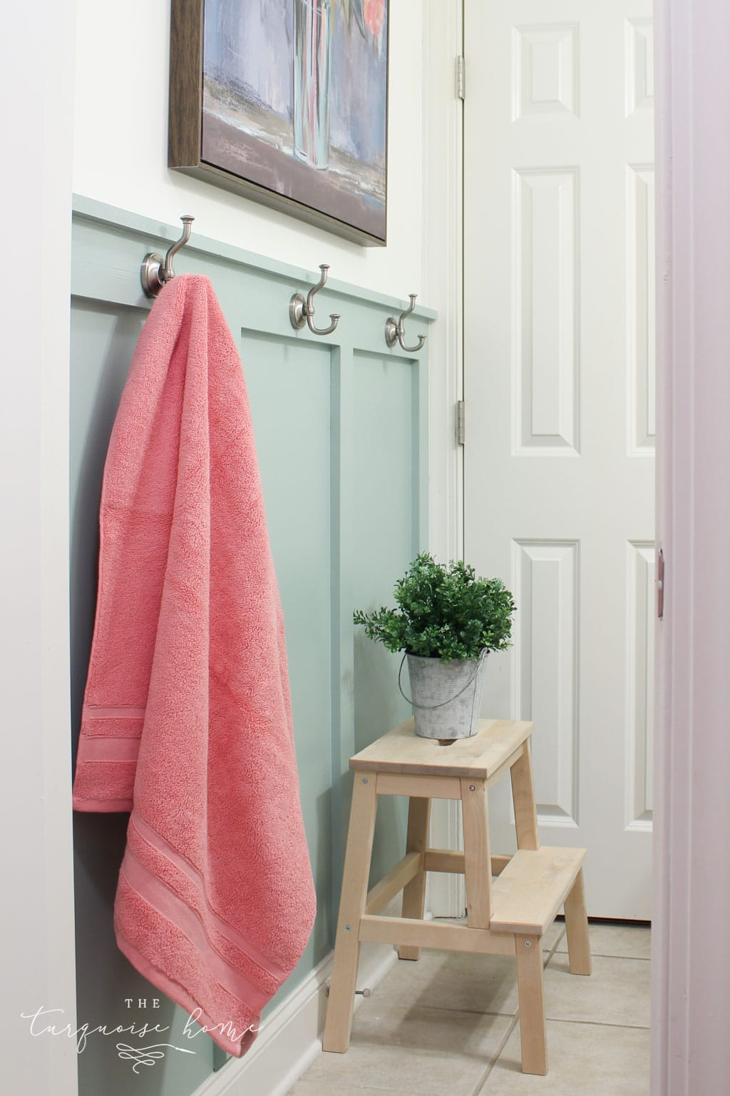
This accent color can work in a bedroom, or small space for a pop of color. Or you can simply bring the color in through accessories! Use this color in small doses, either on the walls in separated rooms, on an accent wall or maybe a door color.
These are great colors for kids bedrooms upstairs, that you can’t see from the common living spaces. I think kids should have a say in how they decorate their rooms, so if they want a fun color that doesn’t match the rest of the house, that’s fine!
You can either choose a harmonious color (next door to your first color on the color wheel) or a complementary color (opposite your first color on the color wheel).
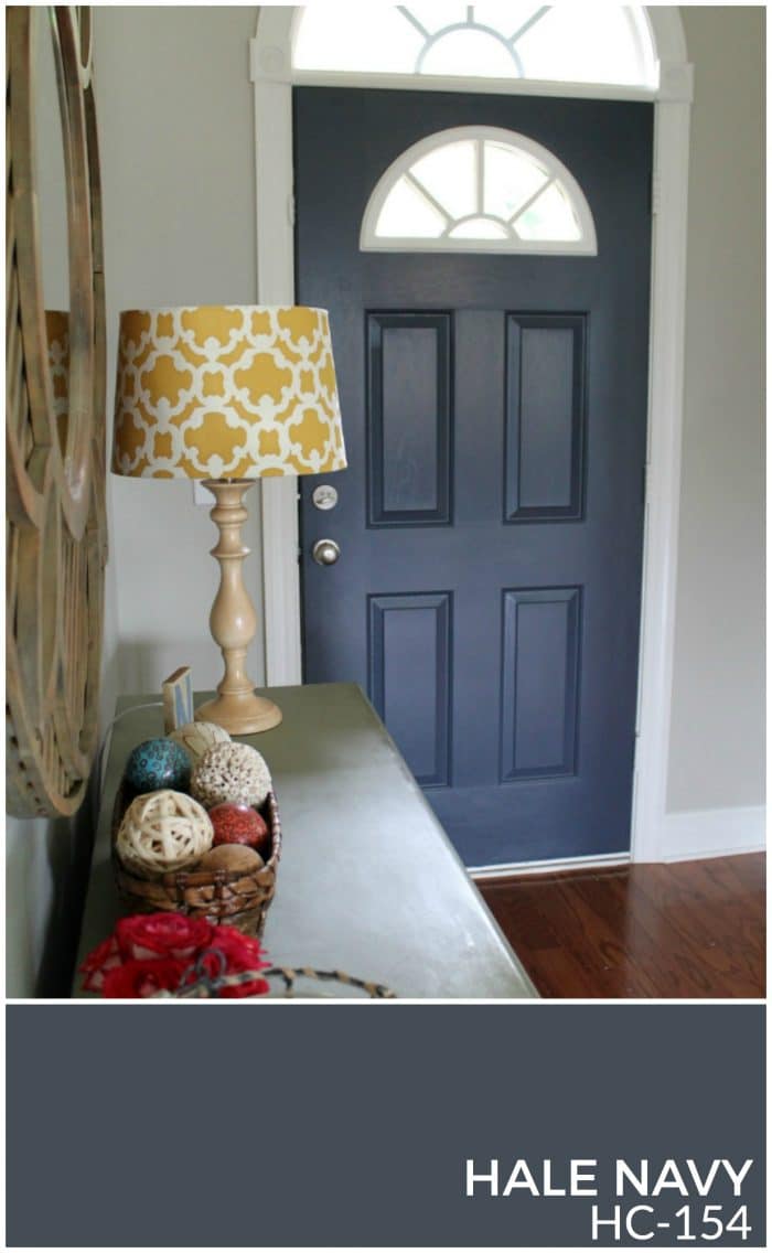
I use Hale Navy by Benjamin Moore as an accent color in my home. I’ve used it in my living room and previously, I painted the insides of my doors Hale Navy.
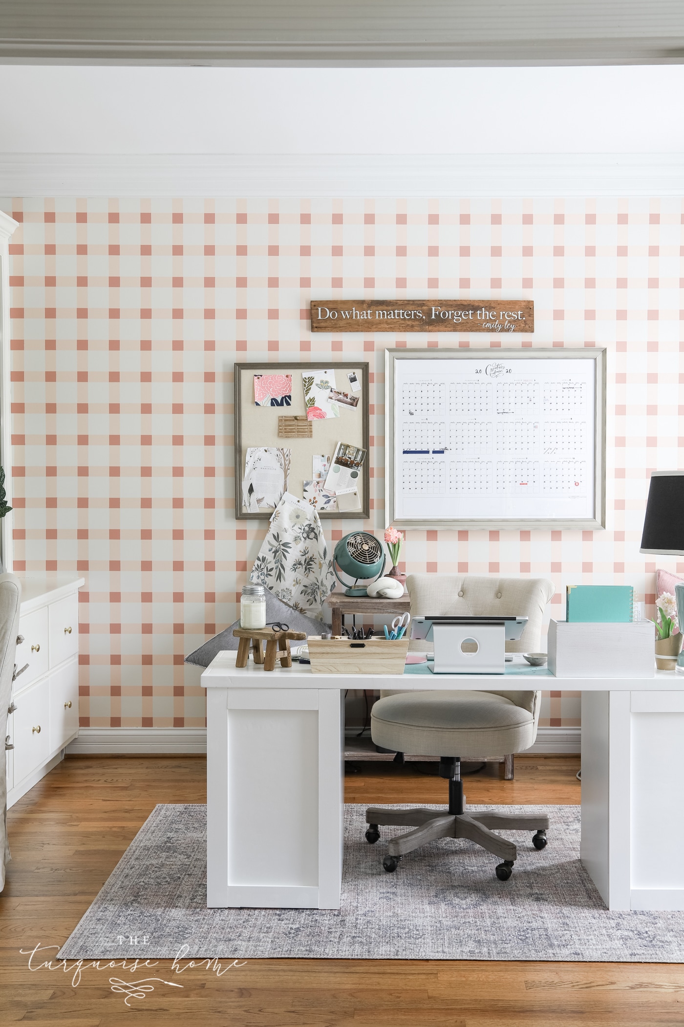
I also like to use pink as an accent color in my decor. For example, my office has a pink plaid accent wall that you can see from the entrance of my home!
Frequently Asked Questions
A whole paint color scheme should include 4-8 paint colors.
– 1 white color for the trim and ceilings
– 1 neutral paint color for main living spaces and more
– 1-2 additional colors for smaller living spaces and accent spaces
– 1-4 more accent colors for bedrooms, accessories and more!
No! But it helps to get the trim paint and neutral paint colors picked out quickly. Other colors can be chosen as needed, but get the foundation in place first.
A Real-Life Whole House Color Palette
Once you’ve nailed down all of your colors, you’ll want to either create a collage with them or make one on a poster board.
It’s so easy to make a collage digital design tool like Canva or PicMonkey. I made a sample floor plan and placed the paint colors I chose in each of the rooms. I even added in some of the wallpaper and fabrics I use in the spaces.
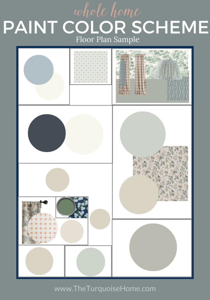
This helps you see the colors all together and gives you a visual when you’re picking things out.
I highly recommend creating a small binder where you can see this color palette printed out. You can also add any paint swatches that you use and fabric swatches to your binder and take it with you when you’re going to pick out decor or new fabrics.
Incorporate Your Color Palette Throughout Your Home
You may be asking yourself now what? You have your colors, but how do you actually transfer those colors to your walls, furniture and accessories.
You’re obviously going to use the white on the trim and insides of closets. And you’ll want to paint the main living space and any open areas surrounding it your default neutral color.
But you may not want to start painting every single space, but rather look for fabrics or textiles that use your colors and then decide which color would look best on the walls.
I highly recommend creating a vision design board for each space with your color palette in mind.
You don’t have to stick with the saturated hues in your palette. You can choose different shades or tones of your color palette for different rooms.
Here’s an example of how I used color in three different rooms in my house, yet they all flow together.
I hope you see how knowing your home color palette makes everything flow together! And it is so simple when I’m looking for decor. Because if it is any of the colors in my home, I can purchase items with confidence and use them interchangeably throughout every room!
I hope you find freedom in knowing how to choose the paint palette for your entire home!
Free Whole Home Color Palette Worksheet
More Posts You Will Love:
- How to Paint a Concrete Patio
- The Best Gray Paint Colors for Your Home
- The Best Blue Paint Colors For Your Home
- How to Paint Outlet Covers
- Which Interior Paint Finishes to Use? {+ Where To Use Them}
It really helped when you talked about how to choose the right color palette for a house! Recently, my wife and I decided to buy a house, and we’re very excited about moving into it! We want to start decorating it, and we want to change the color of its walls, so we’ll be sure to read your tips carefully. Thanks for the advice on using the color wheel to choose our new paint colors!
Thank you for getting the word out about.
Thank you, thank you, thank you! I am so glad that I found your post!!! The interior of my home is in desperate need. This summer I plan on repainting from top to bottom. I’ve been going back and forth about going bold or keeping it neutral on the walls and was clueless about choosing a white for the trim and doors. The cabinets are outdated, so I plan on repainting them as well. I want to incorporate bold colors that work with my vintage decor and furniture, yet won’t overpower my small home. I was never truly happy with my paint color selections in my last home. The colors worked in the individual rooms, but didn’t look great together. I’d like the colors to flow better from room to room. Your article is so well thought out and written, I feel more confident about where to start. These step-by-step directions are perfect for a non-decorator like me. I’m looking forward to checking out more of your website. Thank you again!
This makes me so happy to read, Jenny! You’ll do great!! xo, Laura
Our family is building our first home and this was so helpful! You made it easy even for the beginners!
White and Grey or dark and light combination that is great. I learn a lot from your site and would love to apply them on our next house painting north shore jobs. Will see if the owner also will agree with me with this ideas. Thank you for taking time to share these stuffs
A house is a place where we spend a lot of time peace of mind and relax after a long busy day but when your roam paint dull you can’t feel comfortable I am just painting my roam with a natural background where I feel freshAffordable house paintingCAN YOU PLEASE SUGGEST ME which colors i choose
Make your boring old house into fresh and good looking with house painting. Affordable house paintingB shine home provides an affordable house painting service with a highly experienced and trained team where they can help you paint a fresh coat on your interior and exterior of the house and turn into a new and beautiful look within your budget.
Thank you for informing me that warmer colors are very fun but can make a room feel smaller. About a month ago, I moved into this amazing new home that has the perfect floorplan. However, the wall colors are not my favorite. I will have to follow your tips to choose the best colors and then look into professional services that can help me paint my walls!
What paint colour is that on the wall next to the hale navy please.
I’m glad you talked about how warm colors are able to bring an energetic vibe to a space. My sister is moving to a new apartment next month and asked for my help with the decorating. Your article made me excited to find some fun lamp shades and other accessories in warm shades to help her space match her energetic personality!
Hi Laura! This post is so incredibly helpful! Our office and dining room flank the foyer, which has pretty tall ceilings. I’m going for more of a monochromatic color scheme. Would it be better to paint those two rooms the same color since they can both be seen when coming in the front door? I just don’t have a knack for this.
Stacey
I would consider painting them the same color, or a shade different. Like similar shades/tones, but one lighter or darker than the other. I walk in to Revere Pewter, but my dining room is Wythe Blue and my Kitchen is Sea Salt. They can all be seen from my front door, but they all look good together. One is a grey/neutral. The Sea Salt honestly doesn’t look much different than the grey from afar. And then you get the pop of green/blue from the dining room. If they are all calming, soothing colors, I think you can choose different colors for each room! Hope this helps! Laura
Hi Laura, love your posts! We are in the process of an almost total rebuilding of our home after a flood. Need an opinion! Would like to use Benjamin Moore’s Abalone on the walls and White Dove on doors and trim. I’m drawn to turquoise and a light rust color for accents. Have you had any experience with these 2 colors of paint?
Hi Barb! Thanks so much! Unfortunately I don’t have any experience with either of those colors. I’ve heard great things White Dove, though! xo, Laura
Wish I had this info before we started putting the colors on our first floor walls… now I have what I need to do better on the 2nd floor rooms. Thank you!
Yay! I’m so glad it was helpful for you, Anne! xo, Laura
THAnk you for the post. We have just moved into our dream home. I used Porter paint in Whiskers as my main color and love it!! I like seasonal colors as my pop of color – red is my favorite Inc Christmas – valentine and turquoise in spring- summer.
Yay! Congratulations on the new dream home!!
I enjoyed this post…I do love all those colors, but I disagree with one thing…I use oil paint on all my trim, which I did in a white similar to simply white, But in oil I used SATIN, which is plenty shiny. Maybe because oil is much harder finish it looks shinier, but if I use semigloss it would be too shiny…..Very much depends on the type of paint…..I also am a turquoise girl so love your colors…
Hmmm, good point, Sue! Thanks for sharing your expertise! xo, Laura
Thank you Laura for the post. It seems I will need to do a complete remodel, thanks to Hurricane Harvey. I’m taking advantage and going for a whole new look to my house. This color palette post with tips is very helpful in choosing the new colors. I’ve been looking at some of your other posts about decorating and am inspired by the work you have done. Thank you so much!
Aww, yay! Not yay that you had to rebuild because of Harvey, but yay that this was helpful to you! xo, Laura
Oh boy I’ve been working so hard to do my home which has all REAL oak floors, trim, doors, crown molding and I am just not up to painting it all white. It’s a large 3000 square foot CT colonial. I just did Benjamin Moore Grant Beige in the Family Room I have that really nice floor to ceiling stone fireplace and I enjoy the greige with the wood trim. I did Wythe Blue in the Dining Room and Revere Pewter in the Living Room and my foyer which goes floor to second floor (Litchfield) is Pale Oak. I had zero clue what I was doing but it came beautiful. Thank you for this sight.
No need to paint it all white. I have two of those colors in my home and they look gorgeous together! And Grant Beige was in the running for my living room, but I ended up with Revere Pewter. I love all of those colors! I know it’s all so pretty! xo, Laura
Hi Laura, The download for the Whole House Color Palette is not available. Is there something I need to do on my end to fix it? Thank you!
Hi Suzanne, go to this link and sign up. The link to download the worksheet will be e-mailed to you!
https://app.convertkit.com/landing_pages/252161
Laura,
Love your work! Thanks for sharing it with us…I am unable to download the worksheet for some reason…is there something special i need to do…?
Thanks
Hi Diana, did you go here and sign up for it? https://app.convertkit.com/landing_pages/252161
.Wow. I can see how this could be a 2 year post! There is a LOT of information here. Thanks for pulling all your thoughts and experience together in one place for us! You’ve got me thinking now. At the moment it’s a bit (OK, a lot!) overwhelming, but I’m seeing light at the end of the tunnel: a little time and thought now will save me SO MUCH time and money over the years. A plan HAS to be better than hodge-podge random decisions! I’ll do it!!! THANK YOU Laura!!!!
It did take a while to formulate and write it, for sure! I’ve gotten several e-mails about how helpful it is, so I know it was worth my time. I know I’m always glad when I do the extra work to formulate a plan on the front end when it comes to decorating my home or running my business. I know you’ll be thankful when the later decisions are easy and effortless!
Have a great week, Becky!! xo, Laura
Great article. Finding color combos is hard!