Sherwin Williams Comfort Gray

Today, I’m introducing you to a color you may not have heard of but definitely need to check out: Sherwin Williams Comfort Gray. Find out everything there is to know about this pretty gray color, including how it looks in different rooms.

When you’re looking to make a major but relatively easy change to your decor, I always recommend starting with paint. It’s a relatively cheap option for a refresh that’s easy to change when you are ready. And, it’s definitely cheaper than buying new furniture (or a new house!).
However, the tough part of painting a room is – you guessed it – picking the color!
Should you go with a warm color…a cool color…a gray…a beige…a greige…a white? Before you know it, your brain is spinning out of control and you’ve made zero progress on moving forward with a refresh.
As a side note, this is the whole goal of writing this paint color series and highlighting some beautiful no-fail paint colors. I want to help you spin less and enjoy the process of picking a color more, because it can be so much fun!
This post contains affiliate links for your convenience. See my full disclosure policy.
PRO Tip
Any time you are choosing a new paint color, you need to try out the real paint color in your home first!
The easiest and quickest way to do that is with Samplize! I solely use them for paint samples now. There’s no mess, no leftover sample pots of paint. Plus, these no-mess, peel-and-stick rectangles made from real paint, are easy to move around the room and easy to save for future reference!
Choose The Best Color For You
I love a good neutral color – Edgecomb Gray, anyone? But one family of colors that are really enjoying some much-deserved time in the spotlight right now are the ones in the blue-green family. A good blue-green (or green-blue!) paint can be total bliss in your space if you take the time to pick the right one.
Enter: Sherwin Williams Comfort Gray.
When I see Comfort Gray in action, I immediately have an “ahhhhhh” moment of feeling calmness wash over me. It’s a color that definitely promotes relaxation and has a peaceful zen quality to it.
Just the name “Comfort Gray” brings serenity to mind, doesn’t it?
Want to Save This?
Enter your email below and I’ll send it directly to your inbox!
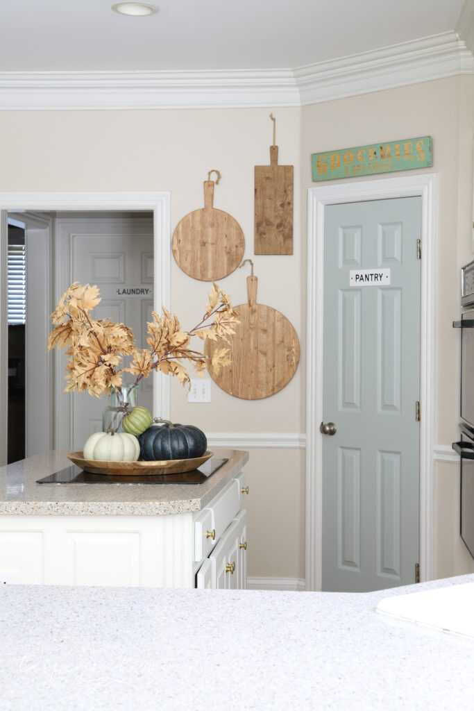
Comfort Gray in My Home
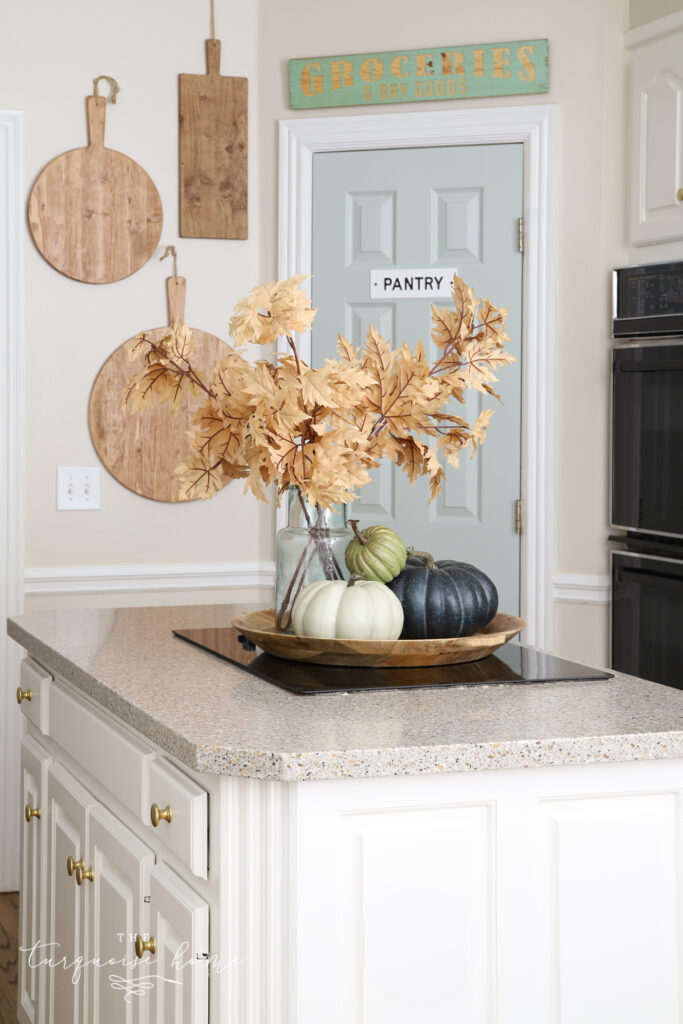
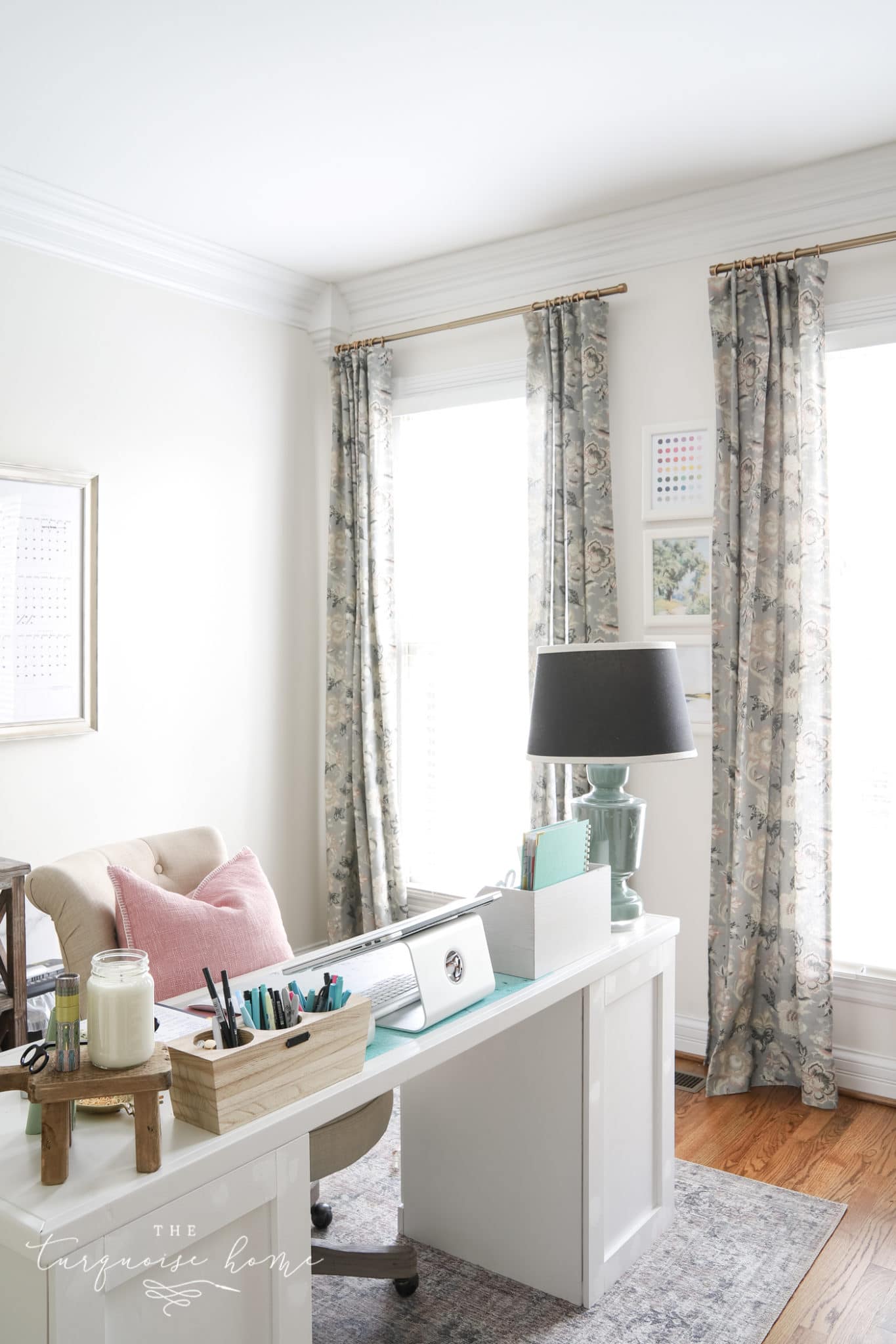
I recently fell in love with this color when I was looking for a pantry door color. Isn’t it fun to paint a door a different color and let it bring life and new color into the room? I don’t know if I’ll keep this color forever, but I’m really loving it in my kitchen!
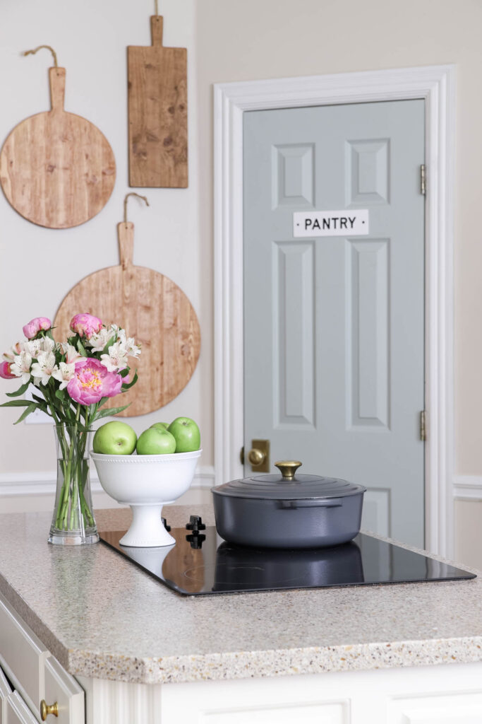
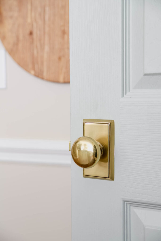
The color looks beautiful with this brass doorknob.
What You Need to Know About Sherwin Williams Comfort Gray
At first glance, Comfort Gray may appear “mint” to some. But, really, it’s so much more than that. It’s got layers.
Comfort Gray is a bit of a chameleon. It’s not gray, or blue, or green but it is a very popular color that shifts between blue-green in some areas and green-blue in other areas, depending on the lighting.
When you look at Comfort Gray, you may immediately think of Sherwin Williams Sea Salt (another fav of mine!), and I completely understand why. In fact, Comfort Gray is essentially a slightly darker version of Sea Salt. It completely reminds me of that gray-green sea glass that you can find on beaches around the world.
It’s a cooler color and works really well to balance out the warm light in south-facing rooms (similar to how blue sea glass balances out against the warm colors of sand).
Comfort Gray Undertones
Comfort Gray is definitely in the gray family but due to its green and blue undertones, it offers an appealing option for anyone who wants a neutral paint but also wants a pop of color.
It’s that perfect ever-changing color that adds variety for those who crave it while still providing a neutral backdrop for your decor.
What Colors Coordinate with Sherwin Williams Comfort Gray
One of the very best qualities about Comfort Gray is its versatility. Due to its chameleon nature, it can pair well with many different colors.
Generally speaking, this lovely color works well with many sand colors, caramel, colors in the bronze family, teal, and terra cotta as well as bright colors like watermelon or coral.
More specifically, if you are looking for individual colors to pair with Comfort Gray, check out:
- Dover White (SW 6385)
- Spare White (SW 6203)
- Snowbound (SW 7004)
- Foxy (SW 6333)
- Bagel (SW6114)
- Moody Blue (SW 6221)
- Greek Villa (SW 7551)
- Amazing Gray (SW 7044)
- Rain (SW 6219)
- Retreat (SW 6207)
- Special Gray (SW 6277)
- Balanced Beige (SW 7037)
- Virtual Taupe (SW 7039)
- Mystical Shade (SW 6276)
Comfort Gray is seriously versatile. If I listed every single color it would look great with, it would be a completely overwhelming, non-helpful list! Just know that many other colors can look amazing when paired with Comfort Gray.
If you have a particular color you want, check it out next to SW Comfort Gray in the room you want to paint and see for yourself.
Comfort Gray in Action in Different Rooms
The best way to start the process of narrowing down your color choices is to see your picks in action. I’ve collected several examples of Comfort Gray in different rooms of the house and in different types of lighting so you can see how it behaves.
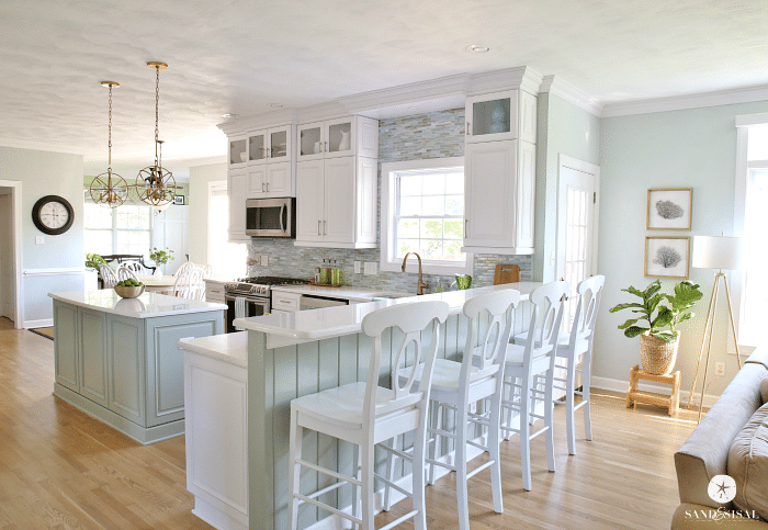
Sherwin Williams Comfort Gray in Kitchens
If you love the bright, relaxed coastal look, Comfort Gray is your go-to color like this kitchen from Sand and Sisal. You don’t need to live at the beach to love (or have) that fun coastal vibe in your own home!
And you can add it in small doses, like I did in my kitchen below, by painting only the door! I love how it pairs with my Edgecomb Gray walls.
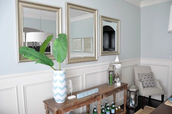
Comfort Gray in the Dining Room
Honey We’re Home used Comfort Gray, and thanks to the lighting, it reads more blue than green here. Pair it with silver and blue accent pieces for a gorgeous look.
SW Comfort Gray in Bedrooms
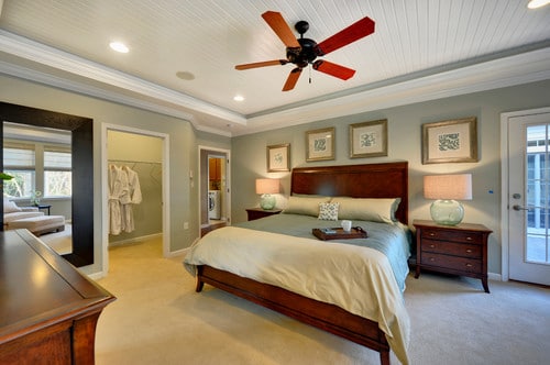
Comfort Gray is so versatile that it can pair well with all the different tones in this bedroom. An excellent color choice by the Schell Brothers. It takes one seriously versatile color to work with gold, brown, white, black, and rose all at the same time!
Many grays and beiges aren’t able to do it, and that’s what I love the most about Comfort Gray.
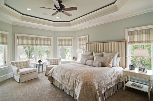
Bedrooms are meant to be serene spaces where you can go to relax and rejuvenate. Comfort Gray transforms a space from ok to peacefully serene in a way that few other colors can. Look how calming and beautiful this master bedroom by Carolina Design Associates, Inc is.
Bonus: the room isn’t too bright even with all the natural light it receives from its many windows.
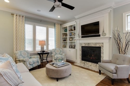
Comfort Gray in Living Rooms
I love decorating the living room in a nice, neutral way so that it helps to bring together the decor from around the house. Neutral doesn’t mean boring, as this example from Bardi Designs shows.
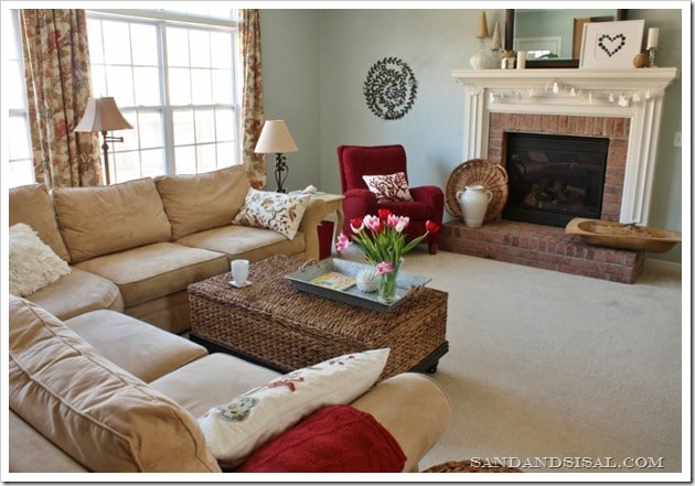
Comfort Gray may shine as a coastal decor color, but it works quite well in traditional and transitional decor designs as well. Sand and Sisal did a terrific job pairing warm sand-like colors with the Comfort Gray walls in this living room.
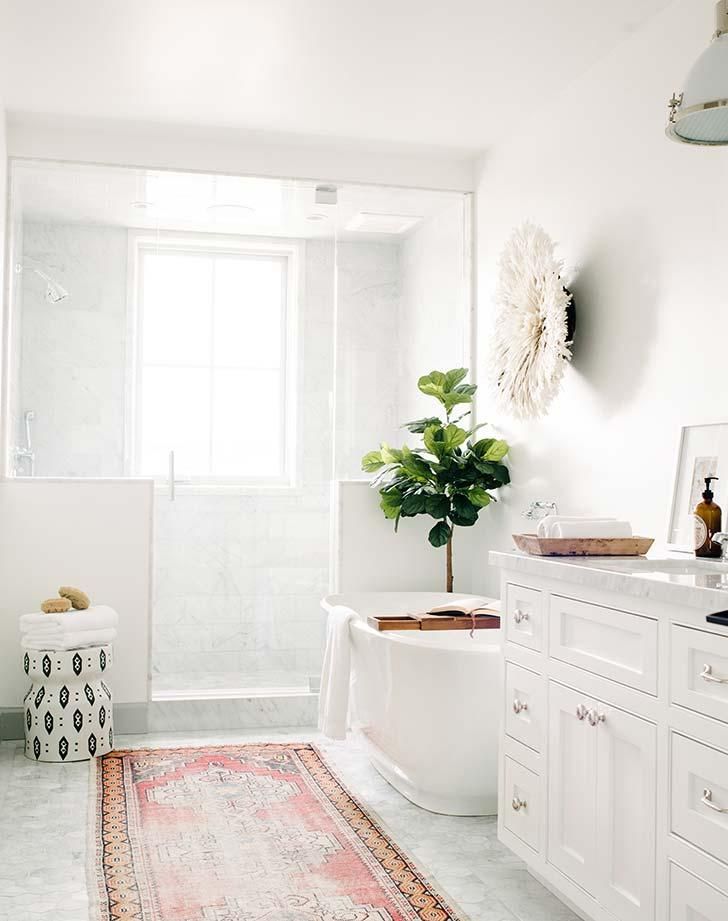
Sherwin Williams Comfort Gray in Bathrooms
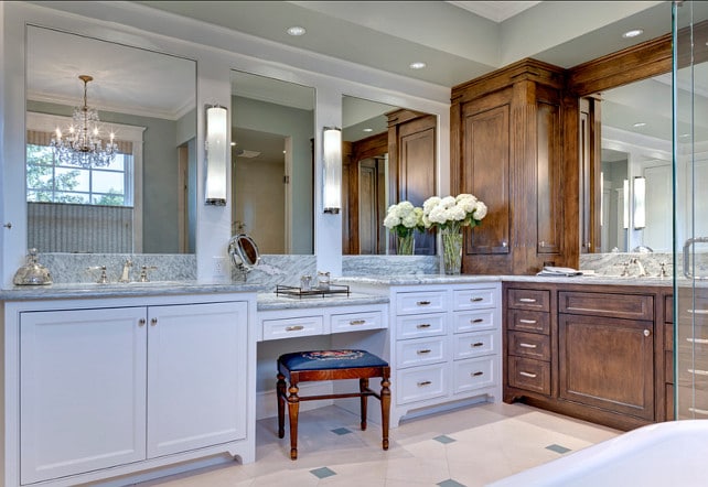
Comfort Gray shines in this bathroom from Home Bunch and beautifully ties together the browns, whites, and grays found all around the room. It’s stunning yet light, almost pastel, due to the lighting!
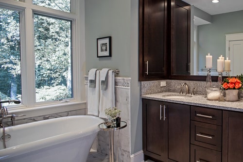
Here’s another beautiful bathroom example from Allard & Roberts Interior Design, Inc. In this lighting, Comfort Gray reads gray with green undertones. It’s soothing and very chic.
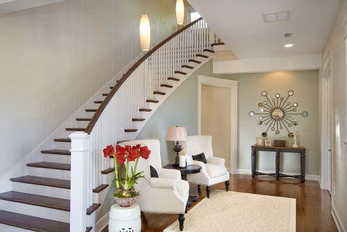
Comfort Gray Stairways
Comfort Gray is subtle, elegant, and hard-working with this entry/stairway area by Dibros Design and Construction. It does a stand-up job of complementing the browns, blacks, pewters, creams, and whites.
Undoubtedly, Sherwin Williams Comfort Gray looks amazing in almost any room. Are you ready to give this great color consideration?
More Favorite Paint Colors in the Best Home Paint Colors Series:

Hello Laura, came across your post while searching for interior door colours. I went with comfort gray and it was the best decision ever. I’ve added black knobs and am planning on changing the door hinges to black also. Absolutely beautiful colour. Changing my main floor interior doors to this colour.
I love to hear it! Thanks for reading, Reema!
I’ve painted my basement in comfort gray as it looks especially nice with the golden oak trim work that I didn’t want to paint white. What color carpet would you recommend? I’m thinking of a toned down gold for the sofa/loveseat, and wonder if a gold color for the carpet would be too much?
i painted my living room and dining room with comfort gray! and it looks light blue! im so upset. how can i make it look gray?!!
Hi Daisy, it really doesn’t look gray. So, I’m not sure how to help, other than picking another color like Revere Pewter or Edgecomb Gray. But just because a color has the word of a color in the name doesn’t mean it’ll come out that color. I definitely recommend always trying colors out on a poster board in the room where it’ll be painted before committing to painting the whole room. I hope you find the right color!
xo, Laura
I ran into the exact same problem with my dining room. I ended up painting one of my walls peppercorn gray from sherwin Williams to tone down the color since repainting isn’t an option at the moment. Maybe add in some pictures etc that have gray hues to them.
Well this reply may never be seen 2 years later, but lighting has everything to do with how Comfort Gray reads. In my southwest room 50% lightened it’s the perfect minty gray green. In my southeast dining room it reads slightly bluer when lightened, but ok when full strength. I used both in that room. In my northeast facing room I had to totally ditch the color as it read bright blue. With the help of a Sherwin Williams design consultation, I had to go with a warmer color in the northeast facing room that would still complement the Comfort Gray in the other rooms. We used Maison Blanche. It was quite the journey.
It IS crazy how they can look so different in different lights. Choosing paint colors is QUITE the journey! xo!
We had the entire interior of our home painted in Comfort Gray back in 2014, and we still enjoy it now in 2022. Our baseboards and trim work are pure white and we think it looks so fresh together.
Additionally, we used Comfort Gray on the exterior of our little beach vacation townhome on South Padre Island, TX. Naturally, Comfort Gray looks much lighter when painted on a home’s exterior, but more so way down south on SPI (extremely sunny almost all the year). It has been a great color outside there because it hasn’t seemed to be fading out. We would certainly use it again!
Never heard of a color named Comfort Gray before, and I’m glad that I see your post, Laura!
It’s a color that definitely promotes relaxation and has a peaceful quality to it. I would surely try it 🙂
Comfort Gray is such a lovely color! We have it in a guest room and it changes quite a bit throughout the day depending on the lighting. Love the way it looks on your doors!
I love that color for your pantry door. It looks like it was meant to be! Very nice. I later realized was a step lighter in number than Sea Salt when I looked at the back of the paint deck. I love a pale blue-green shade in bathrooms, so spa-like Isn’t Great, Wolf Lodge amazing. I love Comfort Gray! My pantry door is also painted, Comfort Gray.
Such a pretty color! I tend to lean more toward beige than gray and would have probably avoided it because f the name, lol, but I can definitely see the blue and green tones! I did our two full bathrooms in SW Windowpane, which I later realized was a step lighter in number than Sea Salt when I looked at the back of the paint deck. I love a pale blue green shade in bathrooms, so spa like! Isn’t Great
Wolf Lodge amazing! We went there a lot when my kids were younger, we discovered they would have lower rates in fall and late winter, so we would try to work it in on a three day weekend when there was a Friday or Monday off school, like for PT conferences, etc. , which worked out well since we were only a few hours away from the one in Grapevine, TX. The big water slides are so fun!
I love that color for your pantry door. It looks like it was meant to be! Very nice!!!
I love Comfort Gray! My pantry door is also painted Comfort Gray (actually all of my interior door are!) the kitchen walls are Revere Pewter and my cabinets are SW Alabaster. I love it!
I’m debating painting all of my interior doors this color. Just nervous to commit… but I know it’s beautiful in your home!!