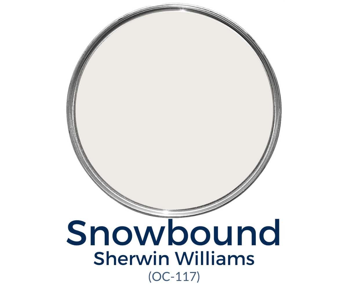
Sherwin Williams Snowbound
Sherwin Williams Snowbound is a very popular white paint color. This shade is a gorgeous soft white that brightens up a room without looking too crisp.
White paint may sound easy to choose, but it’s notoriously challenging due to a huge variety of subtle differences that make surprisingly large impacts.
Instead of choosing a fresh new white paint for each project, I’m a big advocate for having a few go-to shades that are versatile enough to work almost anywhere.

Recently, I published an in-depth color review of Benjamin Moore’s Simply White, which is one of my go-to whites. It’s a clean white that I’ve used on my trim, walls, and kitchen cabinets with great success!
In this post, I have another designer favorite shade of white to share with you. Sherwin Williams’s Snowbound (SW 7004). It’s a neutral white that looks crisp and clean yet also seems soft and creamy.
And with versatile qualities like those, it’s really no wonder why SW Snowbound is frequently chosen for walls, trim, ceilings and even exteriors.
Are you ready to find out more about beautiful white? Let’s get started!
PRO Tip
Any time you are choosing a new paint color, you need to try out the real paint color in your home first!
The easiest and quickest way to do that is with Samplize! I solely use them for paint samples now. There’s no mess, no leftover sample pots of paint. Plus, these no-mess, peel-and-stick rectangles made from real paint, are easy to move around the room and easy to save for future reference!
What color is Sherwin Williams Snowbound?
Here are a few quick highlights to know about this great shade:
- A neutral off-white, with slightly cool white with subtle gray undertones
- Light white with an LRV of 83
- A popular shade for walls, ceilings, trim, and exteriors
- A soft white color that’s neither too bright nor too creamy
Undertones in Snowbound
Snowbound paint color is a versatile white that has very mild gray undertones. It won’t look gray on your walls, however. The gray undertones make this very light white appear soft and slightly muted so that it never appears overly cold.
It may come as a surprise that Sherwin Williams Snowbound also has subtle taupe (pink/purple) undertones. These aren’t strong enough that you’ll see a wall and think it looks pink. However, they help to add a smidge of warmth and soften up this bright white so that it’s never cold or crisp.
One of the most notable things about white paint colors is that surrounding colors and light exposure can significantly influence them. This is definitely the case with Snowbound because, in cool-tinted northern lighting, you’ll see its soft, muted side show up in a more pronounced way.
Then, in warm-tinted southern lighting, you’ll more likely see it read clean white or maybe the tiniest hint of taupe in evening west-facing light.
One thing you won’t notice is a yellow undertone. While this white may pick up some yellow if it’s next to yellow decor, on its own, it doesn’t boast creamy yellow undertones.
Want to Save This?
Enter your email below and I’ll send it directly to your inbox!
LRV of SW Snowbound
Light reflectance value (LRV) is the amount of light a paint color either reflects or absorbs. A higher LRV number indicates how much more light the color reflects (rather than absorbs). In other words, LRV 100 is pure white, and LRV 0 is pure black.
Snowbound has a Light Reflectance Value of 83.
Since it reflects a lot of light, it’s safe to say it’s a bright color without being blindingly white. I would say it’s just on the border between white and off-white, so in low amounts of natural lighting, it may look more muted and off-white. But in natural light, Snowbound looks white.
Sherwin Williams Snowbound Coordinating Colors
SW Snowbound is a little more finicky than some other white paint colors, as I would avoid pairing it with anything too warm, like your true beiges. Sherwin Williams recommends pairing it with gray-tinged shades such as:
- Colonnade Gray
- Autumn Orchard
I love pairing it with a few of my personal favorites, such as:
- Repose Gray
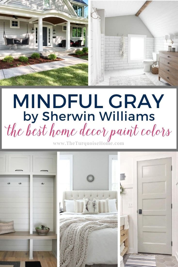
- Mindful Gray
- Silver Strand
- Aqua-Sphere
- Copen Blue
- Argos
- Naval
- Sea Salt
Best Trim Colors to Go With Snowbound
If you choose Snowbound as your wall color, you have a decision to make regarding your trim color.
One option would be to also paint your trim in Snowbound. If you love Snowbound but are concerned about its undertones, this is a great approach to downplay those undertones.
You can add contrast between trim and wall paint when the shades are the same by using different paint finishes. I recommend using semi-gloss for the trim to make it look slightly brighter. Then, use an eggshell finish on the interior walls to make the wall color look slightly darker.
The other way to approach trim color with SW Snowbound walls is to paint them in a brighter white.
Good options are Sherwin Williams High Reflective White and Benjamin Moore Chantilly Lace. (Chantilly Lace is my go-to ceiling color, so it’s a great option for a crisp white!) Of course, you could also go with Simply White by Benjamin Moore, which is a slightly brighter shade.
Snowbound vs. Other White Paints
White paint colors are some of the trickiest if you’re trying to pair them together with other white colors. They all have an undertone and some work well with others and some don’t. So, let’s take a look at how these popular off-whites compare.
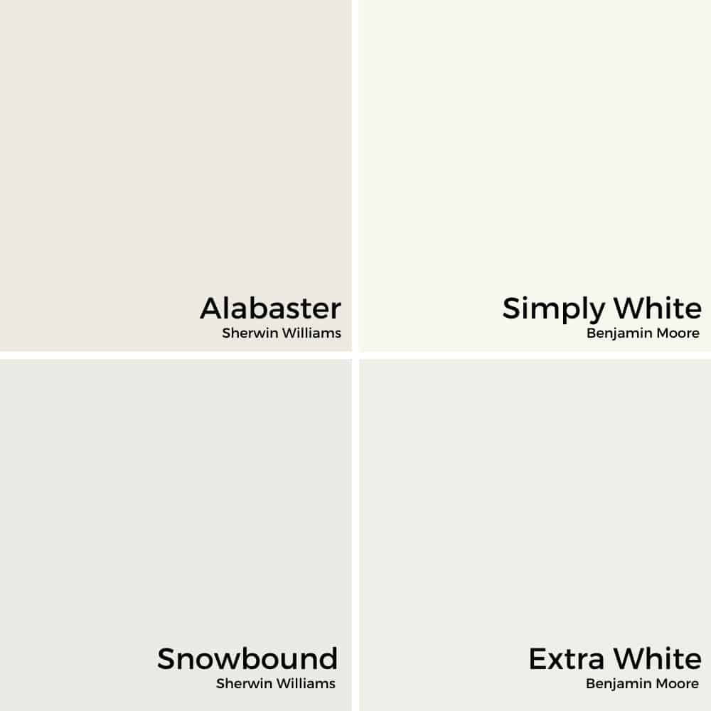
Snowbound vs. Alabaster
Alabaster has warm, beige undertones while Snowbound has much cooler undertones. Alabaster will work well with creams, beiges and greige paint colors. And Snowbound will work well with grays, greige and other off-whites that are cool. But, in the end, they both fall squarely in the off-white paint color category.
Snowbound vs. Simply White
Simple White is a very creamy off-white color that can lean yellow when compared to a true white. So, I would not pair it with Snowbound.
Snowbound vs. Extra White
SW Extra White has a blue-white hue and compared with Snowbound, you could definitely pick up that cool undertone. So, I wouldn’t mix these two colors. If you’re looking for a more true white to pair with Snowbound, I would choose Sherwin Williams Pure White, instead.
Where can you use Sherwin Williams Snowbound?
Snowbound by Sherwin Williams is one of the most versatile and timeless white paint colors. You can confidently use it almost anywhere! Use it for:
- Wall molding
- Trim
- Ceilings
- Interior walls
- Exteriors
Is Sherwin Williams Snowbound a good color for cabinets?
I’ll be very honest: it’s not my top choice because the undertones can be tricky and it often doesn’t look great with various countertops and backsplashes.
However, if you have dark countertops that don’t have a lot of peach, pink, or greige in them, Snowbound can look beautiful.
Home Styles That Work With Snowbound
There really isn’t a style of home that doesn’t work with Snowbound. It’s a fairly neutral shade that you can make work with pretty much any style, including:
- Farmhouse
- Traditional
- Transitional
- And more
Room Examples using Sherwin Williams Snowbound
I’ve gathered a few examples of SW Snowbound (SW 7004) paint to show you how it appears in various rooms and lighting situations. Notice how different decor colors and settings impact the way that Snowbound looks.
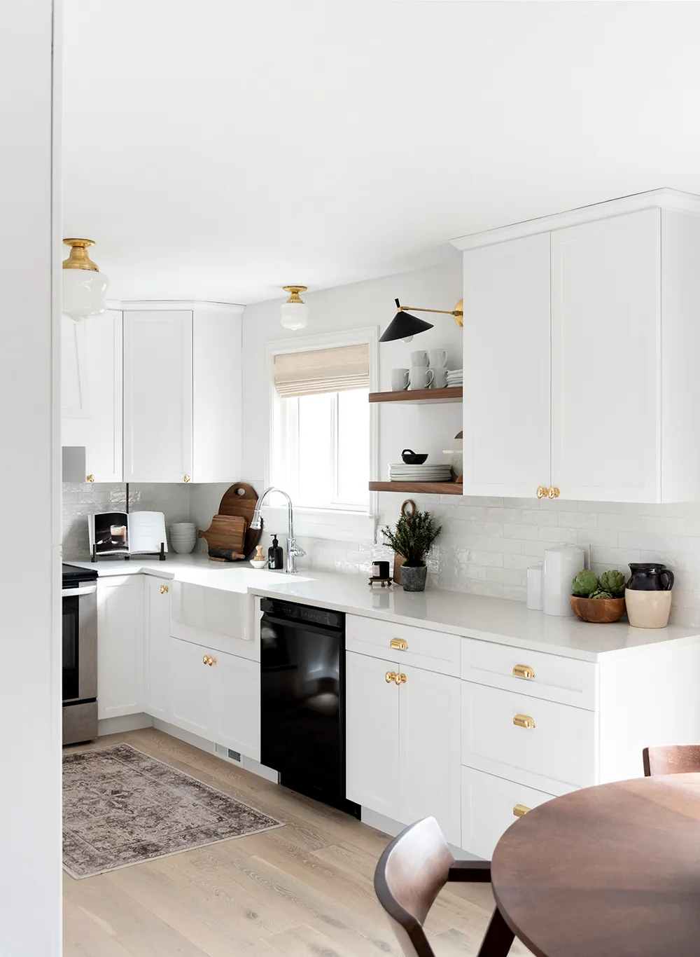
Kitchen Painted With Snowbound
Sarah over at Room For Tuesday used SW Snowbound on the walls and trim in this kitchen makeover. It’s the perfect shade for the walls, even in an all-white kitchen, because it’s soft enough to pull together all the various shades of white into one cohesive design.
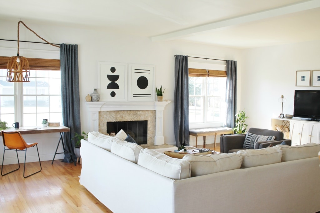
Sherwin Williams Snowbound Living Room
Jennifer at City Farmhouse transformed her living room in her new home by painting the walls with Sherwin Williams Snowbound. This soft white almost has an off-white quality, so it’s light enough to appear white without glaring in the natural light. Beautiful!
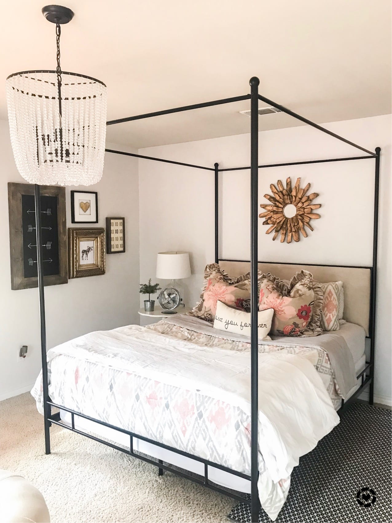
Bedroom in SW Snowbound
Bedrooms are our place for respite, so I lean towards tranquil colors for the bedroom (see my top bedroom paint picks here!). Snowbound is a terrific color choice for bedrooms because it’s a light yet soft shade. It encourages relaxation and serenity without turning the bedroom into a cave.
I love this picture from The Spoiled Home because it shows Snowbound’s range and potential. Notice the grayer appearance in the shadows and the hint of pink on the walls from the reflection of the accent pillows and decor.
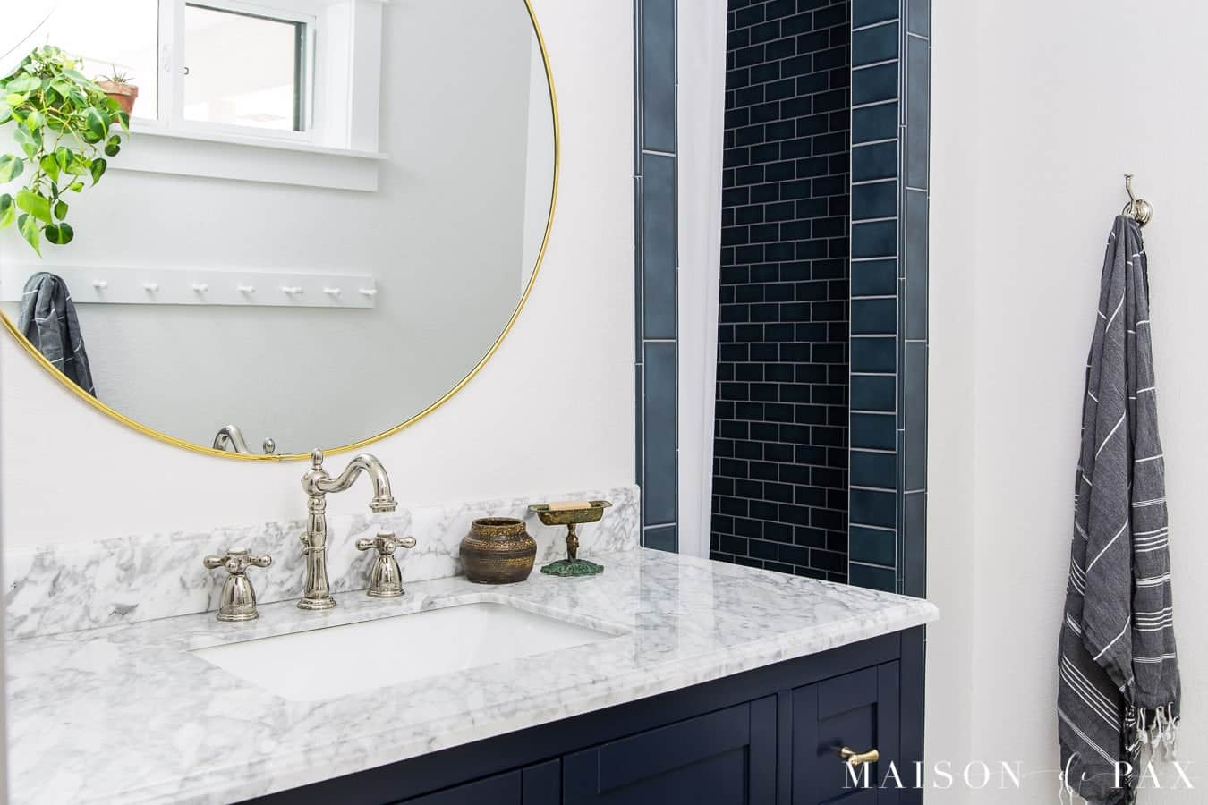
Bathroom Painted SW Snowbound
One look at this bathroom from Maison de Pax, and you can tell that Snowbound is ideal for nearly any space. It looks timeless when paired with navy blue because it offers gorgeous contrast with such bold colors without appearing stark or harsh.
Plus, this bathroom doesn’t have much natural light, but you’d never know that, thanks to how bright and spacious Snowbound makes it feel!
Snowbound Sherwin Williams Exterior
Very light white paint can be too much on home exteriors because the natural light can make it blindingly white. Snowbound, however, is perfect for exteriors, like this home from Grace in My Space, since it reads as bright white but never appears glaringly white.

Frequently Asked Questions
Snowbound leans warm, but only a little. It has very subtle taupe undertones that lend some warmth to the shade, while its mild gray undertones soften it and make it look muted.
No, not at all. Although it’s a white paint with a hint of warmth, this color doesn’t have the yellow undertones that creamier white paints have.
Choosing a white paint color is challenging! Check out my article about how to choose a white paint color for tips and tricks to make this difficult task easier.
Can you see why I love this gorgeous shade of white? Sherwin Williams Snowbound may not be the most versatile white paint, but it’s perfect for anyone that’s searching for a neutral white that’s not too bright.
More Paint Colors
If you’re searching for great go-to shades to use in your home, I highly recommend a few of my favorites:
Tools to Help to Paint a Room Yourself
I’ve gathered some helpful tools for painting a room yourself. I recommend starting by checking out my tips for painting a room in 5 easy steps. I do my own painting nearly all of the time, and I use these tools to make the job easier and give professional-looking results!
- Paint Brush – These paint brushes are a little more expensive than your basic brush, but they’re worth it! I’ve used these brushes for over a decade, and if you wash them out well after each use, they will last for years.
- Painter’s Tape – a MUST-have for taping off edges. You’ll need to tape off all edges if you don’t have a steady hand.
- Drop Cloths – a must-have to protect flooring and furniture from drips.
- Paint cup – Sure, you could use any old cup, but I’ve come to swear by this one. The magnetic piece holds your brush cleanly in place when you need to take a break. And it fits my hand perfectly, keeping it from cramping.
- Roller Tray – I’ve found the only paint tray I’ll ever use again. The magnetic piece is great for holding the roller in place. And the liners are a luxury, but I won’t paint without them because it makes cleaning up a breeze!
More Posts You Will Love: