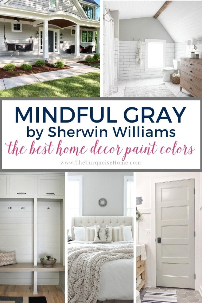
Sherwin Williams Mindful Gray
Looking for the perfect light gray paint shade for your home? Allow me to introduce you to Sherwin Williams Mindful Gray! This wildly popular color is beloved by interior designers and homeowners alike, and for good reason: it’s an incredibly versatile neutral without any sneaky undertones. Read on to find out if Mindful Gray is the right paint color for your home!
Mindful Gray by Sherwin Williams (SW 7016) is a beautiful, light to medium-toned warm gray shade that’s neutral enough to complement a variety of home decor styles and palettes.
With just a touch of beige mixed in, it can be considered a soft greige.
Light gray paints are airy, bright, and look good in almost any room. That being said, it can be challenging to find the perfect shade of gray—so much so that I wrote an entire post about how to do it!
One of the most impressive things about SW Mindful Gray is that it doesn’t have any overbearing overtones, as many light grays tend to have. How frustrating is it to finally pick out that perfect shade, only to find it looks purple once you’ve painted an entire room? You won’t get any unpleasant surprises with Mindful Gray!
So how do you know if Mindful Gray paint is the right light gray shade for your home? Read on to learn more about this incredibly versatile neutral color.
Want to Save This?
Enter your email below and I’ll send it directly to your inbox!
Light Reflectance Value For Mindful Gray
Mindful Gray paint has a Light Reflectance Value, or LRV, of 48.
What does that mean? LRV refers to the reflective value of paint color on a scale of 0 (pure black) to 100 (pure white). Essentially, colors with an LRV rating close to 0 will be darker, while numbers closer to 100 will be lighter colors.
At 48, Sherwin Williams Mindful Gray is right about in the middle of the LRV scale, making it a light to medium-toned shade. It leans slightly to the warm side of gray, but it’s really neutral enough to pair well with both warm and cool palettes.
Once it’s up on a wall, it can appear much cooler than it looks on the swatch, depending on the lighting and other colors in the room.
Mindful Gray Undertones
If you’re at all familiar with gray paint, you’ll know that no matter which shade you pick, there’s always an undertone in there somewhere.
Mindful Gray really doesn’t have any obvious undertones. What I mean by this is that you won’t walk into a room painted Mindful Gray and get overbearing Kermit the Frog vibes.
What you will find in its composition is the tiniest hint of brown or beige, making Mindful Gray lean slightly toward greige. However, it’s still very much a gray shade. You won’t really find any yellow or green undertones that can be quite annoying when it comes to beiges and greiges.
What’s interesting about Mindful Gray is that while it is a warmer gray, there’s a slight hint of blue hidden underneath. This coolness helps to balance warmer palettes, such as off-white trim and yellow-ish wood tones. However, it never appears overly blue or icy-cold as some grays tend to do.
At times, Mindful Gray might reveal very slight hints of green or purple, but in a way that adds to its own unique characteristics. It will never throw off the whole palette in a room.
PRO Tip
Any time you are choosing a new paint color, you need to try out the real paint color in your home first!
The easiest and quickest way to do that is with Samplize! I solely use them for paint samples now. There’s no mess, no leftover sample pots of paint. Plus, these no-mess, peel-and-stick rectangles made from real paint, are easy to move around the room and easy to save for future reference!
What Colors Go With Mindful Gray?
SW Mindful Gray is so versatile, it can be paired with so many different shades. In fact, it looks great as a wall color when paired with white trim.
It works with either bright white or many shades of off-white (Sherwin Williams Alabaster is a popular pick). Mindful Gray even works well on interior siding and can either be paired with white, dark gray, or black trim.
Here are a few other colors that are wonderful complements to Mindful Gray.
- Sherwin Williams Pearly White
- Sherwin Williams Homburg Gray
- Eider White From Sherwin Williams
- Sherwin Williams Halcyon Green
- Sherwin Williams Warm Stone
- Gauntlet Gray From Sherwin Williams
- Sherwin Williams Peppercorn
- Sherwin Williams Alabaster
Mindful Gray vs. Agreeable Gray
These two popular paint colors get compared all of the time, with Agreeable Gray being another popular Sherwin Williams paint color with warm undertones.
Agreeable Gray, which has an LRV of 60 is going to reflect more light than Mindful Gray, which means it will look lighter! Sherwin Williams Agreeable Gray has been described by numerous people as “the perfect greige”—as in a color that hits all the notes and balances between gray and beige. Just like all greige colors, the base of this is a warm, creamy (dare I say agreeable?) gray tint.
I would say Mindful Gray would be better in a single room while Agreeable Gray would work great in a larger, open area or multiple connected spaces in a home.
Mindful Gray vs. Repose Gray is another common comparison.
Painted Rooms With Mindful Gray
Now, on to the fun part – seeing Sherwin Williams Mindful Gray in real homes!
Tools To Help To Paint A Room Yourself
Before I share some examples, I’ve gathered some of the best tools for painting a room yourself.
First of all, you’ll want to check out this post I wrote: Painting a Room in 5 Easy Steps. These tools are the top tools I use when painting my own rooms, which is how they get painted 95% of the time!
- Paint Brush – These paintbrushes are a little more expensive than your basic brush, but they’re worth it! I’ve used these brushes for more than a decade and if you wash them out well after each use, they will last for years.
- Painter’s Tape – A MUST have for taping off edges. You’ll need to tape off all edges if you don’t have a steady hand.
- Drop Cloths – A must-have if you don’t have any laying around the house already.
- Paint cup – Sure, you could use any old cup, but I’ve come to swear by this one. The magnetic piece holds your brush cleanly in place when you need to take a break. And, it fits my hand perfectly, keeping it from cramping.
- Roller Tray – I’ve found the only paint tray I’ll ever use again. The magnetic piece is great for holding the roller in place. Tthe liners are a luxury, but I won’t paint without them because it makes clean up a breeze!
If you need help deciding on the right paint sheen: Which Interior Paint Finishes to Use? And Where to Use Them!
Okay, NOW onto the rooms.
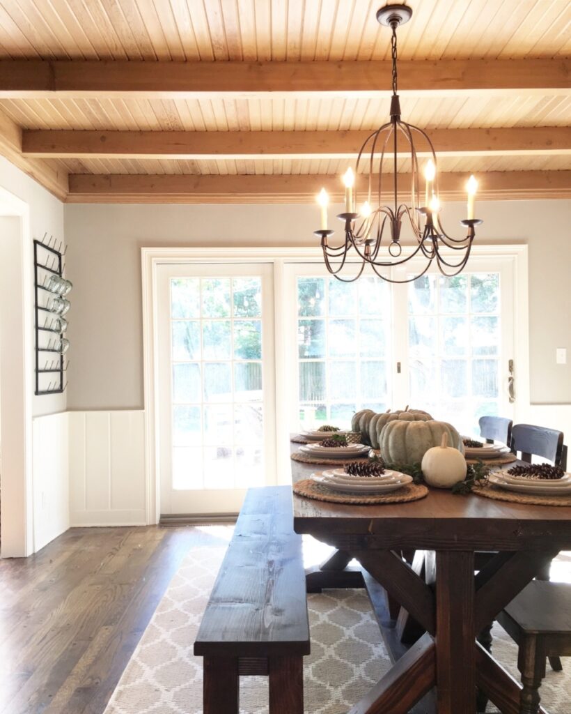
Mindful Gray In Dining Rooms
This softly-lit dining room from Mindfully Gray is filled with warm, golden light, both from natural and artificial sources. The rich-toned wooden ceiling is meant to stand out as a prominent feature in the space. Thus, an unobtrusive, neutral shade is needed for the walls.
Enter Mindful Gray, which looks soft, warm, and creamy in this space. I think it pairs nicely with the off-white paint of the door trim and wainscoting.
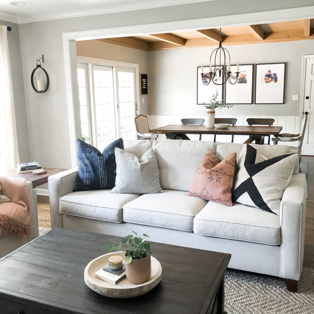
Mindful Gray In Living Rooms
I am in love with this sweet and cozy living room from Mindfully Gray! Mindful Gray takes on a soft role, complementing the warm wood ceiling in the dining room. It adds just enough contrast with the white trim.
You can see how the wall shade walks the line between warm and cool, creating a peaceful balance.
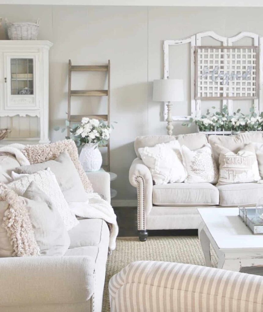
In spaces with a lot of light like this one from Thistlewood Farms, Mindful Gray looks softer, but still holds it own. Here, it manages to become the perfect backdrop for the off-white palette and rustic-inspired decor.
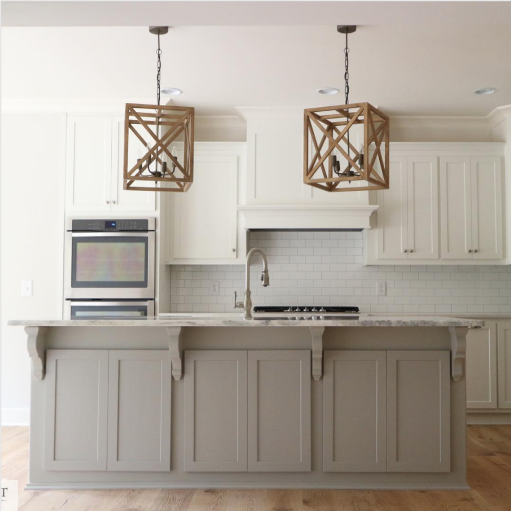
Mindful Gray In Kitchens
SW Mindful Gray is a perfect shade for kitchen cabinets. This kitchen island stands out against white perimeter cabinets but isn’t exactly bold or dramatic.
Mindful Gray in Bedrooms
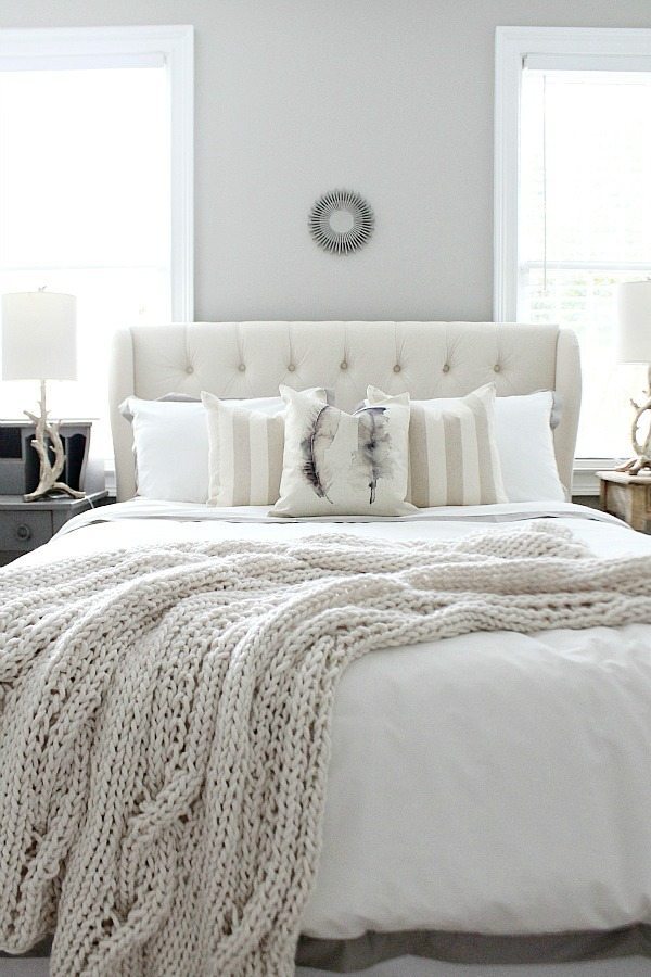
Looking for the perfect light gray paint to create a serene bedroom environment like this one from Refresh Restyle? Mindful Gray stays grounded as a neutral wall shade, softly complementing the layered palette of off-white and neutral colors.
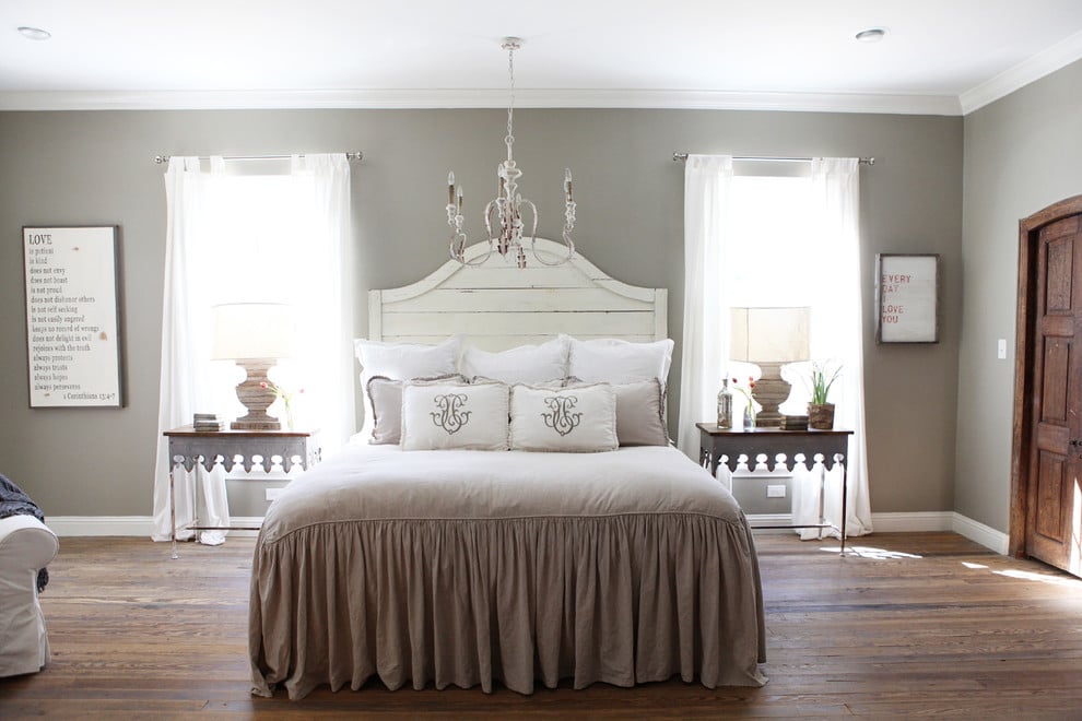
Notice how this bedroom from Made by Mood has a similar decor palette as the last, but Mindful Gray appears much darker as a wall shade. When light is not reflecting directly off its surface, the paint shade shows a little more body.
Here, it looks like a mid-toned true gray with just a bit of warmth.
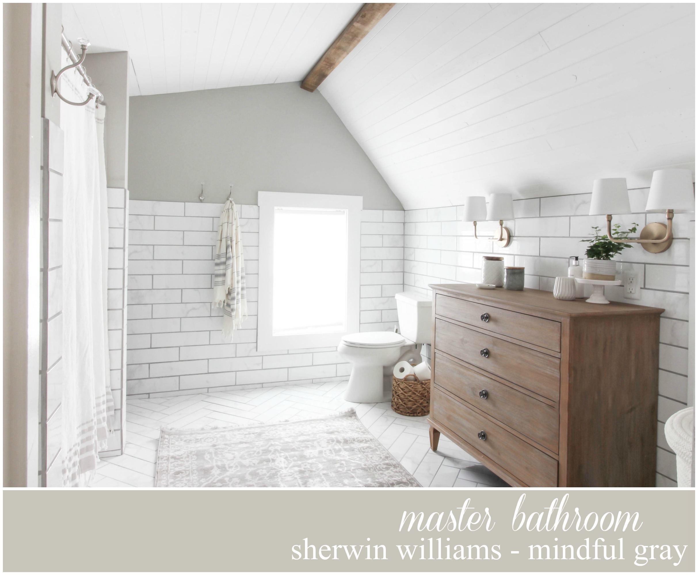
Mindful Grays In Bathrooms
With such a unique architectural shape, it would be a shame not to emphasize it.
This relaxing bathroom from Rooms For Rent Blog plays up shades of soft gray and white, with a few carefully-placed wood accents. Though neutral, Mindful Gray adds a pop of color and interest, highlighting the interesting wall shape.
Mindful Gray In Other Spaces
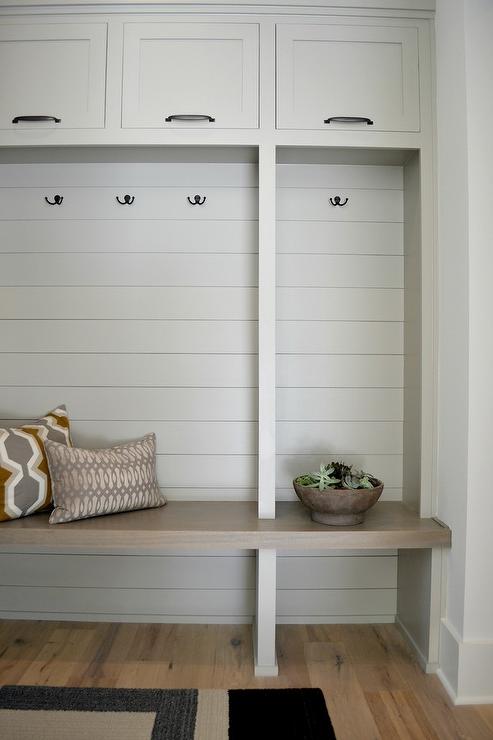
This beautiful and minimal mudroom from Mawr Design features a built-in bench and cabinets in Mindful Gray. It’s really the perfect, neutral shade to add a touch of visual interest against a white wall.
However, it’s not too dark or too bold of a color.
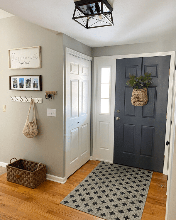
In this cozy entryway from Lizzy Designs Blog, Mindful Gray looks warm and inviting as a wall color. It pairs wonderfully with trim in Sherwin Williams Alabaster and interior door in Peppercorn!
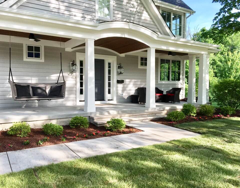
Mindful Gray As An Exterior Color
This welcoming craftsman-style home uses Sherwin Williams Mindful Gray and Alabaster for the trim. I love how the front door pops, painted in Peppercorn.
I hope you enjoyed this in-depth look at Sherwin Williams Mindful Gray! It’s really a great neutral that can work in almost any space. Where would you try this paint color in your home?
Don’t forget to check out these other fantastic paint colors!
If you need more assistance when choosing a paint color, check out this video all about Mindful Gray!


on the exterior photo showing a mindful gray home, could you pass along the trim colour? Thanks
Hi Brad, since it’s not my photo, I’m not sure of the trim color. Sorry!
Hey there, thanks for your insight. We were thinking about painting our exterior house trim Aunt Betty China..(historic color from SW) Do you think Agreeable Gray would go for the siding? ABchina looks cream on an over cast day…I think.
Hi Mary, I’m not familiar with Aunt Betty China, so I don’t know. I’d recommend talking to a local designer to help with the decision! Or get samples and use them outside against the house to see in person how it would look. Sorry, I’m not more help! Thanks, Laura
I love the exterior house color Mindful Gray. Can you tell me what color you painted the door?
Hi Julie,
The door color is Sherwin Williams Peppercorn. Hope this helps!