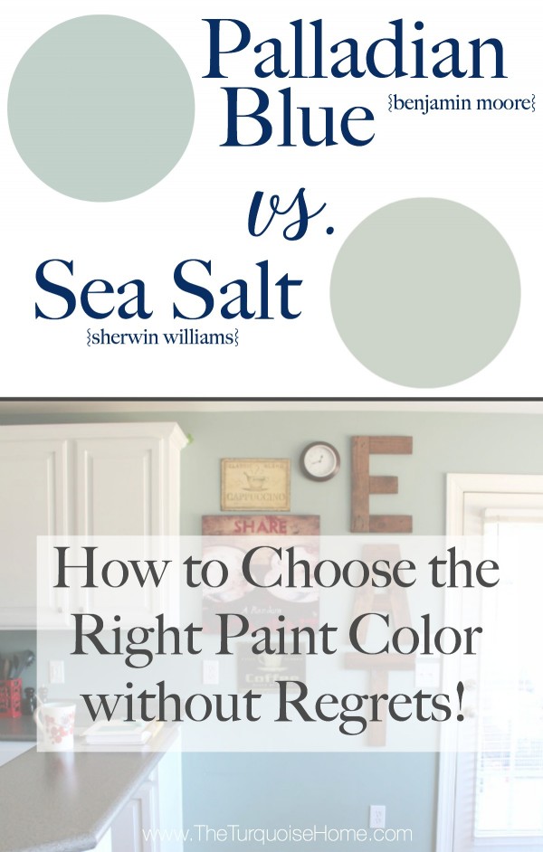
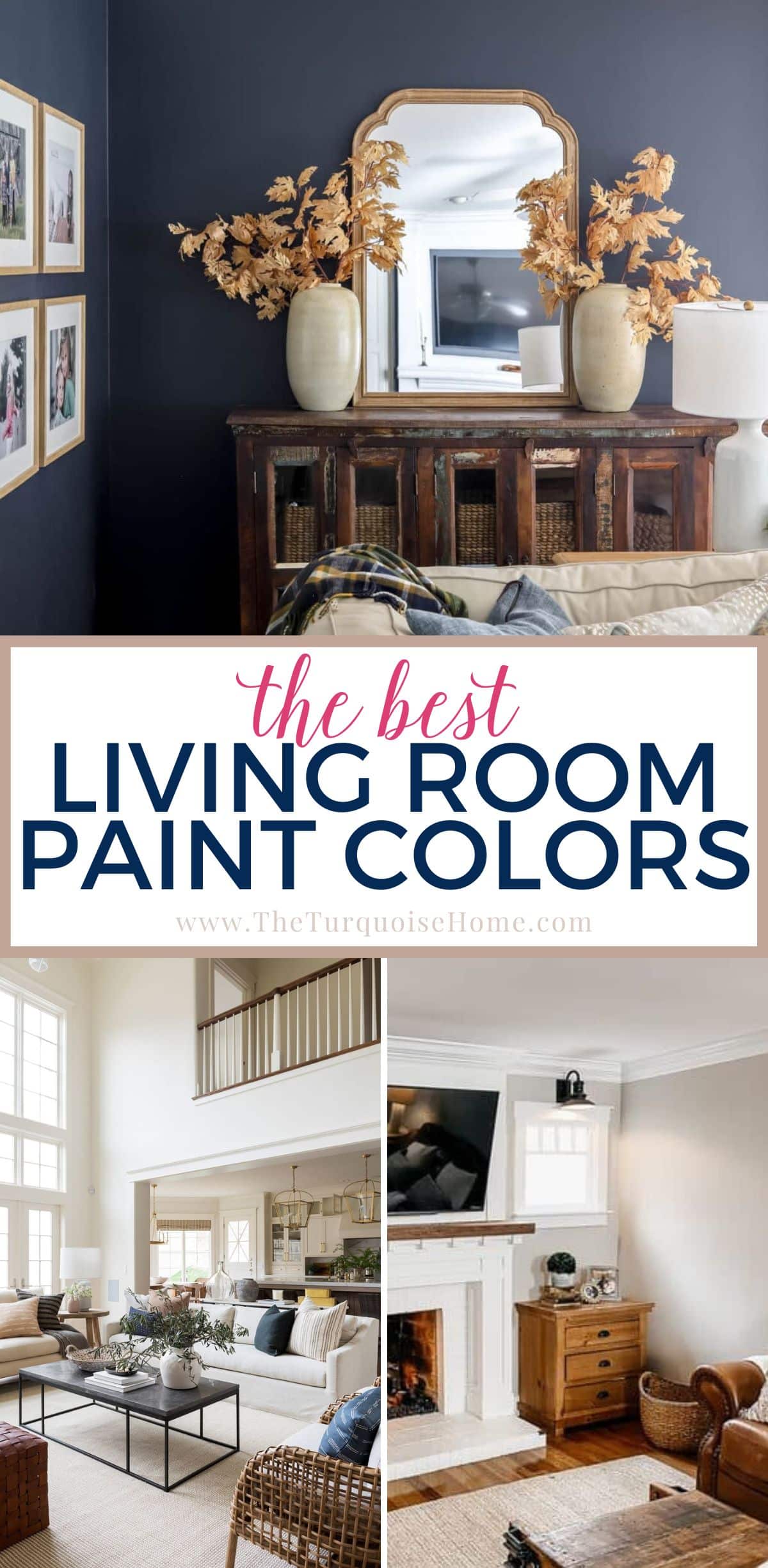
Benjamin Moore Palladian Blue {Paint Color Spotlight}
Palladian Blue by Benjamin Moore is a very popular muted blue-green paint color. This shade is a go-to light hue that adds a sense of peace and restfulness to any space.
Benjamin Moore’s Palladian Blue (HC-144) is a cool-leaning blue-green with gray undertones to give it a beautiful crisp color that will never appear too cold.
If you are searching for a paint color that will look effortlessly chic in any style of home, look no further than today’s highlighted hue! BM Palladian Blue is a versatile muted blue-green (similar to but darker than Sea Salt) that has become one of Benjamin Moore’s most popular shades.
This post contains affiliate links for your convenience. See my full disclosure policy.
It’s also a color that I seriously considered for my kitchen. It took me a long time to decide between Sea Salt and Palladian Blue, and in the end, I chose Sea Salt for my kitchen only because of the lighting and decor in that room.
That being said, Palladian Blue holds a special place in my heart still!
Let’s take a deep dive into Palladian Blue as we explore this beautiful paint color. Try a sample of Palladian Blue here!
Want to Save This?
Enter your email below and I’ll send it directly to your inbox!
What color is Benjamin Moore Palladian Blue?
Here are the quick highlights to note about this great shade:
- Cool-leaning blue-green with gray undertones
- Light shade with an LRV of 60.4
- A wonderful and popular choice for walls, kitchen cabinets, doors, and more
- Versatile and neutral color that works with any home decor and style
- Makes a room feel calm and spa-like
Palladian Blue Undertones
This paint color is a versatile muted blue-green. Since it’s a blend of so many colors, it can have a lot of flex. At times (especially in cool lighting), it will appear bluer or muted. Conversely, in warm lighting, you’ll notice more green.
NOTE: This beautiful shade can effortlessly work with many different colors, although I recommend not pairing it with shades that have purple undertones. But before you commit, swatch! Paint swatches are the best friend you never knew you had when pairing colors together!
PRO Tip
Any time you are choosing a new paint color, you need to try out the real paint color in your home first!
The easiest and quickest way to do that is with Samplize! I solely use them for paint samples now. There’s no mess, no leftover sample pots of paint. Plus, these no-mess, peel-and-stick rectangles made from real paint, are easy to move around the room and easy to save for future reference!
LRV of BM Palladian Blue
Light reflectance value (LRV) is the amount of light a paint color either reflects or absorbs. A higher LRV number indicates how much more light the color reflects (rather than absorbs). In other words, LRV 100 is pure white, and LRV 0 is pure black.
Palladian Blue has a Light Reflectance Value of 60.4.
This shade is firmly in the medium to light category. It’s light enough that it can wash out in very bright natural light, but it also has enough saturation that it will never appear as some sort of variance of white.
Benjamin Moore Palladian Blue Coordinating Colors
BM Palladian Blue goes well with SO many colors! Benjamin Moore recommends pairing it with:
- Elmira White
- Persimmon
- Willow Creek
- Wood Grain Brown
Generally, this shade will look terrific with whites, creams, greiges, grays, dark browns, corals, and more. I love pairing it with a few of my personal favorites, such as:
- Hale Navy
- Revere Pewter
- Silver Satin
- Beach Glass
- Storm
- Comfort Gray
- Chelsea Gray
- Kendall Charcoal
- Sea Salt
What trim colors should I use with Palladian Blue?
If you decide you love Palladian Blue for your walls, I recommend a clean white for your trim (and ceilings) to offer crisp contrast. Two good options would be Benjamin Moore Chantilly Lace or Benjamin Moore White Dove.
Benjamin Moore Palladian Blue vs. Sherwin Williams Sea Salt
Sea Salt is a slightly lighter airy blue green color than Palladian Blue, as you can see in my samples below. Sea Salt has an LRV of 63 with less blue than green.
Years ago I chose between these two colors for my kitchen. Originally, I painted the walls Stratton Blue (Benjamin Moore), but it felt too dark after I painted the cabinets white.
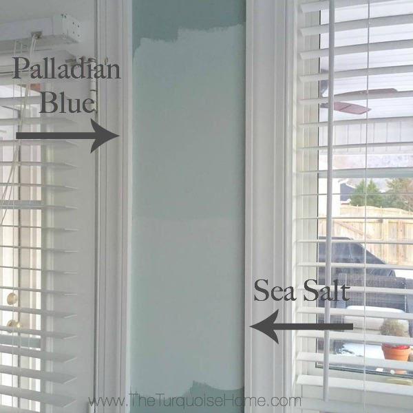
So, the obvious choice would be something similar to Stratton Blue, but lighter. Palladian Blue fit that bill! It’s a shade lighter than Wythe Blue and I just knew it would be perfect.
After sampling Palladian Blue and SW Sea Salt on the walls, I knew Sea Salt was the right choice.
I still LOVE Palladian Blue and it would have been beautiful on the wall, but this just goes to show the importance of sampling colors on the wall before choosing!
Benjamin Moore Palladian Blue vs. Wythe Blue
Sherwin Williams Wythe Blue has an LRV of 48, which means it is the darker of these two colors. Since it’s a brighter shade, Palladian Blue is a little more versatile than Wythe Blue because it doesn’t need as much natural light to keep it from looking too dark.
However, if you’re looking for a paint color for a bright room that has some substance, Wythe Blue may be the better choice.
I used Wythe Blue in my former dining room.
Where can you use Benjamin Moore Palladian Blue?
Palladian Blue is one of the most popular and versatile blue paint colors from Benjamin Moore. You can use it nearly anywhere! Use it for:
- Walls
- Kitchen cabinets
- Vanities
- Accents
- Exteriors
- Ceilings
- Interior doors
Home Styles that Work with Palladian Blue
- Traditional
- Transitional
- Coastal
- Farmhouse
- Classic
- And more!
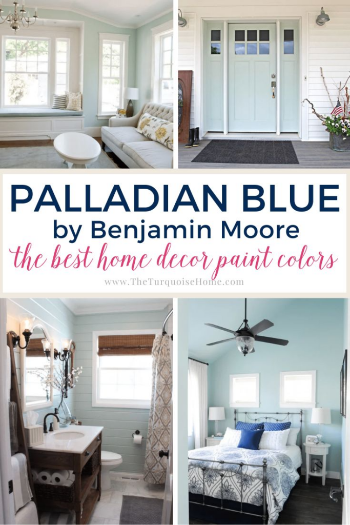
Room Examples using Palladian Blue HC-144
I think that seeing paint colors in real-life examples is one of the best ways to rule it in or rule it out of your list of top choices. Here are a few examples of BM Palladian Blue paint in a variety of settings and rooms.
Kitchens Painted with Palladian Blue
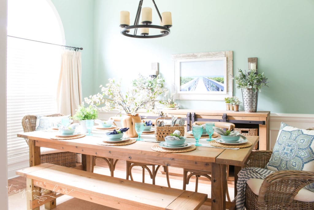
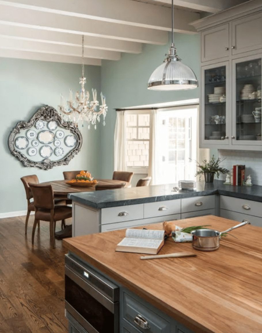
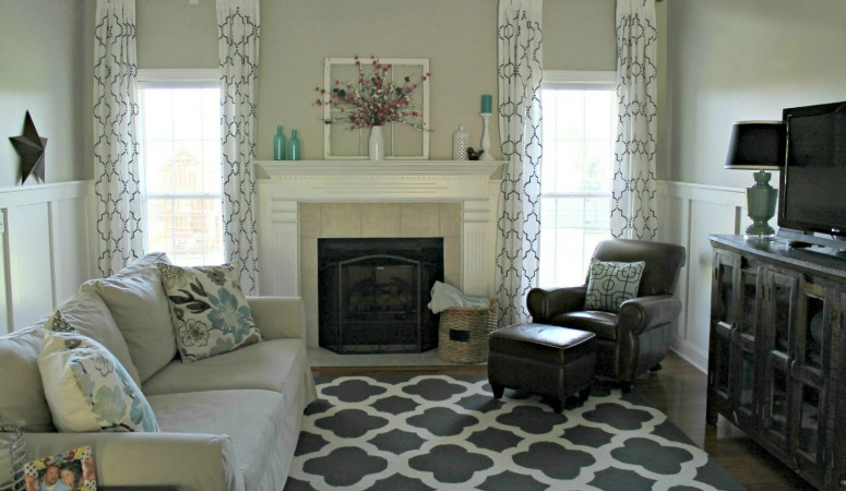
Although I thought Palladian Blue was a little too dark for my kitchen, I adore how it looks in House of Turquoise‘s kitchen! Its gray undertones make it versatile enough to tie together the wood floors, white beam ceilings, gray counters, and silver fixtures. Gorgeous!
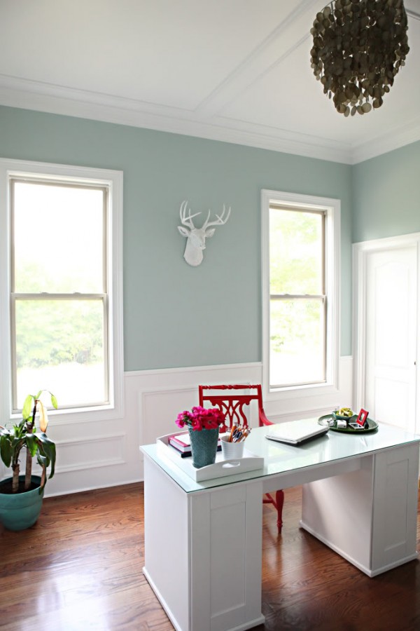
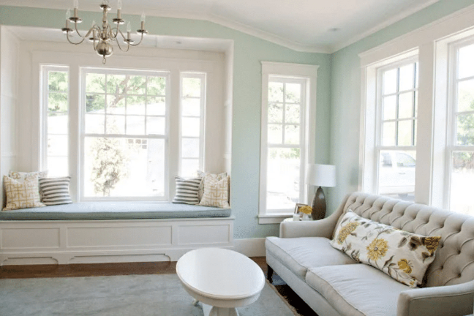
Palladian Blue Living Room
Whether your home is traditional, coastal, or even modern farmhouse, bright natural light will make Palladian Blue look soft with just the right pop of serene color. Use clean white trim like Caitlin Creer did for a beautiful contrast.
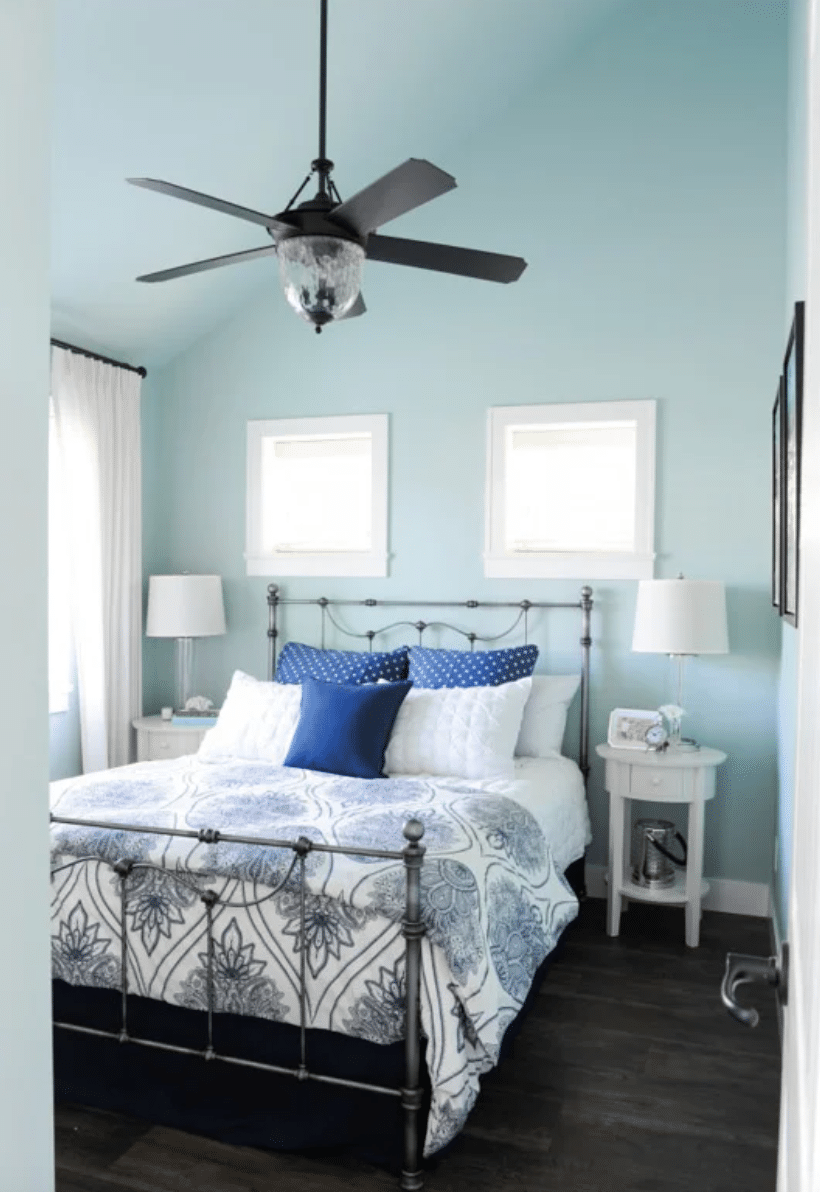
Bedroom in Benjamin Moore Palladian Blue
Maria Killam shows us just how blue Palladian Blue can appear when bathed in cool-tinted lighting. The dark blue accents in the room also help to send those green undertones to the background so blue can shine through.
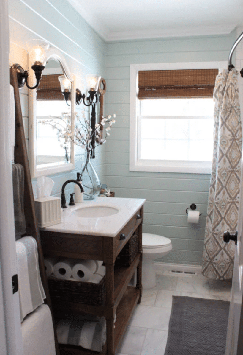
Bathroom Painted BM Palladian Blue
I am in love with this bathroom from 12 Oaks Blog! The texture of shiplap walls gives the paint added depth and dimension and transforms this small room into something drool-worthy.
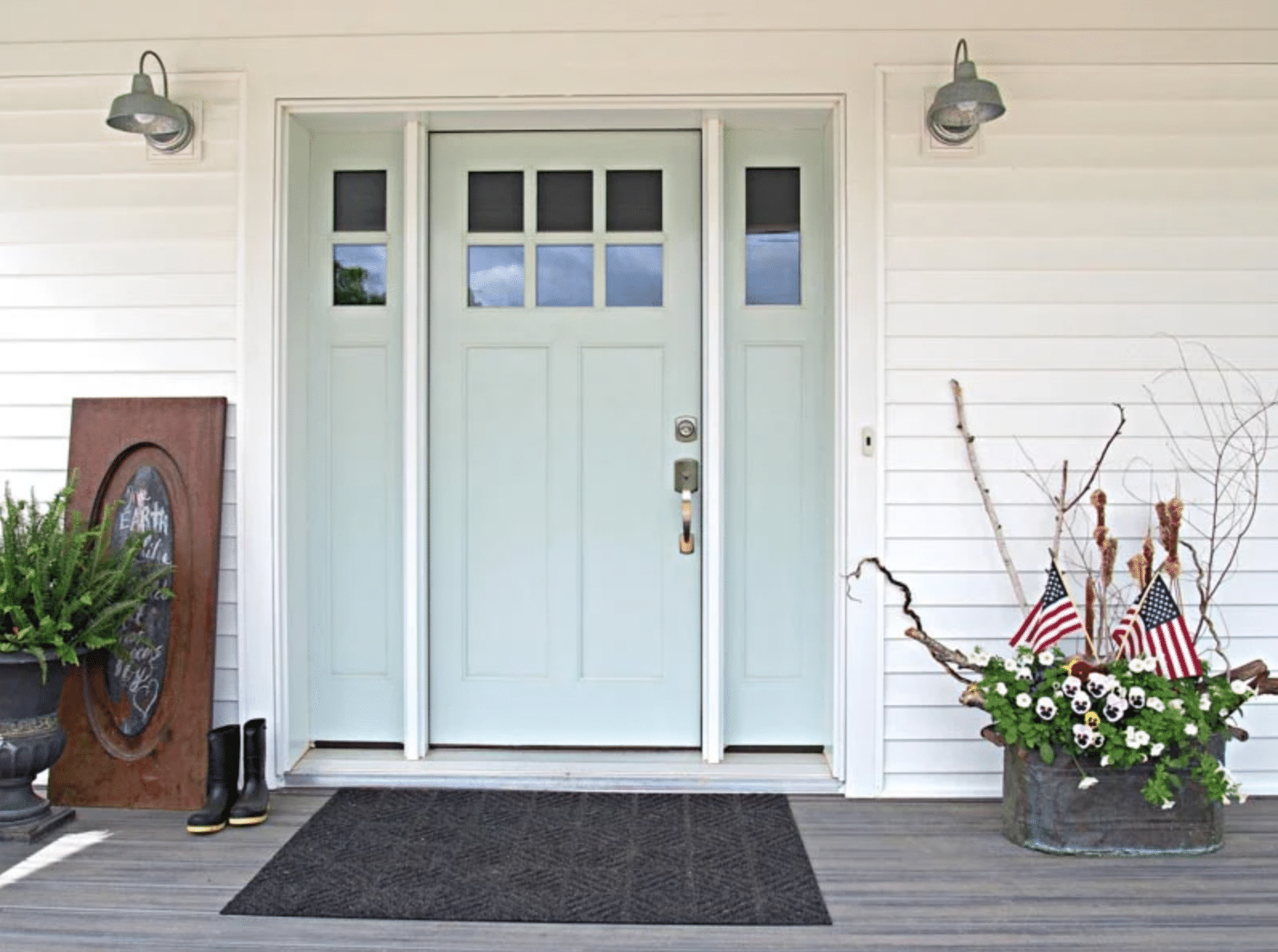
Benjamin Moore Palladian Blue Exterior Front Door
Palladian Blue is also great for exterior doors like this one from Renew My Home! It’s a fun and subtle pop of color that works on any style of house.
Frequently Asked Questions
Palladian Blue is a cool-leaning blue-green-gray. Although it leans cool, it’s not so cool that it will ever make your home feel cold.
This shade is actually a pretty balanced mix of both, so it will flex between them. At times it will appear to be a soft, muted blue, while at others, it will look more like a muted green.
Isn’t Palladian Blue lovely? After seeing how versatile and chic it looks, is it any wonder why it’s one of Benjamin Moore’s most popular blue paint colors?
How to Choose a Paint Color
Choosing paint colors for your home is a challenging task! Many people tend to give up and just pick a color without really vetting it first. Then they end up frustrated when it doesn’t look like they had hoped it would.
I find that the best approach to picking paint in any color family is to research several different shades and then use paint swatches to verify that they look terrific before you buy them! Then use your paint swatches to create a whole house color palette.
Check out these popular paint color families to help you narrow down your list of choices:
- Neutral Paint Colors
- Greige Paint Colors
- Blue Paint Colors
- Blue-Gray Paint Colors
- Green Paint Colors
More Paint Colors
Don’t forget to check out some of my other favorite paint color shades:
Tools to Help to Paint a Room Yourself
I’ve gathered some helpful tools for painting a room yourself. I recommend starting by checking out my tips for painting a room in 5 easy steps. I do my own painting nearly all of the time, and I use these tools to make the job easier and give professional-looking results!
- Paint Brush – These paint brushes are a little more expensive than your basic brush, but they’re worth it! I’ve used these brushes for more than a decade, and if you wash them out well after each use, they will last for years.
- Painter’s Tape – A MUST-have for taping off edges. You’ll need to tape off all edges if you don’t have a steady hand.
- Drop Cloths – A must-have to protect flooring and furniture from drips.
- Paint Cup – Sure, you could use any old cup, but I’ve come to swear by this one. The magnetic piece holds your brush cleanly in place when you need to take a break. And it fits my hand perfectly, keeping it from cramping.
- Roller Tray – I’ve found the only paint tray I’ll ever use again. The magnetic piece is great for holding the roller in place. And the liners are a luxury, but I won’t paint without them because it makes cleaning up a breeze!
More Posts You Will Love:
- Which Interior Paint Finishes to Use? {+ Where To Use Them}
- What Color Walls Go with Dark Wood Trim?
- Best Living Room Paint Colors
What is the LVP in your picture?
Hi, thank you so much for your thorough articles & walking through every aspect of the colors. Question for you – I’ve recently painted my kitchen & living room Wythe Blue – love it. But now I need an accent wall for dining room & also something to carry down the hallway. I want something more light bright & airy, something with a hint of color. Do you think sea salt would look good as an accent for Wythe Blue?
I am just getting ready to place my order for hardie board and I am torn on colors. Which between these two would you choose for the exterior?
It is so refreshing to hear how important color is to you! I am exactly the same way. When I first moved into one of my homes I selected a pretty subdues beige plaid for two walls in my kitchen/family room (this was in the 1980’s), and after the paper was hung I picked a beige paint for the other two walls that (I thought) was a good match. After it was painted it made me sick to look at it. The beige in the paper was a yellowish beige and the paint was a pinkish beige. I literally could not stand looking at it. And of course, no one else knew what I was talking about. There was no way I could live with it – looking at it was, to me, what scratching nails on a blackboard is to most people. I immediately got a better color and paid the painter to paint it all over again. And then I loved it – it soothed my soul.
It’s amazing how much paint colors can have an effect on our mood! So important to get a color you love!! xo, Laura
I am considering Sea Salt as the exterior color of a beach cottage. White trim and unsure about door. Do you think Sea Salt would work outdoors?
Love Sea salt! It’s one of my favorites. The color has a chameleon quality that shifts with the light but it’s always subtle. I used it in my bedroom and find it soothing.
Hi i love the edgecomb grey i googled online says its the best paint for a small hallway with less lightness so i brought the paint sample to a different paint store to mix n match. To be honest it was beautiful i love how airy and bright it done to my hallways it was breathtaking it is a mix of grey cream and white i would recommend this paint for any small hallways or mud room its beautiful . I want to paint my bathroom but want something to go with the flow in the hallway. Any suggestions please nothing dark. Thank you.
I love all the Grey’s and Griege but opted for a little more color in my powder room recently and used Ben Moore Wythe Blue. I love it. With white trim and brown wood floors it makes me think of the beach huts when I was a kid. I put some stripped yellow/off white canvas catchalls from the dollar store on a wasted space behind my toilet and it looks fab. Love that blue so much that I plan to use it in my ball way, which is central to my house. Hope that was helpfull.
Hi there, I am building a new chalet style home. It has a high front wall with lots of windows. This front wall is also spruce lumber and so is the side wall. I am trying to find a nice paint colour that will offer a coastal feel and I am considering Palladium Blue….I am also trying to figure out the best complimentary colour for my high feature wall which is going up to the loft. Can you help? Ceilings are also Spruce lumber so there is a lot of wood going on and I need the right colours that will pop but not be overbearing. PLEASE HELP!
Does anyone know the Sherwin-Williams equivalent to palladian Blue?
No but if you really want that color in Sherwin Williams paint, just take the paint chip into the store and they’ll match it exactly.
SW Rainwashed is almost identical to BM Palladian Blue. I am partial to Benjamin Moore paints, even though I have to drive 45 minutes to get Benjamin Moore versus 5 minutes to Sherwin Williams. Worth the drive. Every time.
I completely agree with Dawn about driving 45 minutes to get Benjamin Moore paint. One coat – no regrets – no smearing – no bleeding. I love that paint. It’s way more expensive than SW or Behr or (gasp) Valspar – but I LOVE it. Consistant color no matter what. It’s worth the drive to only have to paint once. If the color Sea Salt is what you want, I’d just taket that chip to BM and have them match it. So worth it.
I do love BM paint and used their self leveling paint and primer on my cabinets, but SW does have a one coat paint if getting the highest end they carry. It’s the Emerald. They even have a washable matte, so if you don’t want sheen or are hiding imperfections, it’s great. Only time more than one coat was needed was going over a dark paint with a light shade. If you go SW, just pay a few dollars more for the Emerald series…less time, less paint and fast drying.
Cool tip! Thanks, Audrey!!
Not to add to your confusion but….I painted my kitchen Behr’s Marina Isle (same color family as your samples) 12 years ago and I still love it! It looks great in any light, day or night. the adjoining family room is the same color, but cut with white (maybe 50%?) Whatever you choose will be wonderful!
I have so many different glass mosaics on my walls it was difficult to choose a color. I finally just had to jump in there and do it. First I started to paint the semigloss version of the same color in the room which is an off white. YIKES two hours later after painting around edges of large wall mosaic and a sleep to wake to see it in the morning I was sorry I chose that color. I did the paint on the wall tests too. Sooooooooooooooooo I got my craft paints out , which I know is a huge no no, and started mixing in my canning kettle until I LOVED the color. I painted the master bath and the color was Apple Barrel Wild Iris mixed in with white. I forget the actual amount because I did start with this off white almost beige but lighter paint.
The master bath is of course adjoined with the master bedroom which is painted a mint green. I was worried to see through the green room to the now wild Iris room and back again. It works. The Wild iris is also good with so many of the glass colors in my mosaic it makes them pop , and I hate that expression, LOL
So I went onto my guest bath saving back one quart of paint and started mixing again. We are a 90 mile round trip to the paint store so it is not like I can just drop everything and go grab more paint. Guest bath is attached to laundry room through a door of course so I also did laundry room the same color.
Looking through my kitchen to laundry room I am loving the same wild iris paint color mixed with the white enough to soon commit to bringing this color into my kitchen. I have a different huge glass mosaic back splash in the kitchen, 22 foot of it or so, and I am sure this color will be perfect. I have to say I first painted this kitchen the light mint green I LOVE so much and it did not work with my back splash. So I painted it back the same light off white the house was to begin with. In some old photos this looked bright white but it is far from bright white.
Right now I do not have the time or energy to paint more the yard is calling and I have a sick hubby, Hopefully I will get time to paint within the year. Even if I only do one wall at a time and work my way around. The kitchen is open to dinning room and living room. Living room is the same very light mint green ad master.Enjoying your painting tips here.
I would LOVE to see photos of your rooms.
Hi Shirley, If you were asking to see my house I will add a link to all of it. I have no way to divide out the house from the yard and other misc photos. I can assure you all will be a pretty crazy adventure. The older photos start in 2008 at the very last page of photos and come forward as my house yard paint colors glass work evolved over the last 10 years. You can scan whole pages at once or click a photo to get into it in larger form. The link is safe. Since I posted this comment in 2016 hubby died and I went on another painting frenzy. The mint green is no more it is now a very light aqua in living room hallway and master bedroom. The wild Iris is still in the other rooms and my master tiny walk in closet with crystal chandelier. OH Yes I did that!!! With help. I also painted the whole outside of the house from a light yellow with white trim to White with Black trim. HA let them think I am normal on the outside. Giggle. Shock of a life time one the front door is entered. Enjoy. https://www.flickr.com/photos/50185661@N03/
So I couldn’t tell, what color did you paint over your beige walls? And do you have any tips for trying to brighten beige walls – I feel like the beige underneath a lighter color would totally mess up what I think the color is going to look like
Love the colors. We painted our dining room and hallway Palladian Blue and love it. I may try searching salt for the kitchen.
Tons of samples for sure. I spent 400.00 on samples choosing colors for every room in our house last fall. I thought palladian would be the winner in my open concept kitchen/family room but Wedgewood grey took the prize and palladian won in the master bed and bath! Amazing how different something can look in another room. And the 400. For paint samples is a drop in hat compared to the paint bill of over 3000.00 for Benjamin Moore Aura paint. That would be an expensive decision to live with, if you chose the wrong color!
Oh my goodness! I can’t even imagine picking out paint for a whole house all at once, but I guess if you build, or are moving into a house with hideous paint colors, then you have to! Yes, a $3,000 design mistake would be a touch pill to swallow. Good for you for putting in the extra time to test out each one and make sure it’s the right decision. Saves you time AND money! 🙂 Have a great day!! xo, Laura
Hello,
I am considering sea salt for my bedroom and wanted an accent wall color for the wall the bed is up against. Looking at Kendall charcoal, hale navy? Any suggestions?
Thanks
Hi Naomi, I think both Kendall Charcoal and Hale Navy would be beautiful with Sea Salt (especially the navy)! I’ve paired it with Revere Pewter several times, too! Hope this helps! Laura
Thank you for the response. It helps in my decision.
Hi everybody,
I am italian, I just moved to the States and we bought a condo. We are repainting the whole thing cause altough it was freshly done it’s a horrible light yellow!
I like the farmhouse style and chose Classic Gray BM for the living room. Now I am in the process of choosing a light green for dining and kitchen (white cabinets), I want green to follow a mediterranean olive idea in my mind). But is’s sooo difficult. The colors I like are too dark on the wall (rooms are small and I don’t want to make them look smaller with dark colors). I tried today Guilford Green that look great in the pictures, but is seems to grey on the walls. For the master bedroom I wanted a light blue. Love your pictures with Palladian Blue and Sea Salt, but after trying many colors that appear similar on line but seem too dark in the house, now I was almost convinced to go with Haitian sky, from Behr. But your post put me in doubt again! Which one is actually lighter? But happy at the same time? Thanks!!! Daniela
Hi Daniela, of the two colors I have on my walls here: Palladian Blue and Sea Salt, I think Sea Salt is lighter. And that’s the one I chose. If you want to see how it looks in my whole kitchen, check this post out – https://theturquoisehome.com/2016/03/sea-salt-kitchen/
Good luck with your paint choices!!
xo, Laura
Adventures in painting—I love it!
When I bought my current house, the previous owners had done me a great favor and had the walls painted white, and the ceilings are all flat white—nice blank palette to start with, right? Except the dining room and kitchen, which were papered with a little floral pattern. The wallpaper job was very neat and well-done, but that pattern? SO not me. Plus, I don’t need a dining room.
So when I decided to turn the dining room into a study/bar, I was ready to paint. I’d already learned the same lesson as you did, only in a previous home. So I went and get a bundle of little sample jars and some of those peel and stick sheets to paint my samples on and hang on the walls. It was a tricky choice, since I wanted a green in the new study and a terra cotta in the adjoining eat-in kitchen. And whereas the study has little natural light, the kitchen has plenty. But the paint samples got me through. I ended up with a beautiful green that was much lighter than I’d expected to use and a rich terra cotta that was much darker than I’d expected! They coordinate great!
And much like you, as we were painting, I found myself saying repeatedly, “I love these colors!” Yeah, he doesn’t get it either, but he’s glad we only have to paint these rooms once. Now, on to the living room and front door!
Our master bedroom (which gets lots of light) and our laundry room (which has zero windows/light) are both painted Sea Salt, and I adore the color in both rooms. It truly is a neutral and it just makes me happy every time I walk in those rooms. I have several other places I want to use that color, including the ceiling of our entryway (after I have the popcorn scraped off 🙁 )
I can’t wait to see your kitchen painted!
Yay! I bet the color looks very different in a room with light vs. room with no light. We have a tiny little toilet room in our master bath. I haven’t painted it anything yet, but I’m thinking about Sea Salt. Haha!! I bet it’ll look so different than in my kitchen. 🙂
Check out the finished kitchen here: https://theturquoisehome.com/2016/03/sea-salt-kitchen/
xo, Laura
My entire main level is painted Sea Salt and I get constant compliments on it. It’s super soothing and goes well with so many other colors.
Me too….I just painted my laundry room Sea Salt also. Very easy to live with,goes with every color imaginable and after almost 2 years I still love it. So do our guests.
I was going to use Palladium Blue in my bathroom and Sea Salt in the master bedroom. Ended up with Woodlawn Blue in the bathroom and Antique Jade in the master bedroom. I’m still thinking about putting that Sea Salt somewhere…cuz I love it, but it didn’t go as well as the other two choices in the places where I needed them!
Being a color consultant, I thought I should weigh in…Sea Salt has a lot of green in it. It is a beautiful color, but the choice should be made based on what is gong on in the room, counter tops are bossy, are your counter tops white? Is the kitchen open to another room?
If you haven’t heard of Maria Killam’s blog, Color Me Happy…you should march right on over to it and sit yourself down and read, read, read. She is the master of color and undertones. She will be your new best friend. Palladian Blue is a beautiful color, so is sea salt…it’s about the undertones and what works with what else is going on around it. Good Luck !
That is such good advice! What color would you paint bathroom cabinets in a sea salt bathroom? Any ideas of Sherwin Williams colors?
I too find immense JOY in colors and like you can, and have, spent hours pouring over the decisions. I Love your choices and follow your thought process.
Our living room is Sea Salt
http://myoldcountryhouse.com/monday-makeover-sea-salt-living-room/
and our master bathroom is Palladian Blue http://myoldcountryhouse.com/monday-makeover-master-bathroom/
Can’t wait to see it!
They are so beautiful, aren’t they?? On my way to check out your rooms!
Your home is GORGEOUS!! I love that egg next to the paint swatch. I have loved the “robin’s egg blue” color since high school. And the pops of color?? Swooning.
I am painting my whole house Oyster Bay which changes color throughout the say…. For me Sea Salt was to white, but I get the look you were going for… I am doing one accent wall of Retreat and even thinking of painting my cabinets that color…. I believe Oyster Bay is the third color down on the Sea salt strip…
That’s funny, because my 5-year-old daughter doesn’t like the Sea Salt because she says it looks white. But I think I’ll like it. 😀
I just came back from my sister-in-law’s house and her living room and playroom are Sea Salt and her kitchen is Oyster Bay. They look great together!
I can also ‘feel’ the paint.. The color of certain room has a huge impact over my mood. This is why I chose light, pastel colors for my living room and I absolutely love your idea – the combination is so fresh, reminds me of summer days, seashells and the jingling of wind chimes : ))) Lovely!
I recently compared sea salt with Restoration Hardware’s silver sage. I was expecting the two to be very similar – boy was I wrong after painting samples! Sea salt really isn’t green at all. Both are lovely, but for my laundry room I’m going to go with the silver sage to compliment the green tones in my slate-look flooring. Thanks for sharing your process!
That’s so fun! I used Silver Sage in my old house, but that was 6 years ago. I’d love to see the two side by side. Sea Salt looks so green on my wall right now, but I think it looks more gray on the swatch.
My whole main living area is Sea Salt ! Loved it then and still do after 2 years on the wall. Changes subtly with the day … And a real neutral. Will b painting more of my home from that strip . You won’t be sorry 😎
I’m going through the same thing – though in a twisted turn of fate, the colors I actually don’t like were the ones I sampled on the wall. And the ones I love, I chose solely based on the paint chip. I just wrote about my errors (http://ow.ly/XywpC) , but I think I was going for such a stark change from what the previous owners had, I didn’t really have a vision or know what I liked. I just knew I hated the current wall color! I’m currently choosing between Valspar Oatmeal, Valspar Light Raffia and SW Accessible Beige for the kitchen & Hall. Good luck! Loving the Sea Salt in your kitchen!
Love both shades but I really love Sea Salt. Love the subtleness of it. Good choice. 😉
Paint colors are definitely the hardest choices in decorating for me! I painted our master bathroom Palladian Blue a few years ago, and it lasted maybe a year. It was just too dark, and I still don’t know why. Lots of white cabinets, a huge white tub, and a bay window that was basically all of one wall. It should have worked, but it didn’t. I am now having trouble choosing a color for a guest room, and I think the problem is the color that is on the wall now. I think I love the swatches until I put them up (all shades of gray) but the walls are the last of my red and gold phase, and the gold just turns every swatch a weird color. Maybe I should paint a large square of white on each wall to test the swatches on? Your cabinets (and your whole kitchen) look great, and I’m looking forward to seeing Sea Salt on the walls. I know it’s going to be beautiful!